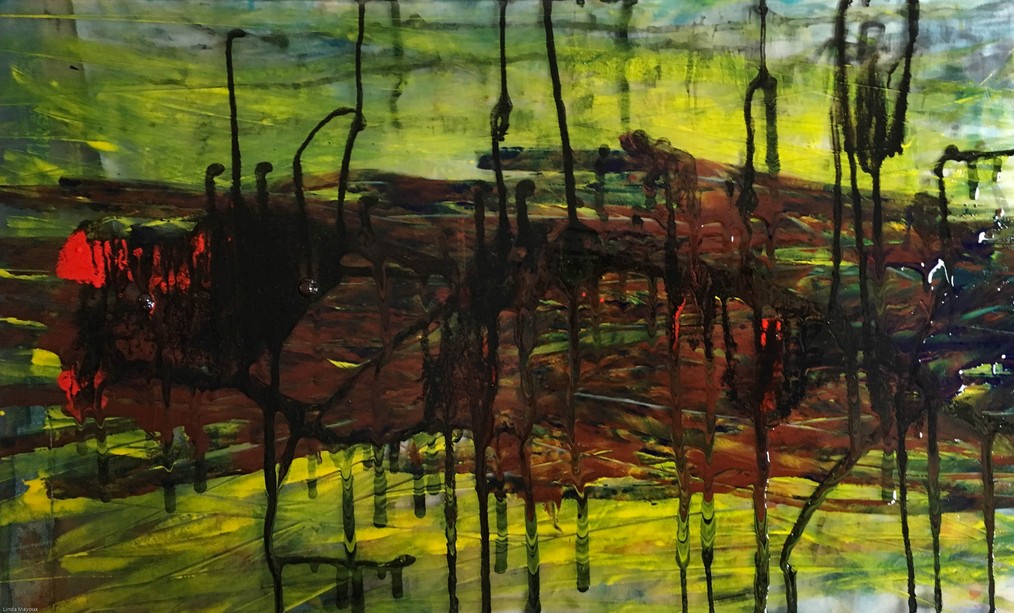
Experiments so far: I could make nice plates. But they splurged out when printing. I need to put some stiffening ink in Akua. And also experiment with Holbein Duo. I have problems using solvents, so that is not an option for me.
Akua 4 plate
Akua 4 plate crop
Akua 4 print 1
Akua 4 print 1 crop
Akua 4 print 2
Issues for printmaking:
– layering – when to overlay, when to marble, when to print in layers?
– texture gets flattened by the press – how do I get depth?
– can I use viscosity printing.
– paint flat or vertically?
Use Holbein duo oil-based inks. But need to be careful about consistency.
Painting with lines not shapes. All-overness. Not blocks of colour. Drawing in the air and does not touch the painting. Uses sticks and many other types of implement. Get different gestural marks.
Blue poles. Painted on nlack. Also uses gravity by putting vertically. Then back on floor. Uses a plank on its side to do the poles, and scrapes it back into the paint.
Bibliography
Anfam, D. (ed.) (2017) Abstract Expressionism, London: Royal Academy of the Arts.
Rothko is one of the artists studied in Project 2.2: Random Abstract Prints. It is possible to simulate some of the power of Rothko paintings using very thin overlays of transparent oil-based ink using a roller. Then overlaying thicker inks like Akua inks and impasto paying attention to the edges. This can be done in two passes – separating the thin transparent ink from the color-field overlays. But there is a tendency for inks to blend depending on the dampness of the paper in the first layer, and for the more textural overlay to squash. Thus losing the textural feel of painting. Much depends on the pressure from the press in the second printing.
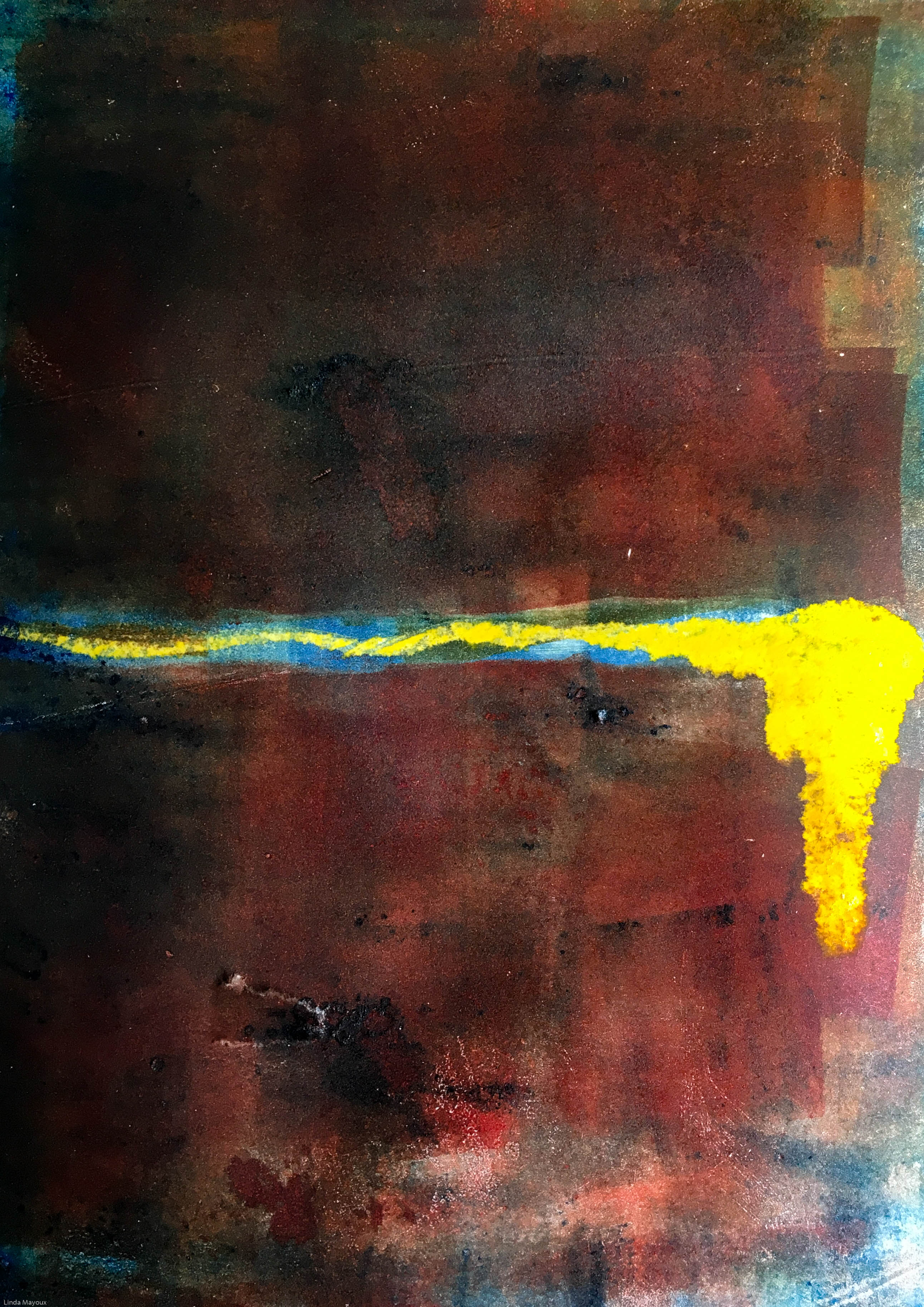
My experiments so far – small A5 prints. Would be interesting to do some larger ones at some time.
Rothko experiment 1
Rothko experiment 2
Issues for printmaking:
can get at least some of the depth through using very transparent layers of oil-based ink applied with a small roller (Rothko used very small brushes to get the subtle vibrations and detail).
overlays of water-based Schminke or Akua ink can be added with a brush or other applicator to drip or merge in the creases and cracks between the fields. this gives interesting difference in texture and luminance.
best to prepare the whole plate and print in one go so that the image hangs together as one layer.
Print on etching press and damp paper to get full depth of colour fields, but experiment with pressure to avoid disturbing the overlaid streaks too much.
About Mark Rothko
Mark Rothko (1903-1970) was prominent in the Abstract Expressionist movement in New York, best known for his large ‘color-field’ paintings. These go beyond pure abstraction, aiming to express the essence of universal human drama ‘tragic experience is the only source book for art’. The feelings expressed in his paintings are grounded in his early experiences of growing up as a Russian Jew through the pogroms and massacres following the failed 1905 Revolution. His early paintings were figurative and surrealist before he went on to paint ‘multi-field’ abstract works that evolved into the later color-field paintings.
He always resisted attempts to interpret his paintings. Instead aiming to draw the viewer in to make their own interpretation as an active relationship ‘a consummated experience between picture and onlooker. Nothing should stand between my painting and the viewer’ (quoted Ball-Teshuva 2017 p.7)
Videos of exhibitions
Overview of Rothko’s art and work by Simon Schama.
Rothko never wrote about or revealed details of his technique. Most of his color-field paintings are in oil, sometimes mixed with egg. The essence of Rothko technique is the background staining of the canvas in multiple layers of colour to give the painting depth and translucency. He then paid attention to the subtlety of the edges between and around the fields.
John Virtue is an English artist who specialises in monochrome landscapes. Virtue uses only black and white on his work as he sees colour as “unnecessary distraction”.He uses shellacblack ink and white paint.
He is well known for his “London Paintings” which were displayed in The National Gallery and focused on the London skyline, using easily distinguishable landmarks from the capital such as the Gherkin, the NatWest Tower and St. Paul’s Cathedral, to familiarise his audience with the otherwise hazy, smoggy and ambiguous drawings.
Abstraction (from the Latin abs, meaning away from and trahere, meaning to draw) is the process of taking away or removing characteristics from something in order to reduce it to a set of essential characteristics.(http://whatis.techtarget.com/definition/abstraction)
The term ‘Abstract Art’ is used to designate the art form that liberated itself from the representational, reality-oriented portrayal. Abstract Art does not illustrate concrete, visual reality, but rather abstract or abstracted movement, form, colour, structures or patterns. In doing so, the pure composition becomes the focus of artistic endeavours. (Elger 2009, back cover)
Abstract art is art that does not attempt to represent an accurate depiction of a visual reality but instead use shapes, colours, forms and gestural marks to achieve its effect http://www.tate.org.uk/art/art-terms/a/abstract-art
Ad Reinhardt Abstract Art cartoon emphasises the importance of the interpretation of the viewer. Changing the question from ‘What does IT represent” to ‘What do YOU represent”
‘We Futurists […] want to carry out this total fusion in order to reconstruct the universe and make it more joyful, that is, to re-create it. We will give flesh and bones to the invisible, the impalpable, the imponderable, the imperceptible. We will find abstract equivalents for all the forms and all the elements in the universe: we will combine them according to the whim of our inspiration, to create plastic compositions that we will set in motion’ (Giacomo Balla and Fortunato Depero 1915 quoted Blazwick ed 2015 p12)
‘It is my conviction that humanity, after centuries of culture, can accelerate its progress through the acquisition of a truer vision of reality. Plastic art discloses what science has discovered: that time and subjective vision veil the true reality…It has become progressively clearer that the plastic expression of true reality is attained through dynamic movement in equilibrium. Plastic art affirms that equilibrium can only be established through the balance of unequal but equivalent oppositions. The clarification of equilibrium through plastic art is of great importance for humanity…It demonstrates that equilibrium can become more and more living in us.’ Piet Mondrian 1941 quoted Blazwick ed 2015 pp. 12-13)
‘if pictorial expression has changed, it is because modern life has made this necessary.’Fernand Leger 1914.
Abstract prints check and log
Compare the two abstract print projects: 2.1 Formal Abstract Prints and 2.2 Random Abstract Prints. What are the advantages and disadvantages, similarities and difficulties of each? Which do you prefer and why?
The formal abstract print produced a very clearly structured image where a lot of thought and pre-planning was required. However at the inking stage many different and accidental chance effects are possible. This would be a possible way of producing some of the colour field effects, particularly those of Clyfford Still – trapping lines of ink between blocks of colour and even letting them overflow. The embossing also produced interesting textural effects, particularly when rotated and overprinted.
The random abstract print is more intuitive and subject to chance and accident – sometimes ‘happy’ sometimes not so happy. With printmaking there is even less control over the final image than with paint because it is often unclear which ink has dried and which has not, and which ink will ‘squish’ and what will retain its mark with different pressures. But I particularly liked the effects of Akua inks and Schminke water-based inks and images produce by printing from old ink marking on the plate.
I like both approaches for different types of effect. The one can also inform the other. And – as in Assignment 2 – it is possible to take advantage of both approaches and use random ink effects on a structured collagraph plate.
How does the Alan Bowness quotation below relate to your experience of abstract painting? What abstract elements are missing from this writing?
“Colour remains the dominant interest, but there is less insistence on it than the past, and clearly now composition, form, even line are equally the concern of the painter. There is no ground in the paintings: shapes are held suspended across the surface, colours are made to advance and recede in a constantly changing relationship. The meeting place of one coloured area with another has a new importance, and one is now aware that the edges form a line that twists and turns, describing a new kind of shape. Drawing assumes again that crucial role it played in Heron’s very early work. Altogether there seems to be a much greater richness in the new pictures: they have gained in complexity without losing their directness and simplicity. They show a direction in which this kind of art can fruitfully move, at a moment when, as we have seen, there is a tendency to feel that all lines of progress have been tried and found exhausted.” Alan Bowness 1972
Colour is only one among many other elements – line, shape, tone, texture.
Find examples of the sorts of abstract prints you like and make notes on them.
Evolution of approaches to abstraction
Abstract art uses a visual language of shape, form, colour and line to create a composition which may exist with a degree of independence from visual references in the world. Abstraction exists along a continuum.
All art is in some degree abstraction. Even figurative art involves varying degrees of selection, interpretation and transformation of the ‘reality’ as perceived by the artist into an image that is then subject to further interpretation by the viewer.
Partial abstraction through obvious alterations of eg colour or form. The artist selects a form and then progressively simplifies it until the image bears only stylized similarities to the original, or is changed almost entirely beyond recognition.
Total abstraction bears no trace of any reference to anything recognizable. This may be the end product of an abstraction process, or the art may not have started with any specific external reference.
Abstraction has been evident in the art of many cultures throughout history.
In Western art it emerged at the beginning of the twentieth century as part of/reaction to the social, intellectual and technological upheaval that took place at the turn of the century. Science was creating very different perceptions of the world with discoveries like X-rays and quantum theories that were outside our visible world. Motorcars and airplanes gave a new speed and freedom of travel to those who could afford them. “Artists sought new ways of responding to the world around them, sometimes by rejecting it, or by pursuing strategies of dissolution, flux and fracture in place of Western notions of aesthetic unity and wholeness…”(Moszynska 2004 p7) Theodor W. Adorno – abstraction is a response to, and a reflection of, the growing abstraction of social relations in industrial society. Frederic Jameson sees modernist abstraction as a function of the abstract power of money, equating all things equally as exchange-values. The social content of abstract art is then precisely the abstract nature of social existence – legal formalities, bureaucratic impersonalisation, information/power – in the world of late modernity. (Wikipedia)
The emergence of abstract art also relates specifically to changes that were occurring within painting itself.
the development of photography from the 1840s led to a re-evaluation of the artist’s role as depictor of reality. But also a freedom to focus on depiction of more subjective, interior realities, and of emotions…. Gauguin’s advice to ‘paint by heart’.
the commercial availability of wider range of paint colours from mid 19th Century (photography being only monochrome) and discoveries about the nature of perception of light and colour encouraged artists to focus on qualities essential to painting: colour and surface texture. Maurice Denis 1890 ‘a picture…is essentially a plane surface covered with colours assembled in a certain order’
increasing awareness of non-Western art in which spatial perception and artistic depiction were based on different premises.
(Moszynska 2004 p8)
Blaswick (2015 p9) makes a distinction between biomorphic abstraction, geometric abstraction and abstract expressionism, although these categories are often fluid and individual artists may not easily fit into any one ‘school’ and/or may combine more than one approach.
Biomorphic abstraction
Bases itself on forms found in nature and the psyche. This type of abstraction is seen in many ancient art traditions including simple, geometric and linear forms on pottery, textiles, and inscriptions and paintings on rock which had a symbolic or decorative purpose. In the twentieth century European artists developed a range of abstraction styles including:
Impressionist paintings like the water lilly paintings of Claude Monet
Paul Cézanne began as an Impressionist started to experiment with still life in multiple perspectives and landscapes based on flat areas of modulated colour
Cubism Georges Braque and Pablo Picasso further developed this focus on multiple perspectives in analytic Cubism. Synthetic cubism and Dada practised by Braque, Picasso, Fernand Léger, Juan Gris, Albert Gleizes, Marcel Duchamp, Kurt Schitters produced abstract collages of different textures, surfaces, papier collé and a large variety of merged subject matter.
Picassowent on to more emotional and shaped forms of abstraction like his paintings of Guernica and female nudes, notably the painting Les Demoiselles d’Avignon 1907 and his paintings of 1932. These drew on cubism and also African art. This abstraction was reflected in his many monoprints, linocuts, lithographs, drypoints and etchings.
Expressionists and Fauvists explored the bold use of paint surface, drawing distortions and exaggerations, and intense colour and to produced emotionally charged paintings that portrayed psychological states of being. Fauvist paintings of André Derain, Raoul Dufy and Maurice de Vlaminck were “wild”, multi-coloured, expressive, landscapes and figure paintings. Woodcuts of the German Expressionists produced powerful abstracted portraits and landscapes.
Henri Matisse uses expressive colour and free and imaginative drawing in French Window at Collioure, (1914), View of Notre-Dame, (1914), and The Yellow Curtain from 1915. Then takes this expressive use of colour and shape further in his cut-outs.
Futurists and Vorticists: with their preoccupation for speed and energy of modern urban life. The Italian poet Marinetti published ‘The Founding and Manifesto of Futurism’ in 1909, which inspired artists such as Carlo Carra in, Painting of Sounds, Noises and Smells and Umberto Boccioni Train in Motion, 1911. These then influenced Vorticists like Wyndham Lewis and printmakers like Sybil Andrews , Claude Flight and Cyril Power of the Grosvenor School.
Georgia O’Keeffe‘s highly abstract forms based on flowers.
Geometric abstraction
Characterised by pure forms based on mathematically defined systems and monochromatic and non-representational surfaces.
Geometric abstraction has characterised Islamic art for many centuries – deriving from both development of geometric theories themselves, and the banning of figurative art in certain Islamic religious cultures. Geometric abstraction has been further developed by contemporary Arab artists as part of identity and political art.
In the West geometric abstraction originated in the late 19th century in Eastern Europe mysticism and early modernist religious philosophy as expressed by theosophist Mme. Blavatsky, Georges Gurdjieff and P.D. Ouspensky who popularised for a Western audience the sacred texts of India and China. They proposed that certain universal and timeless geometric forms like the circle, square and triangle and colours had intrinsic spiritual meanings as fundamental systems underlying visible reality, pointing to a ‘higher truth’.
Geometric abstract artists include:
Wassily Kandinsky, and Hilma af Klint who were heavily influenced by theosophical theories.
Piet Mondrian whose interest in relationships between geometry, colour and balance was also influenced by spiritualist ideas.
Paul Klee
St. Ives group in Cornwall including Barbara Hepworth, Ben Nicholson, Naum Gabo, Patrick Heron.
Constructivist and Suprematist artists like Malevich and artists of the Russian Revolution who saw geometric abstraction as a way of promoting Utopian social change.
Anfam, D. (ed.) (2017) Abstract Expressionism, London: Royal Academy of the Arts.
Antiff, M. & Green, V. (eds.) (2010) The Vorticists, London: Tate Publishing.
Ball-Teshuva, J., (2017) Mark Rothko 1903-1970: Pictures as Drama, Koln: Taschen.
Barringer, T., Devaney, E., Drabble, M., Gayford, M., Livingstone, M. & Salomon, X. F., (2013) David Hockney: A Bigger Picture, London: Royal Academy of Arts.
Blazwick, I. E., (2015) Adventures of the Black Square: Abstract Art and Society 1915-2015, Munich, London, New York: Prestel and Whitechapel Gallery.
Borchardt-Hume, A. & Ireson, N. (eds.) (2018) Picasso 1932: The EY Exhibition, London: Tate Publishing.
Brighton, A., (1966) Francis Bacon, London: Tate Gallery Publishing.
Clark, H. (ed.) (1993) Picasso: In His Words, San Francisco: Collins.
Cocker, M., Dunmore, H., Hare, B., Jacobson, H., Mabey, R., Marsden, P., Mooney, B., Packer, W., Taylor, J. R., Smit, T. & Tooby, M., (2010) Kurt Jackson: A New Genre of Landscape Painting, Farnham, Surrey: Lund Humphries.
Dow, A. W., (1997) Composition: A series of exercises in art structure for the use of students and teachers, California, USa: University of California Press.
Edwards, S. & Wood, P. (eds.) (2004) Art of the Avant-Gardes, New Haven and London: Yale University Press and The Open University.
Eik Kahng, Charles Palermo, Harry Cooper, Annie Bourneuf, Christine Poggi, Claire Barry & J.C.Devolder, B., (2011) Picasso and Braque: The Cubist Experiment 1910-1912, Santa Barbara: Santa Barbara Museum of Art.
Elger, D., (2008) Abstract Art, Hong Kong, Koln, London, Los Angeles, Madrid, Paris, Tokyo: Taschen.
Harrison, C., Frascina, F. & Perry, G., (1993) Primitivism, Cubism, Abstraction: The Early Twentieth Century, New Haven and London: Yale University Press and The Open University.
Kandinsky, W., (1977) Concerning the Spiritual in Art, New York: Dover Publications.
Moszynska, A., (1990 reprinted 2004) Abstract Art, London: Thames and Hudson.
Nickas, B., (2009) Painting Abstraction: New Elements in Abstract Painting, London and New York: Phaidon Press Ltd.
Rothko, C. & Bishop, J., (2017) Rothko: The Color Field Paintings, New Haven: Yale University Press.
Storr, R., (2009) Gerhard Richter: The Cage Paintings, London: Tate Publishing.
Landscape art, even when it aims to be figurative, implicitly or explicitly reflects our visions for how the natural and human-made world should be and our place in it.
Landscape is essentially about exploring the relationships between the maker, their subjects and where they are, both geographically and spiritually or psychologically. .. Whether celebrated for its beauty and the bounties it provides or respected for its power and the challenges it presents, the different ways we’ve presented the landscape – and continue to present it – tell us above all, about the depth, range and contrasting values we place upon it. … This reflects an urge – perhaps even an instinct – to tame the land, and in an abstract sense to take ownership of it. (Jesse Alexander 2013 p.14)
Dutch landscape : drama, comfort and beauty in bleakness
My approach in Project 1.1 Natural Landscape draws on the traditions of Dutch landscape inspired by the similar flat landscapes of the River Cam that I chose as my subject.
Dutch Golden Age painting of the 17th century saw the dramatic growth of landscape painting. The popularity of landscapes in the Netherlands was in part a reflection of the virtual disappearance of religious painting in a Calvinist society. Until the seventeenth century landscape was confined to the background of portraits or paintings dealing principally with religious, mythological or historical subjects. In the 16th Century Pieter Brueghel the Elder perfected the “world landscape” style of panoramic landscape with small figures and using a high aerial viewpoint. But these were still generally idealised images, not of any particular place. Certain popular styles became formulas that were copied again and again.
The first major shift towards depiction of identifiable country estates and villages populated with figures engaged in daily activities was in publication in Antwerp in 1559 and 1561 of two series of a total of 48 prints (the Small Landscapes) after drawings by an anonymous artist referred to as the Master of the Small Landscapes. Artists developed extremely subtle realistic techniques for depicting dramatic light and weather on simple, flat and otherwise quite bleak landscapes. They made some significant innovations in technique, including variation in horizon lines, aerial perspective and rendering of clouds to make them seem overhead and lead the eye into the painting.
Because of this similarity between the flat Dutch landscape and those of East Anglia where I live, much of my own landscape art has been strongly influenced by Netherlands art, particularly since visiting Museum Boijmans van Beuningen, Rotterdam permanent collection of Dutch landscape. See also Logan, A.-M., (1988) and Stechow, W., (1966). Some of the oil and watercolour paintings that were most influential in my development of Project 1.1 were:
Jan Josefsz van Goyen:View over a Flat Landscape (oil on panel 1642) a moody painting of a completely flat landscape with cows, where the top two thirds of the frame is occupied by the grey clouds, but with subtle sunlight breaking through on the horizon line in the far distance.
Adriaen van Ostade: Landscape: (oil on panel 1639) a summer image with a very dramatic stormy sky with bright patches of light on the ground from breaks in the cloud. The horizon line is again low just above the bottom third of the frame.
Although the approaches here are largely figurative, many of these images chronicle the harshness of poverty in the Northern climate. The attention to detail and appreciation of the beauty of these human ‘natural’ landscapes under the powerful skies convey a sense of peoples’ place in the world – sometimes lonely and sometimes comforting.
Key Considerations in Landscape Art
Some key considerations in my work are:
what is the picture trying to communicate? what is the ‘mood‘ of the picture. Awestruck/Sublime, calm/serene, Turner’s turbulence. David’s mystique. Whistler’s mistiness. Colour and dramatic distortions in Hockney. Joy or sorrow in Hambling’s watercolour sunrises and sunsets?
what shape is the picture? 19th century conventions were usually landscape format with broad vistas. But some late 19th century landscapes and also earlier drawings were much more focused on particular elements in portrait format e.g. trees. Japanese and Chinese landscapes were also often vertical. There can also be very long thin panoramas, or tall thin verticals, square formats also.
what sort of terrain is depicted? 19th century conventions and also Chinese and Japanese landscapes were concerned with mountains, trees, flat fields, sky, water, river. Sometimes cottages, houses, castles.
what/who is in it? Are there people? 19th century conventions and before generally used landscape as a backdrop to religious or historical paintings. ‘Landscape paintings’ in both Western and Asian traditions generally had one or two people or a small group of people dwarfed by the natural elements. Sometimes people are excluded altogether e.g Monet’s waterlillies and abstract landscapes like Richter.
how are the subjects arranged? According to rule of thirds composition to focus or lead the eye to certain features or meaning? Pleasing/picturesque? Are there high, low or central horizons, and diagonals and triangular relationships or swirling circles (See post Landscape Composition).
See further discussion, links and references from:
is based on Japanese landscape of Hiroshige and Hokusai and considers further design principles of balance and composition in Japanese art. See Japanese Woodblock Prints
drawing on work of Abstract Expressionists are often evocative of landscapes
Sources:
Alexander, J., (2013) Landscape: Photography 2, Barnsley: Open College of the Arts.
Barringer, T., Devaney, E., Drabble, M., Gayford, M., Livingstone, M. & Salomon, X. F., (2013) David Hockney: A Bigger Picture, London: Royal Academy of Arts.
Bikker, J., Webber, G. J. M., Wiesman, M. W. & Hinterding, E., (2014) Rembrandt: the late works, London: National Gallery.
Hambling, M., (2006) Maggi Hambling the Works and Conversations with Andrew Lambirth, London: Unicorn Press Ltd.
Hambling, M., (2015) War, Requiem and Aftermath, London: Unicorn Press Ltd.
Hauptman, J., (2016) Degas: A Strange New Beauty, New York: MoMA.
Heugten, S. V., (2005) Van Gogh draughtsman: the masterpieces, Amsterdam: Van Gogh Museum.
Hockney, D., (2004) Hockney’s Pictures, London: Thames & Hudson.
Hoerschelmann, A., (2016) Anselm Kiefer: The Woodcuts, Ostfildern, Germany: Hatje Cantz Verlag.
Kossoff, L., (2014) London Landscapes, London, Paris, New York, Los Angeles: Annely Juda Fine Art, Galerie Lelong, Mitchell-Innes & Nash, L.a.Louvre.
Langmuir, E., (2018) A Closer Look at Landscape, London: National Gallery.
Leopold, R., (2004) Egon Schiele Landscapes, Munich, Berlin, London, New York: Prestel.
Logan, A.-M., (1988) Dutch and Flemish Drawings and Watercolours, New York: Hudson Hills Press.
Meyrick, R., (2013) Sydney Lee Prints: A Catalogue Raisonnee, London: Royal Academy of the Arts.
Porzio, D. (ed.) (1982) Lithography: 200 years of art, history & technique, London: Bracken Books.
Stechow, W., (1966) Dutch Landscape Painting of the Seventeenth Century, New York: Phaidon Publishers.
Stevens, C. & Wilson, A. (eds.) (2017) David Hockney, London: Tate Publishing.
Wildenstein, D., (2017) Monet or the Triumph of Impressionism, Koln: Taschen.
Abstract expressionism is the term applied to new forms of abstract art developed by American painters in the 1940s and 1950s, mostly based in New York City, and also became known as the New York school.The name evokes their aim to make art that while abstract was also expressive or emotional in its effect. They were inspired by the surrealist idea that art should come from the unconscious mind, and by the automatism of artist Joan Miró.
Within abstract expressionism were two broad groupings:
Action painters : Jackson Pollock and Willem de Kooning who attacked their canvases with expressive brush strokes. They worked in a spontaneous improvisatory manner often using large brushes to make sweeping gestural marks, or pouring paint over the surface directly placing their inner impulses onto the canvas.
Colour field painting : Mark Rothko, Barnett Newman and Clyfford Still who created simple compositions with large areas of more or less a single flat colour intended to produce a contemplative or meditational response in the viewer.
Several important female Abstract Expressionists from New York and San Francisco like Helen Frankenthaler and Lee Krasner now receive credit as elemental members of the canon.
Key Ideas
influenced by Surrealism’s focus on mining the unconscious, interest in myth and archetypal symbols, understanding of painting itself as a struggle between self-expression and the chaos of the subconscious.
influenced by leftist politics, and value an art grounded in personal experience.
emphatically American in spirit – monumental in scale, romantic in mood, and expressive of a rugged individual freedom.
See my print experiments in the style of Abstract Expressionist Painters:
From these I did a first series of prints using mostly foamboard. I found that when I tried to combine foamboard and softfoam it was difficult to register the image because softfoam changes size quite dramatically when it goes under the press. It is also difficult to draw on first because it is so soft so the slightest mark will show. The main technique that is possible is to start with softfoam and then do a print onto the foamboard. Then work with the foamboard making marks where needed from the impression. Then clean the ink off before re-inking. But it still only works if you do hand printing, if you want to use the softfoam again. It also only really works with water-based inks that dry quickly and rather unpredictably.
I also found using too many colours made things very messy – as this was a colour project, I decided to simplify things and use only softfoam. I found that when I cropped the prints below, some of them made more effective images – inspiration for further prints later. It would have been difficult to predict the effect through thumbnails because so much depended on the precise effects of the ink. It is very difficult to see where the ink is drying more quickly and so what prints and what does not – part of the joy but also frustration of the medium. These were the prints I sent to my tutor. But I was not very happy with them – more a work in progress to continue later than anything finished.
Stepping Stones
So I started again with a different set of sketches, again based on a photo. I used only foamboard and a limited palette, building up the tonal colours. I continued to use Caligo water-based ink but I chose to work with thin Hosho paper to increase the misty effect and also to make sensitive hand-printing easier.
Because this was a series and I was using only one plate, I chose my colours and sequencing very carefully – starting with yellow ochre and brown, then going to blue. I was also able to alter my wiping out and some of the details as I progressed. But how much the ink was drying and where as I worked remained a bit upredictable.