


Overview and assessment
I very much enjoyed this project. Focusing on abstract shapes made me look at urban landscapes in a more structural way – something that is useful not only for abstraction, but also to give greater impact to more figurative images.
For this project I selected one of my favourite views from the first floor of EAT cafe in Cambridge. From this vantage point there are very interesting patterns of roofs from different architectural periods. Technical challenges because the inks and lino were a bit old made me look more critically at the images – including those that were a complete mess, to see how different crops and colour combinations affected how the eye moves through the image.
I do not equate balance with ‘success’. I generally find images where I can easily see the underlying grid of rule of thirds rather uninteresting and ‘pretty’. What I enjoy more is tension and ambiguity. But more subtle forms of balance can be intriguing. In what I consider the most successful images above, the balance is generally achieved because I have inverted the same plate but with a different tone, so there is an echoing of shapes. The image is not a straight abstraction of the scene I saw. More detailed notes are given on the image captions.
Although with these designs I did not get flat abstract images, I do like some of the texturing. As I was trying to get flat colour, the texturing is rather accidental and random. But I could be more strategic with my cutting instead (as I generally am) and make the ridges part of a dynamic design. Going forward I could also think a lot more about the meaning I am trying to communicate about urban life in Cambridge. That would give more impact to the abstract aesthetics.
Inspiration
Before doing this project I looked at work on urban abstraction by the vorticists and made a Pinterest Board for reference.
Urban Abstract Pinterest Board
I also looked back at some of my abstract and other linocuts of figures from Printmaking 1 and linocuts by other artists: Linocut Inspiration. Although I could envisage urban abstracts of Cambridge in the style of the Vorticist and Futurist linocuts of the Grosvenor school, I did not think the particular linocut techniques suggested here would allow that.
Process
Initial sketch of the scene
I started by taking some photos around Cambridge of possible scenes. Some of the images considered for Project 1.2 like those of bikes and arches could be interesting abstracts. But it is not actually so easy to find good vantage points with roofs.


I decided on one of my favourite views from a table on the first floor of EAT cafe in Cambridge. From this vantage point there are very interesting patterns of roofs from different architectural periods. Using a pencil on A3 paper and working to the edge of the page, I started by making a make a line drawing. I paid attention to the shape of each roof, and its perspective in relation to the others. I plotted various possibilities onto the paper and altered the shapes and perspective as I went along. I then did an initial light/dark sketch on my iPad, looking at both portrait and square crops.


For the lights and darks I sketched different lighting and took photographs. I stayed there from 9am to 4pm and the light changed dramatically in that time. Giving different shapes and compositional possibilities for placing lights and darks. I could have explored these variations further in Lightroom and/or Photoshop.


Selecting crops
I then drew four boxes on tracing paper 15cm x 10cm. Using these boxes as viewfinders and moving them over the drawing I experimented with different angles and compositions, looking for what I consider to be balanced composition of lines and shapes. As I made my tracings I edited detail, enhanced diagonals and altered lines to make the design more abstract and trying to further enhance the composition.


I then photographed the tracings and imported into Procreate to further develop the abstraction and experiment with composition. I also experimented with flipping and rotation to see if that made the design become more dramatic or interesting.


Printing: technical issues
Despite the preparation, the crisp linocuts I had managed to achieve in Printmaking 1 (and Project 3.1 Chiaroscuro linocut in this course) proved difficult to achieve. This was partly because these reduction linocuts required two passes:
- Firstly, the lino kept curling up, and was difficult to ink without getting ridges, even when sanded down. It also kept shifting on the press, even with runners and a board on top. a couple of plates even seemed to be slightly different size after they had been cleaned for the second inking. Looking at these issues on the Internet, I think this may be because the lino is now older and so harder. I did not have these same issues with larger linocuts later in the course. Apart from buying a lot of new lino, the only solution I can see is to mount the lino on boards to stiffen it. As these are small linocuts I could consider using my very small block press instead of the etching press.
- Secondly the ink seemed less controllable. I used Caligo inks and these had settled in the tube since I used them last, so the first lot of ink was more oily. This resolves itself in later linocuts in course as I cleared the oily ink.
- Thirdly these images had large areas cut out, unlike other reduction linocuts I had done. I need to rethink some of the design to avoid large cut areas along the edge as these curl and are more difficult to ink.
The other alternative would be to accept the ridging and texturing as part of the process, and work more with it as an integral part of the design as in some of the images below. But mask out around the edges of the plate to make clean prints even with imperfect registration.
Crop 1: Light on the chimney
initial crop
This image focuses on one of the main areas I had studied from life – the light and shadow on the chimney. I really liked the dramatic sweep this made over the roof early in the day. After experimenting with different tonal variations I chose my first image and cleaned it in Procreate on my iPad. This was the image I felt had the greatest impact in terms of negative shapes – the bold black diagonal behind the white house shape that is thrown forward into sun.


Colour experiments
I then experimented with different colours and tonal balance between the light/mid and dark shapes.


Prints
The final prints were not so dramatic as my digital colour explorations – partly because of the technical issues above and the fact that I could not get totally flat colour. Also because digital RGB colour on screen is brighter, and because the colours are muted and altered by overprinting on a particular colour of paper or ink. Adding a third intermediate colour also meant that the bold contrasts in the abstract portrait linocuts were reduced through distraction of this third colour or intermediate tone. The background colours of the paper I used were also less vibrant.


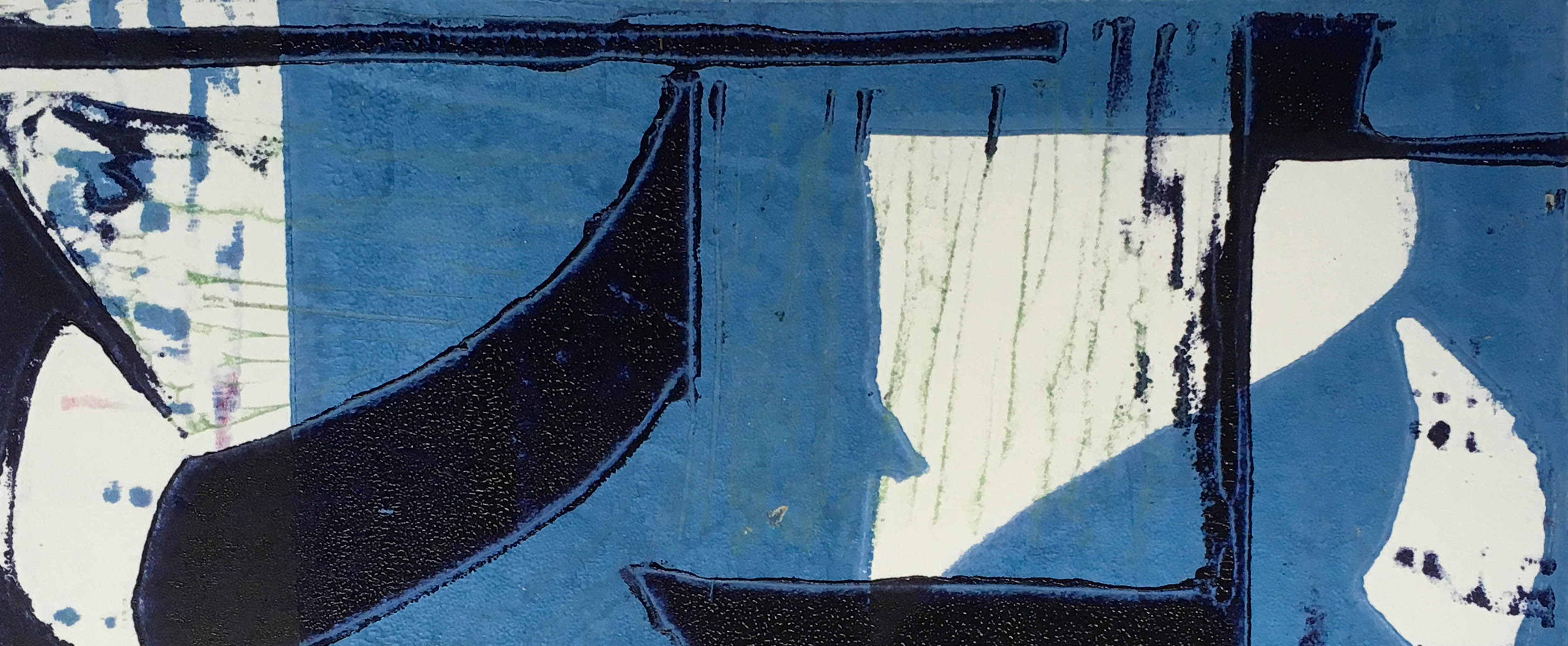
Crop 2: Arch
The second crop focused on the contrast between the arch curve and the roof tops. I experimented placing the horizontal and vertical lines on different centre and third lines. But found that became too predictable. The version with the white block on the right is more dramatic – but needs to be placed on a dark background and proved problematic in printing. I tried omitting the thin diagonal line at the bottom, but that also made the design too static. I like the little rectangle split into two colours bottom right – it creates visual tension and some mystery.
Tone experiments


Colour experiments
As the digital colour experiments had proved less useful than I thought, I limited my colour explorations for this print. I wanted to first see how my inks worked together. Then come back and experiment digitally with those actual col,our variations. Of the three variants I like the third best – like the warm light.


Prints
I found that different colour combinations produced different effects in terms of the reading of the image. I made a mistake in the cutting and omitted the splitting of the rectangle bottom right. In general the large cut area on the left was a problem – unless made interesting by texture. I found that the image was more interesting when rotated.


Different crops varied in their effects depending on the tonal structure of the image. Close crops could produce some quite interesting abstracts.


The most interesting image of the series was again produced through inversion and taking advantage of the accidental textures.

Crop 3: Diagonal Roofs
Tone experiments
In this crop what interested me were the diagonals. I started by experimenting with detail of different shading – making some of the detail lines thicker or narrower, and swapping the high/mid/dark tones. I also experimented with rotation. Finally arriving at the final image below.


Prints
For this image I went straight from the tonal image to print – using the same paper and ink from my printing of the first image. I found I had some challenges with the design with high contrast inks.


I discovered some potentially interesting textural crops of quite messy prints using Lightroom composition grids.


The most successful images were again some that had been inverted and overprinted.


Crop 4: Roofs and arch
This image is more obvious than the others in terms of what it depicts. But I like the shapes.
Tone experiments

Colour experiments
I like the strong dramatic contrasts in the final two images, and am interested in the way the addition of the small vertical line between the houses alters the level of abstraction perceived. But I did not have time to do the final prints.


Conclusion
Reviewing the most successful prints, I do not equate balance with ‘success’. I generally find images where I can easily see the underlying grid of rule of thirds rather uninteresting and ‘pretty’. What I enjoy more is tension and ambiguity. But more subtle forms of balance can be intriguing. In what I consider the most successful images above, the balance is generally achieved because I have inverted the same plate but with a different tone, so there is an echoing of shapes. The image is not a straight abstraction of the scene I saw.
Although with these designs I did not get flat abstract images, I do like some of the texturing. As I was trying to get flat colour, the texturing is rather accidental and random. But I could be more strategic with my cutting instead (as I generally am) and make the ridges part of a dynamic design, masking out the edge of the plate to give a clean border.
Going forward I could also think a lot more about the meaning I am trying to communicate about urban life in Cambridge. That would give more impact to the abstract aesthetics.
Leave a Reply