Charles Shearer is an artist printmaker and teacher from Orkney, currently based in London. He also creates paintings and drawings of scenes inspired from his extensive travels both in the UK and overseas.
Many of his prints are single or multiplate collagraphs made from cutting, drawing and sculpting into display board. The plates are then printed using stencils and roller techniques to produce complex and multicoloured prints. This is the technique I started to explore in Assignment 5 The Dreaming.
His subjects are often ‘creative interpretations’ from his own travel sketchbooks, mostly from Wales, Ireland and his travels between London and Orkney. A key underlying theme is ‘man’s [sic] order within nature’. ‘Of particular interest are deserted buildings and the landscapes surrounding them as he describes “in a landscape stands a grand Irish ruin all in glorious decay, to contrast with a desolate and rutted land beyond the industrial estate”.
There are often fun images in his work too such as his large monoprints of King Flamingo or Night Prowl. He experiments too with texture and materials such as in Bubblewrap Joe.
In addition to making his own work he teaches printmaking at numerous art schools and runs creative print workshops. For experimental prints I produced from a workshop on ‘Cardboard Cuts’ see Collagraph techniques
considers the different techniques she uses to communicate movement in her drawing, painting and printmaking and some of the learnings for my own printmaking practice.
Other notes and video links
Overview of her work
for British Museum ‘Touch’ exhibition 2016
“The border-line between what is tragic and what is comic interests me…They are a pathetic human way of trying to come to terms with the fact of our own death, the fact of other peoples’ deaths, the fact of the horror we see on the news everyday, the terrible things that happen. Some moments you cry, other moments you laugh” (Conversation with Judith Collins Hambling 1993 p13)
Drawing and portraits
My first introduction to Maggi Hambling was through the ‘George always’ exhibition at the National Portrait Gallery in 2009.
Then her wave and Walls of Water paintings shown at the National Gallery. These include a series of monotypes first shown at Malborough Fine Art (see the exhibition), then the Fitzwilliam Museum in Cambridge and the National Gallery.
More recently her work has been more political with the exhibitions, dealing with topics like global warming, migration and war:
Hambling, M. (1993). Towards Laughter. Sunderland, UK, Northern Centre for Contemporary Art.
Hambling, M. (1998). maggi & henrietta.
Hambling, M. (2006). Maggi Hambling the Works and Conversations with Andrew Lambirth. London, Unicorn Press Ltd.
Hambling, M. (2009). The Sea. Salford Quays, The Lowry Press.
Hambling, M. (2009). You Are the Sea. Great Britain, Lux Books.
Hambling, M. (2015). War, Requiem and Aftermath. London, Unicorn Press Ltd.
Ramkalawon, J. (2016). Maggi Hambling Touch: works on paper. London, Lund Humphries and British Museum.
Portraits as a ‘likeness’ of an individual captured through painting, drawing and/or photography have been a part of human culture since prehistoric times. However portraits can have many different purposes that affect the way in which the concept of ‘likeness’ is interpreted, the form of ‘capturing’. Portraits vary widely in for example:
what is portrayed? is this a portrait of the face only (eg frontal, side or three quarters view)? is it just head and shoulders (what attitude?) is it the full body (what posture)? or part of the body only (eg hands? eyes? feet?) ? or is the main focus on context (some portraits contain objects and environment of the sitter without the sitter themselves)
external or internal ‘reality’? is the aim mainly a figurative likeness of external appearance? or more a ‘capturing of inner soul’ that permits abstraction and exaggeration of shapes, colours etc? or does it try to do both?
This is often affected by:
the relationship between the person portrayed and the person doing the portrayal: who commissioned it? who is paying? who is in control of the decisions?
was the portrait commissioned by the subject? why and for whom? how do they wish themselves to be represented?
was the portrait instigated by the artist? using a paid model? or a friend/lover etc? why and for whom? do they have a specific artistic style?
the context in which the portrait is to be viewed:
is it a private, personal painting to be seen by a few close friends and family members who know the person well?
does the intended audience have particular views about what is a ‘good’ or ‘bad’ portrait? or are they more interested in innovative approaches?
These factors have varied significantly over time.
Evolution of approaches
‘Ideal beauties’ : ancient and medieval world
Portraits in the ancient world were very stylised – like the Photoshop social media images of today. These idealised images often said more about the social norms of beauty in different cultures than the sitter themselves – the sitter as they wish to be remembered.
Prehistoric cave paintings, pottery and statuettes depicted people in abstracted form. Some of these may have represented particular people eg chiefs, or deities where particular characteristics have been exaggerated eg fertility or facial features/hairstyles/clothing showing ethnic identity.
Egypt: portraits of rulers and gods were highly stylised, and most in profile, usually on stone, metal, clay, plaster, or crystal. Egyptian portraiture placed relatively little emphasis on likeness, at least until the period of Akhenaten in the 14th century BC.portrait bust of Queen Nefertiti sculpted in c.1360 bc
China: Portrait painting of notables in China probably goes back to over 1000 BC, though none survive from that age. Existing Chinese portraits go back to about 1000 AD
Bust of SocratesRoman-Egyptian funeral portrait of a woman
Ancient Greek and Roman portraiture was often very idealised. But some sculpted heads of rulers and famous personalities like Socrates (see discussion on Gumberg library) were depicted with relatively little flattery.
Middle Ages Most early medieval portraits were commissioned by , initially mostly of popes in Roman mosaics, and illuminated manuscripts.
Move to ‘Realism’: Renaissance to 18th Century
Economic and social changes in the role of the artist, and technological innovations eg use of oil paints that enabled finer brush strokes started a move towards more ‘realistic’ figurative depictions.
In Italy the Florentine and Milanese nobility wanted more recognisable representations of themselves. This stimulated experimentation and innovation particularly in creating convincing full and three-quarter views. Some drawings that were used as studies for religious art by artists like Leonardo da Vinci started to depict grotesque faces. However patrons were still concerned to project a certain image of themselves in their portraits – men with power or women portraits continued to depict an ideal of female beauty in both religious art and portraits like the Mona Lisa. It was at this time also that artists like Leonardo and Pisanello started to add allegorical ‘contextual’ symbols to their secular portraits as in Lady with an ermine – the ermine is said to represent purity and moderation.
Grotesque heads. Leonardo da Vinci drawing.Mona Lisa Leonardo da Vinci
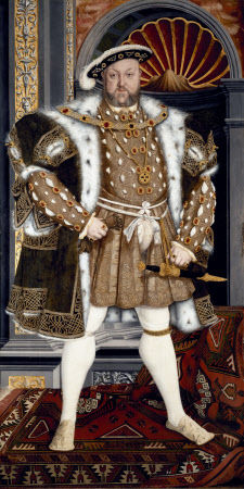
It was only however in Northern Europe that a real move to ‘warts and all’ depictions of real life occurred. Portrait paintings by Durer, Jan van Eyck and Holbein continued to be largely idealised – as for example Durer’s self-portraits. Holbein’s portraits of Henry VIII are commissioned to create an image of supreme power, enhanced by costume and background trappings.
Albrecht Durer painted like ChristHolbein the Younger: Henry the Eighth
But other artists like Bosch, Lucas van Leyden and Quinten Massys and later masters such as Pieter Aertsen en Pieter Bruegel started to produce ‘politically incorrect’ paintings and prints of people and everyday life.
In the 16th Century artists increasingly experimented with printmaking techniques to produce figurative portraits as for example:
Rembrandt van Rijn who painted powerful portraits of himself ‘warts and all’ as he grew older. In addition to paintings he also made etchings.
18th and 19th Centuries: caricature and inner turmoil
This emphasis on idealism changed during the course of the 18th and 19th centuries.
The economic and social upheavals of the eighteenth century in countries like Britain and France led to the rise of political satire and caricature in which an irreverant approach to portraits of the rich and famous spread not only through painting but also prints.
While some Impressionists in France continued an idealised focus on fleeting impressions and light, other painters were experimenting with semi-abstraction and colour to portray inner lives.
Self-portraits began to be autobiographical, done at intervals tracking the evolution of an artist’s life and art. Gauguin used colour and semi-caricature to create a self-image. Courbet and Van Gogh painted numerous self-portraits with graphic portrayal of their internal mental turmoil.
‘Portrait of the Artist with the Yellow Christ’, 1889Gustave Courbet, “Self-Portrait as the Desperate Man,” 1845, oil
In the 20th century many artists took the focus on abstraction and internal mental states even further, including:
Egon Schiele’s very explicit portrayal of sexual angst in his distinctive ‘blind contour style’
Fauvists and expressionists whose woodcut portraits and paintings used exaggerated forms of distortion and use of colour to express emotion and tried to capture ‘inner essence’ and/or the feelings of the artist towards the subject.
Other artists like Andy Warhol started to look at the commercialisation of portrait images.
Contemporary: the politics of portraiture: feminism and identity
Contemporary portraits now cover a broad spectrum of approaches and styles, drawing on approaches from photography as well as painting.
Some artists have taken a detailed and sensitive figurative approach, with an emphasis on intensity and changing inner states in both portraits and self-portraits:
In-depth video on history and development of techniques of Japanese woodcut from monochrome through painted monochrome prints to multiblock printing. It looks at its influence on Western artists like Van Gogh and Monet following the exhibition of Japanese art for the first time at the Paris Exhibition of 1867. It also looks at the modern day revival of ukiyo-e prints as paintings on shops in Tokyo regeneration.
Japanese woodblock prints with Paul Binnie
Lecture on background and underlying ideas in Japanese printing techniques.
Japanese woodblock printing History Ukiyo-e Jose Ortega
History of Japanese printing and way it spread and related to earlier Chinese and Buddhist prints.
Technique
The technique for printing texts and images was generally similar. The obvious differences were the volume produced when working with texts (many pages for a single work), and the complexity of multiple colours in some images. Images in books were almost always in monochrome (black ink only), and for a time art prints were likewise monochrome or done in only two or three colours.
The text or image was first drawn onto washi (Japanese paper), then glued face-down onto a plank of wood, usually cherry. Wood was then cut away, based on the drawing outlines. A small wooden hard object called a baren was used to press or burnish the paper against the inked woodblock to apply the ink to the paper. Although this may have been done purely by hand at first, complex wooden mechanisms were soon invented and adopted to help hold the woodblock perfectly still and apply proper pressure in the printing process. This was especially helpful with the introduction of multiple colours that had to be applied with precision over previous ink layers.
While, again, text was nearly always monochrome, as were images in books, the growth of the popularity of ukiyo-e brought with it demand for ever increasing numbers of colors and complexity of techniques. The stages of this development follow:
Sumizuri-e (墨摺り絵?, “ink printed pictures”)—monochrome printing using only black ink
Benizuri-e (紅摺り絵?, “crimson printed pictures”)—red ink details or highlights added by hand after the printing process;green was sometimes used as well
Tan-e (丹絵?)—orange highlights using a red pigment called tan
Aizuri-e (藍摺り絵?, “indigo printed pictures”), Murasaki-e (紫絵?, “purple pictures”), and other styles in which a single color was used in addition to, or instead of, black ink
Urushi-e (漆絵?)—a method that thickened the ink with glue, emboldening the image. Printers often used gold, mica, and other substances to enhance the image further. Urushi-e can also refer to paintings using lacquer instead of paint. Lacquer was rarely, if ever, used on prints.
Nishiki-e (錦絵?, “brocade pictures”)—a method of using multiple blocks for separate portions of the image, using a number of colors to achieve complex and detailed images. A separate block was carved to apply only the part of the image designated for a single color. Registration marks called kentō (見当) were used to ensure correspondence between the application of each block.
Contemporary Japanese woodblock
Katsutoshi Yuasa
Keizaburo Matsuzaki
Bibliography
Clark, T. (ed.) (2017) Hokusai: Beyond the Great Wave, London: Thames & Hudson and British Museum.
Pollard, C. & Watanabe, M. I., (2014) Hiroshige: Landscape, cityscape, Oxford: Ashmolean Museum.
Schroer, A. (ed.) (2005) Hiroshige, Berlin, Munich, London, New York: Prestel.
Schroer, A., (ed.) (2005) Hokusai, Berlin, Munich, London, New York: Prestel.
Exhibitions
Hokusai: Beyond the Great Wave (25 May – 13 August 2017)
She has a studio in Cottenham in the Cambridgeshire Fens.
My prints explore the notion of time and landscape through a contemplative exploration of surface. The sources of my prints can come from working in the open air or expressing landscape filtered through memory…I am captivated by the ancient semi-natural landscapes typical of my native west Cornwall where a blurred line exists between nature and human activity. Recent works of the Fens focus on the meeting point of land, horizon and sky, their flatness altering the perception of distance. ‘
From interview with Iona in Cambridge 4th Feb 2017:
Her landscapes have a strong geometric structure of contrasting colours and textures. She mainly uses a combination of carborundum, drypoint and monoprint techniques. A mix of a binder (polyurethane varnish) and carborundum grit is applied onto the surface of a plate and sealed with the same varnish. The binder has to withstand a lot of working but should not be so thick as to hide the grit texture of the carborundum. To contrast the carborundum, drypoint is added to produce an incised line. The plate is then inked up using etching ink and copperplate oil with a brush or roller.
Originally she worked in black and white. Now she also works in colour from memory and notes. Colour is built up by layering carborundum plates or more often overlaid though monoprint. Dry ink can be added as a third pass. Ink can be laid on thickly for more embossing. She can use the same base plate but with different seasons. Editions of 40. Or 10-15. She gets commissions where people ask for specific colours.
The technique allows working directly in the landscape to paint on the carborundum and the drypoint plates, and large images can be produced. She prints on thick Somerset paper, printing to the edge of the paper to “leave the composition as unconstrained as the landscapes from which I seek inspiration”. She mounts with nonreflective glass.
Linocut uses a cheap, versatile material that gives possibilities for dynamic mark-making and bold shapes with simplified colour. It has been used by for many different types of prints including portraits, political works, landscapes and typography. It has been particularly popular as a medium for political protest, including the Russian Revolution and US Civil Rights movements.
Earlier artists applied many of the techniques earlier developed for woodcut – both markmaking and use of tone and structure. Some were influenced by Japanese woodcut traditions as well as Western wood engraving and African and Oceanic art. Linocut artists from the Grosvenor School and Russian Revolution (see below) were influenced by major art movements of the twentieth century, particularly cubism, futurism and constructivism. Others developed new directions with Picasso’s use of the reduction linocut (that can also be done with any other surface like wood). Contemporary linocut artists used a wide variety of experimental techniques, using abrasive solutions as well as power tools to create a range of marks and tones.
Nineteenth century
Linoleum was invented in the early 1860s and first used for printing in 1890 in Germany for the manufacture of wallpaper.
Franz Ciceck, an Austrian artist and teacher was one of the first to popularise lino for artists’ prints. He recognised the medium’s potential to instruct children in colour and design: it was cheap, easily worked with simple tools, adaptable to water-based inks, and versatile. He toured Europe and North America with examples by his pupils and influenced art education worldwide.
Twentieth century
In the early 20th century linocut became very popular as an artistic medium.
German Expressionists 1905-1920s : The first major artist to adopt linocut as a medium was Erich Heckel, and his earliest linocut is dated 1903. Artists from Die Brucke regularly used linocut instead of woodcut from 1905 to 1920s. These focused on bold shapes and expressive distortion in monochrome prints. The use of lino was ideal for this, although the fine lines and use of woodgrain etxture in some of the woodcuts was not possible.
This German Expressionist tradition has been continued by modern artists like Georg Baselitz who produces very large linocuts and combination prints often on subjects of political protest.
In revolutionary Russia important linocuts were produced from about 1918.
Lyubov’ Popova was a Russian avant-garde and ‘new woman’ artist (Cubist, Suprematist and Constructivist) painter and designer. She produced a number of linocuts in constructivist style.
The printmakers of the Grosvenor School (see C.S. Ackley, 2008) produced very dynamic linocuts with strong curvature distortion influenced by the Vorticist and Futurist movements. Key artists were:
The work of the Grosvenor School has also influenced some contemporary linocut artists like the Canadian Gary Ratushniak who was trained by Sybil Andrews draws also on native America traditions.
Edward Bawden is another English artist and illustrator who often worked in watercolour, but also produced many linocuts. His work is more figurative and many of his paintings are from his experience as war artist in the Second World War.
Matisse produced 70 linocuts between 1938 and 1952. These are similar in both style and subject matter to his black and white monoprints of figures. They use a fluid expressive white-line technique that takes advantage of the variation in line that can be achieved as linocut tools glide through the the soft material..
Picasso used linoleum for popular posters in the early 1950s. In 1959 he began a series of innovative colour linocuts, developing the reduction print technique. He developed a method of printing in different colours progressive states cut on a single block, so that the finished print comprises layered impressions of all the states.
Linocuts were very popular as effective and cheap media for mass communication by African American artists involved in the American Civil Rights movement. Influenced by both African and Mexican art they depicted images of racial and sexual issues. Key proponents were:
Recently there has been a resurgence of interest in linocut as an art form. It is a key part of the many printmaking courses as an easier introduction to relief printing than woodcut. It has therefore become widely used for things like greetings cards. But there are also contemporary linocut artists doing innovative work – including very large pieces that exploit its potential for being cut into smaller blocks and because of its relatively light weight. There has been development of a wide range surface etching and texturing techniques using different tools.
Some of the sources I have looked at (in alphabetical order – unfortunately websites for other artists I looked at were fleeting and disappeared since I started the course).
Richard Bosman creates linocuts that are often very experimental in their use of different types of paper.
Helen Brown creates landscape linocuts from plates produced outdoors on site.
Lynda Burke creates dramatic monochrome landscapes with a variety of mark-making.
Geraldine Theurot Street of San FranciscoGeraldine Theurot San Francisco, Sutter StGeraldine Theurot The ManGeraldine Theurot New YorkGeraldine Theurot Brooklyn Birdge


