Categories
Inspiration Landscape Media Natural Printmakers Woodcut

Helen Brown

Google images

“I work directly from the landscape in either lino or woodcut. Working outdoors enables me to capture the line and fluidity of scenes and localities.

My landscapes are landscapes of self-possession and movement. Through their layered and textured forms they express the tectonic flow of the earth, as mountains and valleys rise and fall in an experience of time much more immense than our own.

I spend time in the places my work depicts, returning to them. From the Sussex Downs to the foothills of the Himalayas, my prints are imbued with the emotion of place. Each one of my pieces is given individual life though colour and chine colle (paper overlay) or hand tinting, just as the mood of a scene shifts with light, time and experience.

My work takes shape in the place between landscape and dreamscape. Whether in architectural or animal forms, it connects the experiential world to the imagination, the material to the emotional.

Our thoughts and feelings colour the things we encounter, and they in turn colour us. In my prints I give visual expression to this conversation.”

See page on Art of Illustration

Biography

Helen Brown grew up in Cambridge and did an Art Foundation course there then an art degree at Brighton. She learned screen printing, etching and linocut.

Techniques

While in Brighton she started to focus on linocut because she could do observational prints outdoors :

“I went to Devil’s Dyke, just outside Brighton and cut the block while sitting outside the pub. They gave me free food and loads of people asked what I was doing. The print worked very well, and people bought it. I thought I would follow this path for a while because I enjoyed it, and it worked well with my travelling.”

“I like the stages; you make the block and then there is the never-ending choice of how to print it. I might print the block in ten different colours. I really like chine colle, where I use coloured papers that I have cut up beforehand. This technique I have taken to extremes.”

“I have recently been thinking more about the marks, so I feel very inspired with my work.I made a lot of blocks from my last trip to Guatemala, which I print to have a bright, strong colour blend, like their dyed and woven fabrics. The landscape in Guatemala is quite unreal, so using unrealistic colours would not seem right. That is what is good about printmaking: I can print the blocks and it might look great, or not, but I can easily change the way I print it.”

The  prints are individually made by the artist in tranches of a few prints – the edition is not all printed at once.

See profile in D’Arcy and Vernon-Morris pp223-225

Categories
Inspiration Media Printmakers

Yuji Hiratsuka

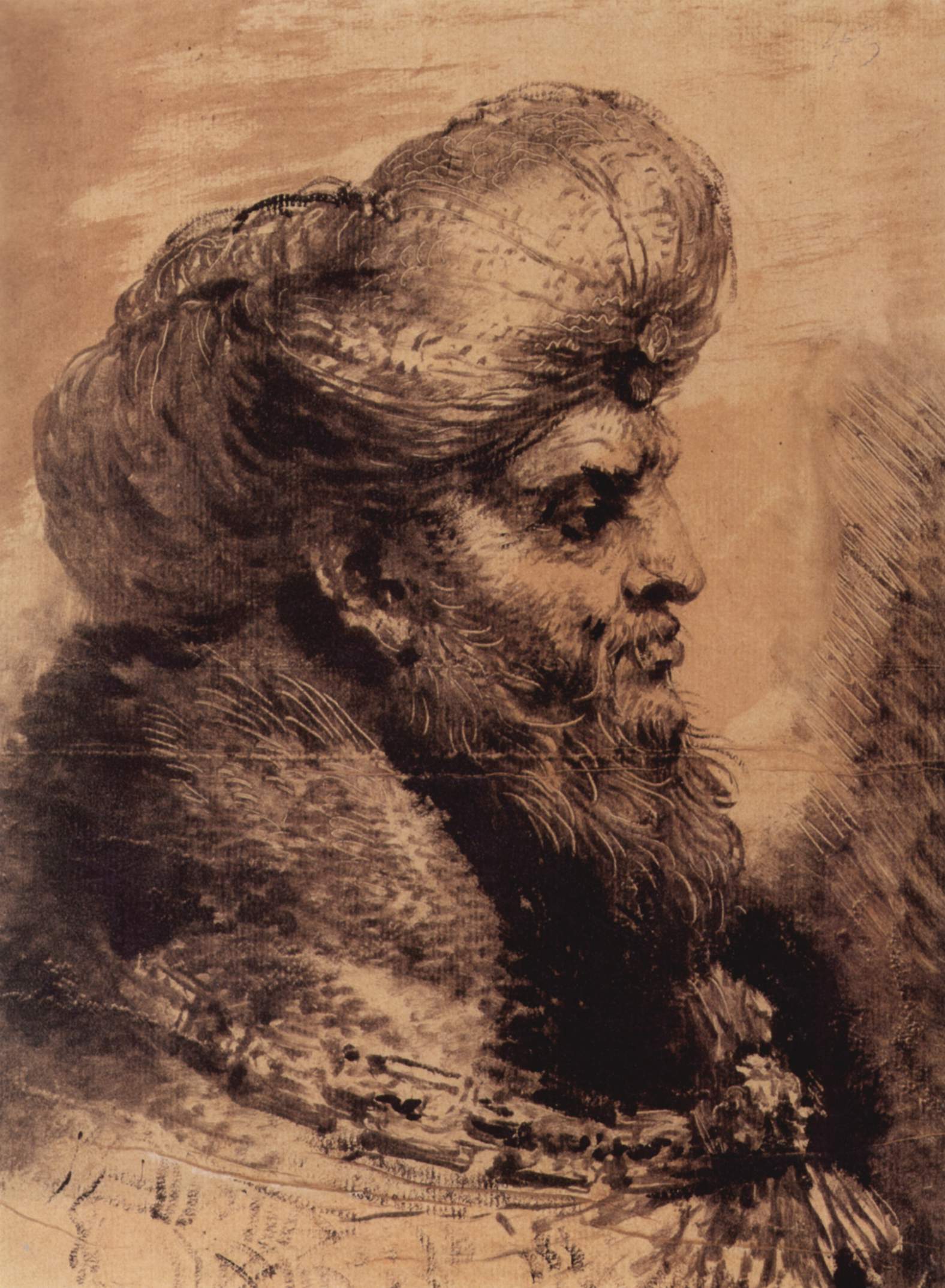
Yuji Hiratsuka sees Japan as a land of contrasts. On the surface it looks rather westernized with McDonald and Coca Cola. But underneath the facade traditional Japanese culture and values remained unchanged. His graphic work is a witty and original synthesis of old Japanese ukiyo-e tradition and modern Western elements.

website: http://www.artelino.com/articles/yuji_hiratsuka.asp

Google images

Japanese gardens are cultivated high atop thirty story Western skyscrapers, or people dine on McDonald’s hamburgers while watching Sumo wrestling. In my work I explore this chaotic coexistence.

“There are many and varied points of view in modern Japan. Some survive from historic periods of significant aesthetic and philosophical development. Two periods in particular contribute to what is known as traditional Japanese art.”

“During the first, in the middle of the 16th century, the Shogun lords closed Japan to all foreign interactions and evolved an art independent of Chinese models. The most important influence was the simplicity born in the spirit of the Zen sect. Art based on Zen was an art of suggestion rather than expression; it emphasized the importance of empty spaces and simple forms.”

“The second period is the Edo era of the 17th century in which the Ukiyo-e school developed a popular art form, largely prints and reproductions, inexpensively designed for common people. Ukiyo-e art was decorative and brightly colored and often featured poster-like caricatures of national personalities (Yakusha-e).”

“In my work I draw from the ancient and the contemporary to express the mismatched combinations and hodgepodge which is Japanese daily life. The Zen aspect can be seen in my portraits. In this case, I always leave the face blank or flat and profile very simple.”

“I do not draw eyes or noses on my portraits. The human face is always changing; the face at work is different from the face that enjoys the love. Aging changes the faces also. I want my prints to express this change. The portraits are left ambiguous so that the viewer can add his/her interpretation. This is the aspect of suggestion rather than expression. Also, I am interested in the humorous and colorful aspects of Ukiyo-e poster art.”

“In my portraits I want to incorporate an element of wit through exaggeration and distortion. For emphasis, I fill in small areas with bright, whimsical colors. To express contemporary influences I use the figure dressed in Western style. My primary source of subject matter is photographs, frequently black and white, which I tear from books, magazines and newspapers. These materials are kept in my studio or in my bag, and whenever I am ready to begin a drawing for the print, I rummage through the wrinkled images.”

“There are small transitions in my work from time to time, and my interest is always based on unpredictable texture that is printed from the etched surface of the copper plate. My prints explore the complex relationship of paper, ink and etched plates to describe my thought, as well as the relationship which occurs between figures and space to express other human experiences. Always I try to investigate the maximum potential available to me as a printmaker.”

Biography

Yuji Hiratsuka was born in Osaka, Japan. In 1973 until 1978 he studied at Tokyo Gakugei University, Koganei-shi, Tokyo, Japan. In 1978 he graduated with a BS (Batchelor of Science) in Art Education.

In 1985 the young artist, then 33 years old, decided to take a plane in Eastern direction, and moved to the United States. Hiratsuka has not been the first one to make this step. Many Japanese artists of the 20th century went to the United States – some for studies, others for teaching. Some remained only one or two years in the U.S.A. and others forever.

Yuji Hiratsuka has stayed until now in his new homeland. He first extended and intensified his studies. From 1985 until 1987 he made his MA (Master of Arts) in printmaking at New Mexico State University in Las Cruces, NM. And from 1987 until 1990 he studied at Indiana University, Bloomington, and graduated with an MFA (Master of Fine Arts) in printmaking.

In 1987 Hiratsuka began to work as an art instructor. Since 1992 he is an Associate Professor at the Department of Art, Oregon State University in Corvallis.

Technique: Chine Collé with Etching

The artist uses a mixed media combination of Chine Collé with etching. Thisis a  time-consuming printing process that requires a lot of skill and experience.

“My personal technique using Chine Collé with traditional and innovative etching is the following:

With continuous alterations to a copper plate I print a sequence of black, yellow, red and blue, passing the same plate through the press for each design and color change.

To start with; the first tones to the plate are given with line etching, drypoint, aquatint, softground, photocopy transfer or roulette. I pull my first color. With these first impressions, I work back into the plate with a scraper, burnisher and emery paper to enhance the lights and accent the motif. I then go on to the second, third and fourth colors.

Finally, the print is completed from the back with a relief process of woodcut or linocut to intensify shapes and/or colors.

I print on the paper which best suits my work; this is a thin Japanese paper known as Toyama Kozo (Japanese Mulberry). As in the French use of Chine Colle I apply glue to the back of the Kozo print and pass it through the press, with a heavier rag paper (BFK Rives or Somerset, etc.) beneath. What the viewer sees; is my four color intaglio print saturated with subtle tones that come through the back of a Toyama Kozo paper which is set deep into a rag paper.”

Categories
Chiaroscuro Inspiration Media Portrait Printmakers

Benedetto Castiglione

Giovanni Benedetto Castiglione

(Wikimedia Commons)

Kopf eines bärtigen Orientalen 1655 31.7 × 23.6 cm (12.5 × 9.3 in), Windsor Castle

Giovanni Benedetto Castiglione (1609–64) was an Italian painter and etcher who was the first artist to produce brushed sketches intended as finished and final works of art (rather than as studies for another work).

Heavily influenced by Rembrandt he experimented with different inking variations on etchings. From there he invented the monotype process in the 1640s. He produced over twenty surviving monotypes, over half of which are set at night.

He normally worked from black to white. He drew directly into an unetched plate, drawing white lines with a stick, created tonal areas with his fingers, rags and brushes. He then printed using a printing press.

File:Giovanni Benedetto Castiglione - The Creation of Adam - Google Art Project.jpg
The Creation of Adam circa 1642 Monotype (dark manner) in black on ivory laid paper Height: 303 mm (11.93 in). Width: 203 mm (7.99 in).

Categories
Abstraction Inspiration Media Printmakers

Koichi Yamamoto

Inspiration for my printmaking

I find Yamamoto’s large abstract monochrome monoprint landscapes extremely evocative. Inspired by a Zen minimalist aesthetic, with a focus on tone and markmaking, they have a dreamy and ethereal feel – full of suggestion of light and dark, huge towering buildings or seething underlying masses in the deep. Yet cannot be completely grasped or understood.

Yamamoto Printmaking Official website

Monoprints

Google images of Yamamoto monoprints

Koichi Yamamoto is an artist who merges the traditional and contemporary by creating unique and innovative approaches to the language of printmaking.Koichi’s prints explore issues of the sublime, memory, and atmosphere.
Koichi has worked with meticulous copper engravings to large-scale monotypes.
He completed BFA at the Pacific Northwest College of Art in Portland, Oregon then move to Krakow, Poland for producing works and to study copper engravings in Bratislava Academy of Fine Arts in Slovakia Republic.
He studied in Academy of Fine Arts in Poznan, Poland and then completed MFA at University of Alberta, Canada. He also worked as a textile designer in Fredericia, Denmark.
He has exhibited internationally. He has taught at Utah State University and University of Delaware and currently an Associate Professor at University of Tennessee in Knoxville.
Video of his working process

[wpdevart_youtube]51MP7MLLt8A[/wpdevart_youtube]

Sources of inspiration in water surfaces

[wpdevart_youtube]gJpf-zuEcbM[/wpdevart_youtube]

Metal engraving

[wpdevart_youtube]l7kbmU1U-z4[/wpdevart_youtube]

Copperplate etching Kite design

[wpdevart_youtube]hRsLbfUXl_M[/wpdevart_youtube]

Categories
Abstraction Chiaroscuro Etching Inspiration Linocut Lithograph Media Memory Monoprint Portrait Printmakers Still Life

Pablo Picasso

To be further developed as I finish Assignments 3, 4 and 5.

Picasso’s work is a key influence in my printmaking, both stylistically and conceptually. I am particularly interested in his abstract work both that influenced by African art with its ferocious angularity that is also echoed in Guernica, and the fragmented light of the abstraction in analytic cubism ‘trying to communicate the perfume’ of an image. See particularly:

and forthcoming:

  • Assignment 4: Abstract Self Portrait (1932 paintings, cubism, portraits and lithographs) forthcoming
  • Assignment 5: From memory (influenced by Guernica) forthcoming

Painting isn’t an aesthetic operation; it’s a form of magic designed as a mediator between this strange, hostile world and us, a way of seizing the power by giving form to our terrors as well as our desires.(p11)

Painting is stronger than I am. It makes me do what it wants. (p70)

A picture is not thought out and settled beforehand. While it is being done it changes as one’s thoughts change. And when it is finished, it still goes on changing, according to the state of mind of whoever is looking at it. (p12)

References and Resources

  • Borchardt-Hume, A. and N. Ireson, Eds. (2018). Picasso 1932: The EY Exhibition. London, Tate Publishing.
  • Clark, H., Ed. (1993). Picasso: In His Words. San Francisco, Collins.
  • Cohen, J., Ed. (1995). Picasso: Inside the Image. London, Thames & Hudson.
    Coppel, S. (1998). Picasso and Printmaking in Paris. London, South Bank Publishing.
  • Cowling, E., N. Cox, S. Fraquelli, S. G. Galassi, C. Rigpelle and A. Robbins (2009). Picasso: Challenging the Past. London, National Gallery Pubications.
  • Eik Kahng, Charles Palermo, Harry Cooper, Annie Bourneuf, Christine Poggi, Claire Barry and B. J.C.Devolder (2011). Picasso and Braque: The Cubist Experiment 1910-1912. Santa Barbara, Santa Barbara Museum of Art.
  • Picasso (1980). Picasso: Lithographs. Toronto, Dover Publications.
  • Picasso (1981). Picasso: Line Drawings and Prints. Toronto, Dover Publications.
  • T.J.Clark (2013). Picasso and Truth: from Cubism to Guernica. Princeton and Oxford, Princeton University Press.

Picasso as artist

Picasso’s life and evolution of his style from:

    • Highly accomplished figurative drawings and paintings from boyhood to late teens
    • Blue period (1901–1904) influenced by the suicide of his close friend Carlos Casagemas
    • Rose period (1904–1906) during his early marriage and relationship
    • African influence (1907–1909), notably Les Demoiselles d’Avignon as a sudden leap to abstraction (see also Wikipedia overview of images from, this period)
    • Analytic cubism (1909–1912)
    • Synthetic Cubism (1912–1919), also referred to as the Crystal period.
    • Neoclassicism and surrealism (1919–1929)
    • The Great Depression to MoMA exhibition: 1930–1939 – the period of Guernica, his 1932 paintings of Marie-Thérèse Walter and the Vollard Suite etchings
    • Later works to final years: 1949–1973 combined elements of his earlier styles

    Overview: BBC Modern Masters Series by  Alastair Sooke

    Gives an overview of Picasso’s life and art and the way they influenced each other, and the influences that Picasso’s art still has for us today.

    Les Demoiselles d’Avignon, MoMA

    A detailed discussion of the origins and meaning of this painting.

    Exhibition Review: Exhibition Review : Picasso 1932 – Love, Fame, Tragedy at the Tate Modern 2018

    The Exhibition focuses on his numerous paintings in the one year of 1932, influenced by his relationship with Marie-Thérèse Walter. See catalogue:

    Borchardt-Hume, A. and N. Ireson, Eds. (2018). Picasso 1932: The EY Exhibition. London, Tate Publishing.

    Girl before a Mirror

    Discussion by a teacher of the ways in which the meanings of this painting are seen and explained to children.

    Picasso portraits at the National Gallery

    Looks in particular at multiple viewpoints and cubism.

    Guernica and attitudes to politics

    Picasso’s last paintings are very poignant, but not well received.

    Google Picasso drawings

    Picasso as printmaker

    Picasso (1881–1973)  made prints throughout his career – over 2,500 principally in etching, lithography and linocut, but also monoprints.

    Google Picasso monoprints

    Google Picasso lithograph

    The Vollard Suite at the British Museum (etchings)

  • Google Picasso etching

    Linocuts

    Invention of the reduction linocut

    His earliest linocut is from 1939, but his major period of working in this medium was from the mid-1950s to the early 1960s. During this time the artist resided mainly in the south of France, far removed from his collaborative involvement with the master printers in Paris where he had made his etchings and lithographs in the 1930s and 40s. He began by producing linocut posters for ceramic exhibitions and bullfighting events in Vallauris with the talented local printer Hidalgo Arnéra.

    Within a very short time Picasso was finding new ways of producing colour linocuts which dispensed with the orthodox method of cutting a separate block of linoleum for each colour.  He devised a method of progressively cutting and printing from a single block that required him to foresee the final result, as once he had gouged away the linoleum surface he could not go back.

    Linocuts Exhibition British Museum exhibition: 10 January – 6 May 2014

     Still Life under the Lamp (1962) depicts a still life of apples next to a glass goblet, brightly illuminated under a lampshade at night. The BM exhibition shows nine stages, beginning with a blank tabula rasa, Picasso progressively cut and printed the single block, gradually building the image with increasing complexity. At each stage the viewer sees an image that would appear finished but Picasso goes further, pursuing it to its final form. (See Google images)

    Jacqueline Reading (1962) a series consisting of four progressive proofs for a monochrome subject, Jacqueline Reading, Picasso’s second wife Jacqueline Roque with whom he lived in the last years of his life. She is posed reading, one hand held to her face and eyes cast down, locked in an interior world. For this print Picasso used two blocks. In the first block he scratched the surface with a stiff comb to describe the form of Jacqueline’s head and bust in tonal terms. A second block was cut with gouges to leave just her outline. Then the print from the second block was superimposed over the first to achieve the final image. (See Google images)

  • Other linocuts: Google Picasso linocut ;
  •  before the lance avant la pique 1959 1
  • Deux femmes près de la fenêtre, 1959
  • Danseurvet musicien  
  • Les Banderilles Like Cretan. Like the composition. How about the background?.
  • Trois femmes 1959
  • le vase de fleurs  
  • tete de femme de profil

Picasso lithographs: Google images

Picasso drypoint : Google Images

Painting technique: Cubist

MoMA painting techniques series has an interesting overview of how to draw multiple perspectives.


Categories
Inspiration Linocut Printmakers

Elizabeth Catlett

Elizabeth Catlett (1915-2012) was an African-American graphic artist and sculptor. She is best known for her depictions of the African-American experience in the 20th century, which often had the female experience as their focus. Her work is a mixture of abstract and figurative in the Modernist tradition, with influence from African and Mexican art traditions.

Google Elizabeth Catlett prints

Her work was influenced by the Harlem Renaissance movement and the Chicago Black Renaissance in the 1940s and reinforced in the 1960s and 1970s with the influence of the Black Power, Black Arts Movement and feminism. Catlett was more concerned in the social messages of her work than in pure aesthetics. “I have always wanted my art to service my people — to reflect us, to relate to us, to stimulate us, to make us aware of our potential.” She was a feminist and an activist before these movements took shape, pursuing a career in art despite segregation and the lack of female role models. “I don’t think art can change things,” Catlett said “I think writing can do more. But art can prepare people for change, it can be educational and persuasive in people’s thinking.”

Her printwork was mostly woodcuts and linocuts produced 1947-1966 with theTaller de Gráfica Popular,  a famous workshop in Mexico City dedicated to graphics arts promoting leftist political causes, social issues and education.   She and other artists created a series of linoleum cuts on prominent black figures as well as posters, leaflets, illustrations for textbooks and materials to promote literacy in Mexico. Her linocut series “The Black Woman Speaks,” is among the first graphic series in Western art to depict the image of the American black woman as a heroic and complex human being. Her posters of Harriet Tubman, Angela Davis, Malcolm X and other figures were widely distributed.

See also many other videos of interviews about her political role and life.

Categories
Inspiration Linocut Printmakers

Margaret Taylor-Burroughs

Margaret Taylor-Burroughs (1915 – 2010), also known as Margaret Taylor Goss, Margaret Taylor Goss Burroughs or Margaret T G Burroughs; was an African-American artist and writer, with her efforts directed toward the exploration of the Black experience and to children, especially to their appreciation of their cultural identity and to their introduction and growing awareness of art.

Many of here linocuts have become iconic images of the American Civil Rights movement. In many of Burroughs’ pieces, she depicts people with half black and half white faces.

Google Margaret Burroughs linocuts

In The Faces of My People Burroughs carved five people with different skin tones staring at the viewer. One of the women is all black, three of the people are half black and half white and one is mostly white. While Burroughs is attempting to blend together the black and white communities, she also shows the barriers that stop the communities from uniting. None of the people in The Faces of My People are looking at each other, and this implies a sense of disconnect among them.On another level, The Faces of My People deals with diversity. An article from the Collector magazine website describes Burroughs’ attempts to unify in the picture. The article says, “Burroughs sees her art as a catalyst for bringing people together. This tableau of diverse individuals illustrates her commitment to mutual respect and understanding”.

My People:  there are four different faces – each of which is half white and half black. The head on the far left is tilted to the side and close to the head next to it. It seems as both heads are coming out of the same body – taking the idea of split personalities to the extreme. The women are all very close together, suggesting that they relate to each other. My People focuses on a common conflict that all the women in the picture face.

Birthday Party: here both black and white children are seen celebrating. The black and white children are not isolated from each other; instead they are intermixed and mingling around the table together waiting for birthday cake. An article published by The Art Institute of Chicago described Burroughs’ Birthday Party and said, “Through her career, as both a visual artist and a writer, she has often chosen themes concerning family, community, and history. ‘Art is communication,’ she has said. ‘I wish my art to speak not only for my people – but for all humanity.’ This aim is achieved in Birthday Party, in which both black and white children dance, while mothers cut cake in a quintessential image of neighbors and family enjoying a special day together”.

She also helped to establish many art establishments and opportunities for artists promoting civil rights.

She helped found the South Side Community Arts Center in 1939 to serve as a social center, gallery, and studio to showcase African American artists.

She is credited with the founding of Chicago’s Lake Meadows Art Fair in the early 1950s. At its inception there were very limited venues and galleries for African American Artists to exhibit and sell their artwork, so she launched the Fair, which rapidly grew in popularity and became one of the most anticipated exhibitions for artists, collectors and others throughout the greater Chicago area. After a brief hiatus beginning in the early 1980s, it was resurrected by Helen Y. West in 2005 – and another of Margaret Burroughs’ legacies lives on.

Margaret and her husband Charles co-founded what is now called the DuSable Museum of African American History in Chicago in 1961. The institution was originally known as the Ebony Museum of Negro History and Art and made its debut in the living room of their house at 3806 S. Michigan Avenue in the Bronzeville neighborhood on Chicago’s south side, and Taylor-Burroughs served as its executive director for the first ten years of its existence. She was proud of the institution’s grass-roots beginnings: “we’re the only one that grew out of the indigenous Black community. We weren’t started by anybody downtown; we were started by ordinary folks.”Burroughs served as Executive Director until 1984 and was then named Director Emeritus, remaining active in the museum’s operations and fundraising efforts.

Burroughs was impacted by Harriet Tubman, Gerard L. Lew, Sojourner Truth, Frederick Douglass, and W.E.B. Du Bois.

See also the many You Tube videos on her legacy to the Civil Rights movement, interviews with her before her death and reading her poetry.

Categories
Inspiration Linocut Media Memory Printmakers

Sybil Andrews

Sybil Andrews (19 April 1898 – 21 December 1992) was an English printmaker best known for her modernist linocuts portraying the energy and excitement of urban life. Together with her  informal partner Cyril Power she helped in the establishment and became the first secretary (1925–1928) of the The Grosvenor School of Modern Art.

Her linocuts are a key source of inspiration for my linocuts in Project 5.1: Grand Arcade

List of works

For more see: Google images

References:

Clifford S Ackley ed British Prints from the Machine Age: Rhythms of Modern Life 1914-1947 Thames and Hudson 2008

Wikipedia