Monoprints


Etchings


Overall assessment
This clump of willow trees on the River Cam faces eastwards. Sometimes the skies behind are very dramatic with beautiful light breaking through grey clouds, at dawn and reflections in the water on moonlit nights. The tangled roots at the waters-edge are different on each tree. And the water has ever-changing reflections depending on the strength of the current, wind and passage of swans and rowing boats. The trees are particularly interesting in winter with the bare branches against the sky and early Spring as the buds just start to show brilliant green. Then autumn when the yellow leaves have dropped onto the river.
The sketch was done in February. In contrast to Project 1.1 ‘A Landscape Waiting’ I wanted something bold and colourful. The sketch shows the turbulent water left by a passing rowing boat. The clouds in the sky are windy with patches of light shining through and reflecting in pools on the water.
After first continuing my exploration of etching from Project 1.2 Urban landscape, I decided to do something much bigger and more painterly. Inspired by Impressionists like Cezanne, the smokey monoprints of Degas and Japanese and Chinese landscape painting. I had also become very inspired by Maggi Hambling‘s bold abstract sunrises and sunsets that I started to look at for my parallel project.
The final prints are monoprints in water-based inks on softfoam, printed on watercolour paper. I think Print 1 Dawn and Print 3 Moonlight work well. I like the feel of the media and the varied mark-making I can achieve using palette knife on softfoam. The painterly quality and texture are softer that than watercolour or acrylic/oil paintings I have done of similar subjects. It is possible to get a wide variety of expressive and semi-impasto marks. But, unlike monoprint on foamboard or perspex it is not possible to use drips and sprays. The water-based inks are also more unpredictable in how they print than oil-based or Caligo inks because they dry much more quickly. These characteristics are ones that can be used and built on for their own specific effects, with some experience.
These prints aim at emotional impact rather than ‘meaning’. ‘Winter sunset’ with its red-purple/blue contrast in sad and bleak. ‘Brown moon’ has spiky defiant branches celebrating moonlight. The monoprint ‘Moonlight’ is more reflective. ‘Dawn’ in particular is a bright optimistic celebration of sunrise – excitement of new beginnings. I like these images and do not really think that all art has to have deep narrative or conceptual meaning. Sometimes it can just be a a celebration of life!
Developing the image
Choice of image and sketches
I did a sketch of the willows with a very different feel from the Dutch landscape style I had used in Project 1.1 and explored different crops and inverting the tone in Photoshop. I decided on three winter images:
- dawn with a low horizon to focus on the trees against the sky
- gloomy grey day (the actual sketch) with a mid horizon focusing on the relationship between the trees and reflections in moving water.
- moonlight with a high horizon to focus on the moonlight on the water.


I experimented with different exposures and crops of this sketch in Lightroom – with mid horizon, high horizon and low horizon levels to vary the point of emphasis between tree/sky and water/reflection.
Inspiration
As this assignment also asked me to consider differences between painting and print-making I looked back at my earlier drawings and paintings of willow trees to see whether these pointed to new styles and approaches that could be tried out in print media (See River Cam portfolio on zemniimages website )
I also looked through images of landscapes, trees and water I thought might be interesting and relevant from my work on other artists and printmakers:
- Edgar Degas very smokey and evocative monoprints, particularly the more abstract landscape images like ‘Factory Smoke‘
- Maggi Hambling’s very colourful abstract landscape watercolours of sunrises and sunsets
- Kurt Jackson varies his format and horizon levels in his semi-abstract work (see my study of this in Sketchlog 1 Landscape).
- Piet Mondrian Trees Google the dynamic line of his charcoal drawings, and the stylisation of the oil painting development.
- Egon Schiele Trees Google The skeletal trees with thinned leaves sandwiched between the pale paint shapes are really haunting, as are the end of year dark blood colours on the autumn tree landscapes.
- Katarzyna Cyganic does very delicate black and white linocut with bold compositions of trees and reflections in water.
- Google search on Printmaking Trees
As it was winter – a key feature being the skeleton trees – and too cold for me to do much colour work, I took photos to look at differences in colour and light between the three winter images I had planned. Also later to investigate in detail parts of the image that I had not understood – particularly the shape of the trees, reflections and movement in the water – so that I could improve the colour and mark-making in my prints in relation to my observations rather than just fudged.
The first series of photos were taken at the same time as I did the sketches to capture the colours, mistiness and movement in the water.


I got up at dawn to see the sunrise – actually it is quite difficult to see the trees because they are in shadow.


I also had the opportunity to take photos on a snowy moonlit night – rather murkier than I expected because of the glare of street lights bouncing between the snow and the clouds.


Print experiments: exploring new media
This project coincided with a number of workshops to explore new media that I thought would be interesting in Printmaking 2 and for future. I used these to explore different approaches to colour and mark-making of the willows and reflections as preparatory studies – as well as to develop my skills in these media.
Willow Experiments 1: Etching
My first set of images were done in the etching class with David Borrington at Curwen Gallery covering hard ground, soft ground and sugar lift techniques. I was interested in how mark-making for etching might differ for natural landscapes like the willows compared to the urban landscapes in Project 1.2. It was also useful because with etching is so easy to quickly explore different colour options and effects using the same plate. These then informed my choices when I came to do the softfoam prints. Details of the etching process can be found in my discussion of Etching techniques.
My most successful prints, based on a square crop.


Willow experiments 2: Photo-lithography
My second set of experiments were in a photo-lithography course, using a very loose approach to painting with gouache and Indian ink on drafting film. Although the final images do not stand as prints on their own, this process helped to practice very loose painterly marks and drips with something like the compositions I had in mind for the final prints. These images have potential as the basis for imaginary landscapes when turned upside-down.


Details of the photolithography process can be found in my discussion of Photolithography techniques.
Willow experiments 3: Softfoam mark-making
Before embarking on the final prints I wanted to loosen up my mark-making and explore different effects I could produce with palette knife and the ink on softfoam without worrying too much about the outcome. I based my image on some photographs of ice on the river that I thought might be relevant for the Moonlight image. I particularly like the coloured Cezanne-like prints where I use some masking – an approach to explore further.


The final prints
For the final prints I worked on the three images in parallel but on different softfoam plates. These are all printed in Schminke water-based inks on softfoam, using an etching press on dampened A2 Bockingford paper. I did three passes of each, partially re-inking where necessary.
Image 1: Dawn
As discussed above, when I actually photographed these trees at dawn, the trees themselves are not visible. I also found the very pink light (somewhat exaggerated in the photos) too ‘pretty’ and anaemic, and not reflective of how I actually felt about the experience of the dawn – much brighter and hopeful. More like the brilliant sunset and sunrise watercolours of Maggi Hambling.


Of this series I thought the first pass print looked more like an exotic sunrise because it was too orange and saturated. The third final pass was more snow-like. I selected the second print as the one that most closely represented my feelings of hope, and because the mark-making is clearer and more interesting on the trees and water.
Image 2: Gloomy day
This image is the one most closely based on my original sketch and photos. I like the gloomy glowering feel, particularly the darkness in the first pass. But the mark-making on the reflections is too haphazard and clumsy. I also tried overprinting to get more tonal contrast, but this ended up being mis-registered because softfoam expands when put through the press more than once.


Rather than throw these prints away I experimented with different crops that suggest possibilities for different composition in future. Some of the smaller mark-making pieces suggest narratives that could be worked into illustrations.


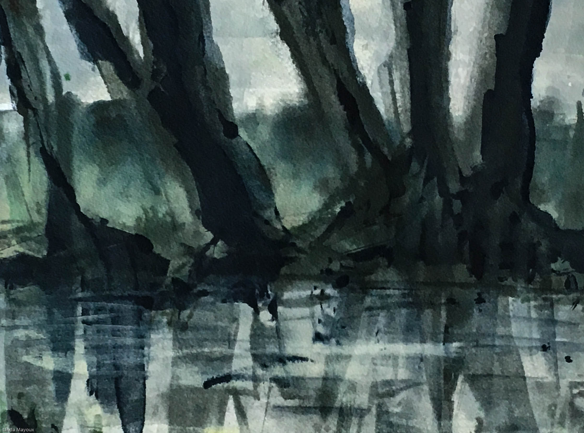
Image 3: Moonlight
This final image was done from a combination of memory of walking along the river in the moonlight, my snowy night photos and particularly the daytime photos above inverted in Photoshop – with a dose of Japanese romanticism.


I did three prints of this, all of which were quite successful in their own way. The first print is the most dramatic and least ‘realistic’. The other two are quite beautifully icy and snowy. But the ink splurge at the bottom is a too prominent distraction in these two lighter prints – the main reason I selected the first print for the assignment.


Again I experimented with cropping on the two lighter prints to either use or eliminate the offending splurge – I really like the dreamy, smokey Degas-like feel of some of these crops. Although they no longer have a border, it would be possible to mount crops 1-6 onto card as images in their own right. Crops 7-10 could be the basis for evocative illustrations.


Final reflections
These prints aim at emotional impact rather than ‘meaning’. ‘Winter sunset’ with its red-purple/blue contrast in sad and bleak. ‘Brown moon’ has spiky defiant branches celebrating moonlight. The monoprint ‘Moonlight’ is more reflective. ‘Dawn’ in particular is a bright optimistic celebration of sunrise – excitement of new beginnings. I like these images and do not really think that all art has to have deep narrative or conceptual meaning. Sometimes it can just be a a celebration of life!
Leave a Reply