Categories
Abstraction Formal abstract Inspiration Printmakers Woodcut

Japanese landscape prints: Hiroshige and Hokusai

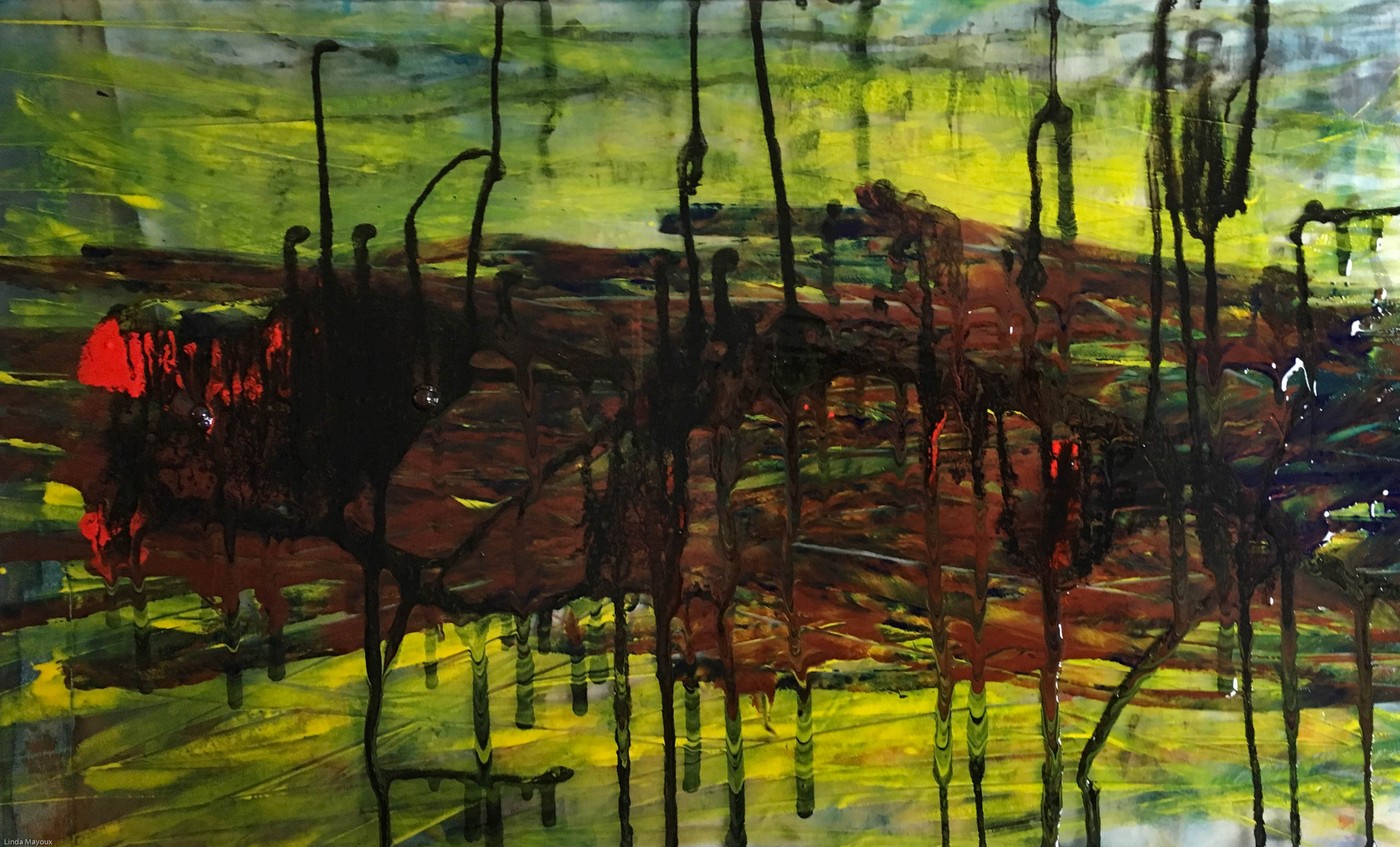
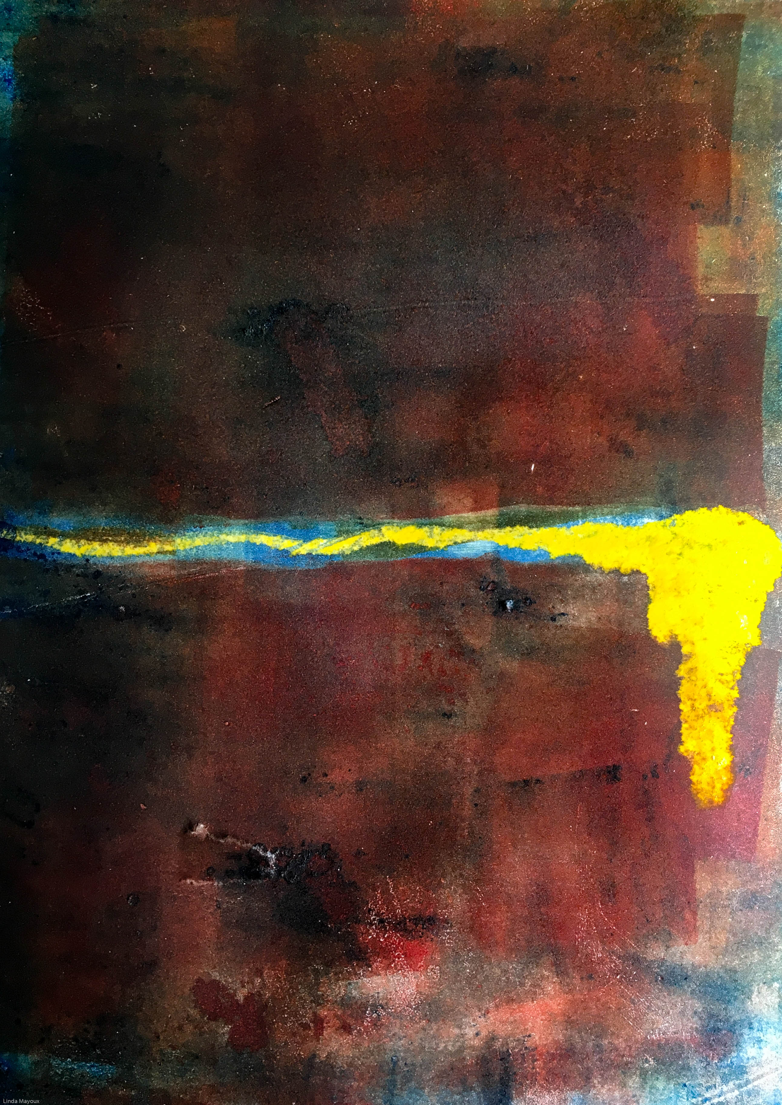
The woodblock prints of Hiroshige and Hokusai were the source for my work in Project 2.1: Formal Abstracts: Japanese landscape.


History of Japanese Woodblock Print

Ukiyo-e

In-depth video on history and development of techniques of Japanese woodcut from monochrome through painted monochrome prints to multiblock printing. It looks at its influence on Western artists like Van Gogh and Monet following the exhibition of Japanese art for the first time at the Paris Exhibition of 1867. It also looks at the modern day revival of ukiyo-e prints as paintings on shops in Tokyo regeneration.

Japanese woodblock prints with Paul Binnie

Lecture on background and underlying ideas in Japanese printing techniques.

Japanese woodblock printing History Ukiyo-e Jose Ortega

History of Japanese printing and way it spread and related to earlier Chinese and Buddhist prints.

Technique

The technique for printing texts and images was generally similar. The obvious differences were the volume produced when working with texts (many pages for a single work), and the complexity of multiple colours in some images. Images in books were almost always in monochrome (black ink only), and for a time art prints were likewise monochrome or done in only two or three colours.

The text or image was first drawn onto washi (Japanese paper), then glued face-down onto a plank of wood, usually cherry. Wood was then cut away, based on the drawing outlines. A small wooden hard object called a baren was used to press or burnish the paper against the inked woodblock to apply the ink to the paper. Although this may have been done purely by hand at first, complex wooden mechanisms were soon invented and adopted to help hold the woodblock perfectly still and apply proper pressure in the printing process. This was especially helpful with the introduction of multiple colours that had to be applied with precision over previous ink layers.

While, again, text was nearly always monochrome, as were images in books, the growth of the popularity of ukiyo-e brought with it demand for ever increasing numbers of colors and complexity of techniques. The stages of this development follow:

  • Sumizuri-e (墨摺り絵?, “ink printed pictures”)—monochrome printing using only black ink
  • Benizuri-e (紅摺り絵?, “crimson printed pictures”)—red ink details or highlights added by hand after the printing process;green was sometimes used as well
  • Tan-e (丹絵?)—orange highlights using a red pigment called tan
  • Aizuri-e (藍摺り絵?, “indigo printed pictures”), Murasaki-e (紫絵?, “purple pictures”), and other styles in which a single color was used in addition to, or instead of, black ink
  • Urushi-e (漆絵?)—a method that thickened the ink with glue, emboldening the image. Printers often used gold, mica, and other substances to enhance the image further. Urushi-e can also refer to paintings using lacquer instead of paint. Lacquer was rarely, if ever, used on prints.
  • Nishiki-e (錦絵?, “brocade pictures”)—a method of using multiple blocks for separate portions of the image, using a number of colors to achieve complex and detailed images. A separate block was carved to apply only the part of the image designated for a single color. Registration marks called kentō (見当) were used to ensure correspondence between the application of each block.

Contemporary Japanese woodblock

Katsutoshi Yuasa

Keizaburo Matsuzaki

Bibliography

Clark, T. (ed.) (2017) Hokusai: Beyond the Great Wave, London: Thames & Hudson and British Museum.

Pollard, C. & Watanabe, M. I., (2014) Hiroshige: Landscape, cityscape, Oxford: Ashmolean Museum.

Schroer, A. (ed.) (2005) Hiroshige, Berlin, Munich, London, New York: Prestel.

Schroer, A., (ed.) (2005) Hokusai, Berlin, Munich, London, New York: Prestel.

Exhibitions

Hokusai: Beyond the Great Wave  (25 May – 13 August 2017)

Picasso post-war prints: lithographs and aquatints (27 January – 3 March 2017)

Categories
Abstraction InProcess Memory Portrait Self-portrait

Francis Bacon

!!to be further elaborated as I finalise Assignments 4 and 5

Francis Bacon’s edgy, visceral paintings tapping the unconscious a key source of inspiration for:

Quotations from the videos below:

We do with our lives what we can. And then we die. What else is there?

If anything ever does work in my case chance, and what I call ‘accident’ takes over.

Gamble everything on the next brush stroke…different strokes trying to do something else then develop themselves

How are you going to trap reality? How are you going to trap an appearance without making an illustration of it?

  • Colour of meat is beautiful

Issues for my printmaking:

  • Feeling the form as it emerges – particularly with monoprint or inking collagraph plates. One thing can turn into another.
  • Can work from photographs for portraits. But observe – Bacon could not draw.
  • Shadows do not need to relate to a subject – making them different can create considerable tension
  • his tryptichs ‘don’t relate to each other, but they play off one another…the balance seems better with three’


Key images

Three Studies for Figures at the Base of a Crucifixion c.1944 The work’s exhibition in April 1945 coincided with the release of the first photographs and film footage of the Nazi concentration camps. (Tate Modern website)
Triptych August 1972. This work is generally considered one in a series of Black Triptychs which followed the suicide of Bacon’s lover, George Dyer. Dyer appears on the left and Bacon is on the right. The central group is derived from a photograph of wrestlers by Edward Muybridge, but also suggests a more sexual encounter. The seated figures and their coupling are set against black voids and the central flurry has been seen as ‘a life-and death struggle’. (Tate Modern website)
Study for a self-portrait. Also known as Businessman I 1952 or Man’s Head 1952

Other paintings

 1940s

Man in a Cap

Videos

BBC documentary

Tate Gallery Retrospective with words from Francis Bacon spoken by John Hurt

BBC Archive film

His last interview

Works set to music

Resources and references

Categories
Abstraction Artists Inspiration Random abstract

Helen Frankenthaler experiments

Studies for Project 2.2 Random Abstract Prints

Issues for printmaking technique:

  • Use water-based Schminke inks because they can be very dilute and mix beautifully on the paper.
  • Do a painting on the plate using different thicknesses of pigment and leave to dry fully.
  • Then selectively spray with water, and use gravity to move the pigment around, to produce the final painting.
  • Hand print on damp paper.
  • Many print variations can be made on the same inking plate through adding pigment and respraying.

About Helen Frankenthaler

Website of Helen Frankenthaler Foundation

Helen Frankenthaler (1928-2011) was eminent among the second generation of postwar American abstract painters and is widely credited for playing a pivotal role in the transition from Abstract Expressionism to Color Field painting.

Through her invention of the soak-stain technique, she expanded the possibilities of abstract painting, while at times referencing figuration and landscape in unique ways. Her 1952 Mountains and Sea, was a seminal, breakthrough painting of American abstraction. Pioneering the “stain” painting technique, she poured thinned paint directly onto raw, unprimed canvas laid on the studio floor, working from all sides to create floating fields of translucent color. Mountains and Sea was immediately influential for the artists who formed the Color Field school of painting, notable among them Morris Louis and Kenneth Noland.

Helen Frankenthaler painting: HFF website

Some of the most impactful for the mixing of pigments on the surface are her watercolours.

Helen Frankenthaler watercolours: Google images

In addition to unique paintings on canvas and paper, she worked in a wide range of media, including ceramics, sculpture, tapestry, and especially printmaking. As a significant voice in the mid-century “print renaissance” among American abstract painters, she is particularly renowned for her woodcuts.

Helen Frankenthaler print: HFF website

Stain painting techniques

Categories
Abstraction Figure Memory Portrait

Jenny Saville

Jenny Saville’s extremely tactile approach to painting women’s bodies, including her own, as a feminist critique of the way the female nude has been portrayed by the male art establishment has influenced my work in:

Assignment 2: The Human Condition 2: Flesh Here my focus is on the tactility of the body and ways in which different types of paper eg wrinkled blotting paper or tracing paper give different body textures. As well as meanings of different shapes.

Assignment 4: Abstract Self-Portrait (forthcoming)

Assignment 5: Memory? (forthcoming influenced by Aleppo)

“The way to change peoples’ attitudes is just to do it.”

“The struggle is part of making things work”

“Try to create a balance of being unbalanced”

References and resources

Gray, J., L. Nochlin, D. Sylvester and S. Schama (2005?). Jenny Saville. New York, Rizzoli.

Google images

Katy Cowan (2018) “A major exhibition of works by British artist Jenny Saville to launch in Edinburgh” Creative Boom

Videos below

Key points for my printmaking:

  • She works from photos and sketches, not painting from live models
  • She plays with colours and composition in Photoshop
  • Some of her paintings use text – following the example of feminist photographers like Jo Spence
  • Mixing red and cyan on flesh creates tension because we do not know how to read it.
  • Body as narrative of traces, a copperplate to be etched on – possibilities for over-printing
  • Cut out the shape of a body and draw around and over it, then remove the mask. Keep going till you have something believable.

Videos

Jenny Saville discussing her painting process in 2018 in relation to the All Too Human exhibition at Tate Britain. This is a detailed discussion of her working process and evolution as an artist. She is interested in:

  • Relationship between ‘how you are’ and ‘how you are seen’ eg in work on plastic surgery, people saw themselves as ill because they did not have the nose or breasts they wanted. They saw surgery as enabling them to be their ‘real self’.
  • Paint as vocabulary and anatomy of paint traces from Pollock and de Kooning and document of the process of making


Earlier interview with Jenny Saville, focussing particularly on her recent work with its interest in time and traces, multiple figures and memory.

Aleppo

in exhibition ‘All Too Human’ pieta of people carrying bodies out from war zones. she used lots of photographs of a woman in burqa and lots of bodies.

Jenny Saville Aleppo

“I have been working on Pietas [depictions of the Virgin Mary holding the dead body of Christ] quite a bit, and a series of children being carried.

“Over 20 years I have collecting images of babies being carried out of bombings, war situations, in Pieta poses knowing that one day I will do a piece, so this work has been a long time in the making.

“Aleppo is the first one I have released like it.

“I have done paintings linked to war before, but not linked to a political situation – I have endless images from the internet, or from newspapers, of babies that have been killed in these bombings, and when I finished the piece, I have two children myself, how long will it be before we as humans know not to do this?

“When I was titling it, I thought I would link it – for the first time – to what is going on in Syria.

Interview with Phil Miller for Scottish Sunday Herald

Music Video of more of her paintings

Categories
Abstraction Random abstract

Japanese ink experiments

Categories
Abstraction Random abstract

Gerhard Richter experiments

For Project 2.2 Random Abstract Prints

Possibilities for Printmaking:

  • Use Akua water-based relief inks and impasto medium applied with palette knife, then selectively scraped. This replicates the appearance of squeejee and acrylic paint.
  • Drip blending medium and/or liquid ink pigment and use gravity to make further marks
  • Hand print on thin Japanese paper to retain delicate markings and as much as possible of the impasto

About Richter’s painting technique


Squeejee techniques

Bibliography

Godfrey, M. & Serota, N., (2011) Gerhard Richter: Panorama, London: Tate Publishing
.
Storr, R., (2009) Gerhard Richter: The Cage Paintings, London: Tate Publishing.

Galleries and Exhibitions

Tate Modern: Gerhard Richter: Panorama (6 October 2011 – 8 January 2012) and permanent exhibition

Categories
Abstraction Random abstract

Clyfford Still experiments

!!for further exploration and development
lifelines and energy fields.

Life and death merging in fearful union

If you look at my paintings with unfettered eyes, you may find forces in yourself you did not know existed

Experiments so far – flashes and cracks of vertical colour like fate striking out of the blue. It would be very interesting to revisit some of my other abstracts that lack impact eg Project 2.1 Formal Abstracts  and some of my life abstracts and develop them further using mark-making and colour contrasts that express the energy and turmoil of Clyfford Still’s paintings.

Issues for my printmaking:

  • Importance of verticality
  • Use of palette knife
  • Monoprint: contrast between thick impasto textured areas and thin ‘lifeline’ streaks. Can use different ink.
  • Collagraph: can use large shapes that are heavily textured, with small delicate rivulets of colour in between
  • Linocut: again can texture the linocut and overprint with similar colours to create depth over thin incised lines

Videos

‘Energies, forces, feelings all those things that are embodied with being alive’
interest in vertical and horizontal and what is means to being in the world. ‘verticality expresses a sort of life force. When we are alive we move through the world vertically, when we die we become horizontal. Things grow vertically, when they die they fall over.’

Techniques: interest in gesture. most distinctive feature is use of palette knife. roughness and skins contrast with delicate ‘lifelines’. Paintings take weeks or months of construction.

Museum in Denver Colorado

Bibliography

Anfam, D. (ed.) (2017) Abstract Expressionism, London: Royal Academy of the Arts.

Categories
Abstraction Random abstract

Jackson Pollock experiments

Experiments so far: I could make nice plates. But they splurged out when printing. I need to put some stiffening ink in Akua. And also experiment with Holbein Duo. I have problems using solvents, so that is not an option for me.

Issues for printmaking:
– layering – when to overlay, when to marble, when to print in layers?
– texture gets flattened by the press – how do I get depth?
– can I use viscosity printing.
– paint flat or vertically?

Use Holbein duo oil-based inks. But need to be careful about consistency.

Painting with lines not shapes. All-overness. Not blocks of colour. Drawing in the air and does not touch the painting. Uses sticks and many other types of implement. Get different gestural marks.

Blue poles. Painted on nlack. Also uses gravity by putting vertically. Then back on floor. Uses a plank on its side to do the poles, and scrapes it back into the paint.

Bibliography

Anfam, D. (ed.) (2017) Abstract Expressionism, London: Royal Academy of the Arts.

Categories
Abstraction Formal abstract Random abstract

Mark Rothko experiments

Rothko is one of the artists studied in Project 2.2: Random Abstract Prints. It is possible to simulate some of the power of Rothko paintings using very thin overlays of transparent oil-based ink using a roller. Then overlaying thicker inks like Akua inks and impasto paying attention to the edges. This can be done in two passes – separating the thin transparent ink from the color-field overlays. But there is a tendency for inks to blend depending on the dampness of the paper in the first layer, and for the more textural overlay to squash. Thus losing the textural feel of painting. Much depends on the pressure from the press in the second printing.

My experiments so far – small A5 prints. Would be interesting to do some larger ones at some time.

Issues for printmaking:

  • can get at least some of the depth through using very transparent layers of oil-based ink applied with a small roller (Rothko used very small brushes to get the subtle vibrations and detail).
  • overlays of water-based Schminke or Akua ink can be added with a brush or other applicator to drip or merge in the creases and cracks between the fields. this gives interesting difference in texture and luminance.
  • best to prepare the whole plate and print in one go so that the image hangs together as one layer.
  • Print on etching press and damp paper to get full depth of colour fields, but experiment with pressure to avoid disturbing the overlaid streaks too much.

About Mark Rothko

Mark Rothko (1903-1970) was prominent in the Abstract Expressionist movement in New York, best known for his large ‘color-field’ paintings. These go beyond pure abstraction, aiming to express the essence of universal human drama ‘tragic experience is the only source book for art’. The feelings expressed in his paintings are grounded in his early experiences of growing up as a Russian Jew through the pogroms and massacres following the failed 1905 Revolution. His early paintings were figurative and surrealist before he went on to paint ‘multi-field’ abstract works that evolved into the later color-field paintings.

Rothko early paintings: Google images

Rothko watercolour painting: Google images

Rothko color-field painting: Google images

He always resisted attempts to interpret his paintings. Instead aiming to draw the viewer in to make their own interpretation as an active relationship ‘a consummated experience between picture and onlooker. Nothing should stand between my painting and the viewer’ (quoted Ball-Teshuva 2017 p.7)

Videos of exhibitions

Overview of Rothko’s art and work by Simon Schama.

http://www.dailymotion.com/video/x3rm1t9

Rothko painting techniques

Rothko never wrote about or revealed details of his technique. Most of his color-field paintings are in oil, sometimes mixed with egg. The essence of Rothko technique is the background staining of the canvas in multiple layers of colour to give the painting depth and translucency. He then paid attention to the subtlety of the edges between and around the fields.


For a more detailed discussion see:

In the Studio: Materials & Techniques of Mark Rothko. MoMA

For a practical experimental approach see:


Bibliography

Galleries and Exhibitions

Tate Modern: Rothko  (26 September 2008 – 1 February 2009) and permanent exhibition

Categories
Abstraction Chiaroscuro Design

Notan

Notan

Japanese dark, light. A notan painting is a small, quickly executed monochrome painting that consists of simple shapes in a number of flat values.

positive and negative space

barry john raybould:

mass notan: rough plan of disrribution of light and dark shapes. 7 or less shapes.

contour notan: detailed exploration of exact contour of light and dark shapes

limited value study: quick painting in 3,4 or 5 values.

shape simplification. Merge shapes that have similar values into larger shapes of one

11

11

11

11

11

11

11