Charles Shearer is an artist printmaker and teacher from Orkney, currently based in London. He also creates paintings and drawings of scenes inspired from his extensive travels both in the UK and overseas.
Many of his prints are single or multiplate collagraphs made from cutting, drawing and sculpting into display board. The plates are then printed using stencils and roller techniques to produce complex and multicoloured prints. This is the technique I started to explore in Assignment 5 The Dreaming.
His subjects are often ‘creative interpretations’ from his own travel sketchbooks, mostly from Wales, Ireland and his travels between London and Orkney. A key underlying theme is ‘man’s [sic] order within nature’. ‘Of particular interest are deserted buildings and the landscapes surrounding them as he describes “in a landscape stands a grand Irish ruin all in glorious decay, to contrast with a desolate and rutted land beyond the industrial estate”.
There are often fun images in his work too such as his large monoprints of King Flamingo or Night Prowl. He experiments too with texture and materials such as in Bubblewrap Joe.
In addition to making his own work he teaches printmaking at numerous art schools and runs creative print workshops. For experimental prints I produced from a workshop on ‘Cardboard Cuts’ see Collagraph techniques
Cornelia Ann Parker OBE, RA (born 1956) is an English sculptor and installation artist. Her work covers sculpture, photography, performance. Her work is often in collaboration with institutions dealing with political as well as psychological themes.
Her ‘violent acts’, the light textures cast by many of her sculptures and use of found objects were an inspiration for Project 5.2 Arcadia Recycled
Videos and interviews
“Beauty is too easy,” says the 56-year-old British artist Cornelia Parker. “Often in my work I take beautiful objects and do extreme things to them, so that they are overlaid with something a bit more sinister and violent.” She laughs. “I’m sure an analyst could have a field day on me.”
David Dernie is a Cambridge-based architect and artist.
His exhibition ‘Heat’ shown as part of Cambridge Open Studios in July 2018 was a series of abstract collaged paintings ‘exploring built and natural landscapes in a warming world’.
Paintings below shown with permission from the artist.
The overlaying of abstract shapes, textures and washes inspired my work for Project 5.2 Arcadia Recycled and point to further directions I could pursue using print, collage and paint techniques.
Rose Wylie (b. 1934) is a British artist known for her very large playful drawings and paintings on unprimed canvas dealing with her memories of childhood and war.
her ideas on the interlinked nature of memory and reality whereby memories are never fixed but reinterpreted in the light of current experience
way of continuing to work and chip away at the same piece, sticking and overlaying elements as a process of exploration of ideas
very playful aesthetic that increases the impact of her witty and sophisticated observation of life and its visual representation.
Video Interviews on her art
In the following videos she talks about her memories of childhood and war and how these influenced her art. Her main artistic input was produced after the age of 70. She was always taught not to rub out her drawings and now works and reworks her painting. A key influence on her work was Dada.
2013
About ‘Woof Woof Quack Quack exhibition
Radio interview about the nature of experience and memory
Louise Bourgeois was born in Paris in 1911. Her parents ran a tapestry restoration business where she helped out by drawing missing elements in the scenes depicted on the tapestries.
Bourgeois’s work is based, more or less overtly, on memory. Much of her work probes themes of loneliness, jealousy, anger, and fear. Many of these emotions originate in her vivid memories and sense of betrayal by her father who carried on an affair with Sadie Gordon Richmond, the English tutor who lived in the family house. This led her to seek psychoanalysis – a subject she wrote about a lot in her diaries. Through her work she is able to access and analyse hidden (but uncomfortable) feelings, resulting in cathartic release from them. She has said:
Some of us are so obsessed with the past that we die of it. It is the attitude of the poet who never finds the lost heaven and it is really the situation of artists who work for a reason that nobody can quite grasp. They might want to reconstruct something of the past to exorcise it. It is that the past for certain people has such a hold and such a beauty … Everything I do was inspired by my early life.
(Destruction of the Father, p.133.)
Bourgeois started printmaking in 1938, the year she moved to New York with her husband Robert Goldwater (1907-73). She experimented widely with techniques and effects, producing an important portfolio of etchings titled He Disappeared into Complete Silence(The Museum of Modern Art, New York) in the 1940s.
She used drypoint more frequently than any other technique. She produced around 1,500 prints that use only drypoint, or in combination with other intaglio techniques. She liked the fact that the drypoint needle was easy to manipulate and that no acid or special equipment was required. She referred to the scratching as an “endearing” gesture, a kind of “stroking.” While it could not “convert antagonism,” something she admired in engraving, she liked the immediacy of drypoint’s effects, with its soft, irregular line and tentative qualities. She used drypoint in some her most iconic print projects, such as the Sainte Sébastienne series, the portfolio Anatomy, and the illustrated book Ode à Ma Mère, which presents a range of her celebrated spider imagery.(https://www.moma.org/explore/collection/lb/techniques/drypoint)
Bibliography
Malbert, R., (2016) Louise Bourgeois: Autobiographical prints, London: Hayward Publishing.
Muller-Westermann, I. (ed.) (2015) Louise Bourgeois: I Have Been to Hell and Back, Ostfildern, Germany: Hatje Cantz Verlag.
Wye, D., (2017) Louise Bourgeois: An Unfolding Portrait, New York: MoMA.
We do with our lives what we can. And then we die. What else is there?
If anything ever does work in my case chance, and what I call ‘accident’ takes over.
Gamble everything on the next brush stroke…different strokes trying to do something else then develop themselves
How are you going to trap reality? How are you going to trap an appearance without making an illustration of it?
Colour of meat is beautiful
Issues for my printmaking:
Feeling the form as it emerges – particularly with monoprint or inking collagraph plates. One thing can turn into another.
Can work from photographs for portraits. But observe – Bacon could not draw.
Shadows do not need to relate to a subject – making them different can create considerable tension
his tryptichs ‘don’t relate to each other, but they play off one another…the balance seems better with three’
Key images
Three Studies for Figures at the Base of a Crucifixion c.1944 The work’s exhibition in April 1945 coincided with the release of the first photographs and film footage of the Nazi concentration camps. (Tate Modern website)Triptych August 1972. This work is generally considered one in a series of Black Triptychs which followed the suicide of Bacon’s lover, George Dyer. Dyer appears on the left and Bacon is on the right. The central group is derived from a photograph of wrestlers by Edward Muybridge, but also suggests a more sexual encounter. The seated figures and their coupling are set against black voids and the central flurry has been seen as ‘a life-and death struggle’. (Tate Modern website)Study for a self-portrait. Also known as Businessman I 1952 or Man’s Head 1952
Jenny Saville’s extremely tactile approach to painting women’s bodies, including her own, as a feminist critique of the way the female nude has been portrayed by the male art establishment has influenced my work in:
Assignment 2: The Human Condition 2: Flesh Here my focus is on the tactility of the body and ways in which different types of paper eg wrinkled blotting paper or tracing paper give different body textures. As well as meanings of different shapes.
She works from photos and sketches, not painting from live models
She plays with colours and composition in Photoshop
Some of her paintings use text – following the example of feminist photographers like Jo Spence
Mixing red and cyan on flesh creates tension because we do not know how to read it.
Body as narrative of traces, a copperplate to be etched on – possibilities for over-printing
Cut out the shape of a body and draw around and over it, then remove the mask. Keep going till you have something believable.
Videos
Jenny Saville discussing her painting process in 2018 in relation to the All Too Human exhibition at Tate Britain. This is a detailed discussion of her working process and evolution as an artist. She is interested in:
Relationship between ‘how you are’ and ‘how you are seen’ eg in work on plastic surgery, people saw themselves as ill because they did not have the nose or breasts they wanted. They saw surgery as enabling them to be their ‘real self’.
Paint as vocabulary and anatomy of paint traces from Pollock and de Kooning and document of the process of making
Earlier interview with Jenny Saville, focussing particularly on her recent work with its interest in time and traces, multiple figures and memory.
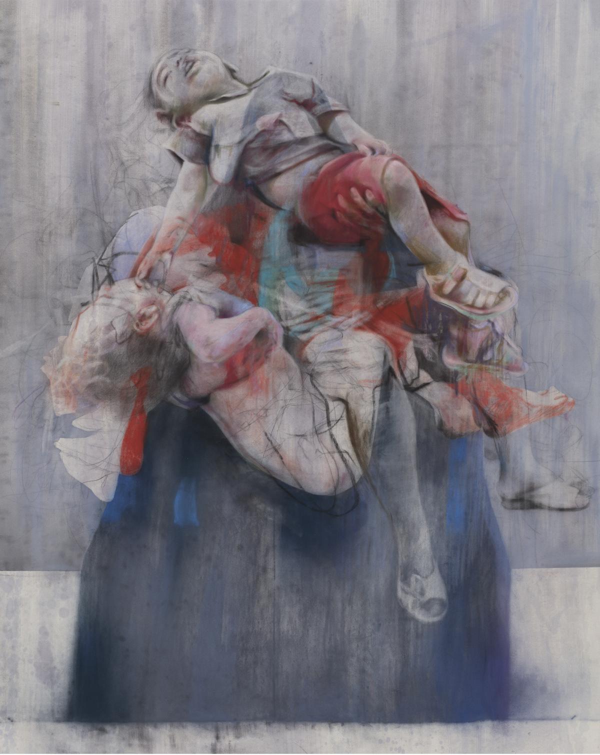
Aleppo
in exhibition ‘All Too Human’ pieta of people carrying bodies out from war zones. she used lots of photographs of a woman in burqa and lots of bodies.
Jenny Saville Aleppo
“I have been working on Pietas [depictions of the Virgin Mary holding the dead body of Christ] quite a bit, and a series of children being carried.
“Over 20 years I have collecting images of babies being carried out of bombings, war situations, in Pieta poses knowing that one day I will do a piece, so this work has been a long time in the making.
“Aleppo is the first one I have released like it.
“I have done paintings linked to war before, but not linked to a political situation – I have endless images from the internet, or from newspapers, of babies that have been killed in these bombings, and when I finished the piece, I have two children myself, how long will it be before we as humans know not to do this?
“When I was titling it, I thought I would link it – for the first time – to what is going on in Syria.
Carborundum printmaking is a printmaking technique in which the image is created by adding light passages to a dark field to create gradients of tone and a sandy texture. . It can be used on its own as a collagraph plate, or in combination with other techniques on any plate to which it can be made to adhere eg combined relief and/or intaglio collagraph plates (as in the feature image to this post), also drypoint and woodcut.
Carborundum was originally used by printmakers to grind down lithography stones. It works because when the carborundum adheres to the plate the ink sits around it. The grit is available in several grades – fine, medium and coarse – each giving different effects.
Bibliography of sources consulted:
Stobart, J., (2001) Printmaking for Beginners, London, A&C Black.
Preparing the plate
Normally, cardboard or wood plates are coated in a layer of carborundum or screen, and the lights are created by filling in the texture with screen filler or glue. The carborundum grit can be applied in a number of different ways:
Painting onto the plate with a liquid glue and then sprinkling the carborundum onto it
Mixing different amounts of glue with it and then painting them on in sections, the more grit used the darker. Example: one spoon of carborundum to five spoons of glue will be much lighter than five spoons of carborundum to five spoons of glue.
Using stencils to apply the glue and sprinkling different amounts of carborundum through the different stencils.
Using any of the above, then scratching into the plate and textures with a drypoint needle or other instrument.
Printing the plate
Carborundum prints may be printed as intaglio plates. To print a carborundum print, the surface is covered in ink, and then the surface is wiped clean with tarlatan cloth or newspaper, leaving ink only in the texture of the screen or carborundum. A damp piece of paper is placed on top, and the plate and paper are run through a printing press that, through pressure, transfers the ink from the recesses of the plate to the paper.
Very large editions are not possible as a small amount of carborundum comes off every time it is wiped down.