Schminke water-based inks are the first inks I ever used. They are artist-quality linoprint inks, made with high-quality organic and inorganic pigments on a gum arabic base. They have good lightfastness (at least 4-5 stars). They dry within 15 minutes to be wipe-proof but not waterproof and can be overprinted if necessary. There are 15 colours and 3 effect colours.
They can be used for:
linocut: the fast-drying time means they can be quickly overprinted and give a sharp line
monoprint: being water-based, they are also diluted with water which can produce very beautiful water-colour effects on monoprint. They can also be laid onto softfoam and keep their texture well when used with a palette-knife.
In-depth video on history and development of techniques of Japanese woodcut from monochrome through painted monochrome prints to multiblock printing. It looks at its influence on Western artists like Van Gogh and Monet following the exhibition of Japanese art for the first time at the Paris Exhibition of 1867. It also looks at the modern day revival of ukiyo-e prints as paintings on shops in Tokyo regeneration.
Japanese woodblock prints with Paul Binnie
Lecture on background and underlying ideas in Japanese printing techniques.
Japanese woodblock printing History Ukiyo-e Jose Ortega
History of Japanese printing and way it spread and related to earlier Chinese and Buddhist prints.
Technique
The technique for printing texts and images was generally similar. The obvious differences were the volume produced when working with texts (many pages for a single work), and the complexity of multiple colours in some images. Images in books were almost always in monochrome (black ink only), and for a time art prints were likewise monochrome or done in only two or three colours.
The text or image was first drawn onto washi (Japanese paper), then glued face-down onto a plank of wood, usually cherry. Wood was then cut away, based on the drawing outlines. A small wooden hard object called a baren was used to press or burnish the paper against the inked woodblock to apply the ink to the paper. Although this may have been done purely by hand at first, complex wooden mechanisms were soon invented and adopted to help hold the woodblock perfectly still and apply proper pressure in the printing process. This was especially helpful with the introduction of multiple colours that had to be applied with precision over previous ink layers.
While, again, text was nearly always monochrome, as were images in books, the growth of the popularity of ukiyo-e brought with it demand for ever increasing numbers of colors and complexity of techniques. The stages of this development follow:
Sumizuri-e (墨摺り絵?, “ink printed pictures”)—monochrome printing using only black ink
Benizuri-e (紅摺り絵?, “crimson printed pictures”)—red ink details or highlights added by hand after the printing process;green was sometimes used as well
Tan-e (丹絵?)—orange highlights using a red pigment called tan
Aizuri-e (藍摺り絵?, “indigo printed pictures”), Murasaki-e (紫絵?, “purple pictures”), and other styles in which a single color was used in addition to, or instead of, black ink
Urushi-e (漆絵?)—a method that thickened the ink with glue, emboldening the image. Printers often used gold, mica, and other substances to enhance the image further. Urushi-e can also refer to paintings using lacquer instead of paint. Lacquer was rarely, if ever, used on prints.
Nishiki-e (錦絵?, “brocade pictures”)—a method of using multiple blocks for separate portions of the image, using a number of colors to achieve complex and detailed images. A separate block was carved to apply only the part of the image designated for a single color. Registration marks called kentō (見当) were used to ensure correspondence between the application of each block.
Contemporary Japanese woodblock
Katsutoshi Yuasa
Keizaburo Matsuzaki
Bibliography
Clark, T. (ed.) (2017) Hokusai: Beyond the Great Wave, London: Thames & Hudson and British Museum.
Pollard, C. & Watanabe, M. I., (2014) Hiroshige: Landscape, cityscape, Oxford: Ashmolean Museum.
Schroer, A. (ed.) (2005) Hiroshige, Berlin, Munich, London, New York: Prestel.
Schroer, A., (ed.) (2005) Hokusai, Berlin, Munich, London, New York: Prestel.
Exhibitions
Hokusai: Beyond the Great Wave (25 May – 13 August 2017)
We do with our lives what we can. And then we die. What else is there?
If anything ever does work in my case chance, and what I call ‘accident’ takes over.
Gamble everything on the next brush stroke…different strokes trying to do something else then develop themselves
How are you going to trap reality? How are you going to trap an appearance without making an illustration of it?
Colour of meat is beautiful
Issues for my printmaking:
Feeling the form as it emerges – particularly with monoprint or inking collagraph plates. One thing can turn into another.
Can work from photographs for portraits. But observe – Bacon could not draw.
Shadows do not need to relate to a subject – making them different can create considerable tension
his tryptichs ‘don’t relate to each other, but they play off one another…the balance seems better with three’
Key images
Three Studies for Figures at the Base of a Crucifixion c.1944 The work’s exhibition in April 1945 coincided with the release of the first photographs and film footage of the Nazi concentration camps. (Tate Modern website)Triptych August 1972. This work is generally considered one in a series of Black Triptychs which followed the suicide of Bacon’s lover, George Dyer. Dyer appears on the left and Bacon is on the right. The central group is derived from a photograph of wrestlers by Edward Muybridge, but also suggests a more sexual encounter. The seated figures and their coupling are set against black voids and the central flurry has been seen as ‘a life-and death struggle’. (Tate Modern website)Study for a self-portrait. Also known as Businessman I 1952 or Man’s Head 1952
Helen Frankenthaler (1928-2011) was eminent among the second generation of postwar American abstract painters and is widely credited for playing a pivotal role in the transition from Abstract Expressionism to Color Field painting.
Through her invention of the soak-stain technique, she expanded the possibilities of abstract painting, while at times referencing figuration and landscape in unique ways. Her 1952 Mountains and Sea, was a seminal, breakthrough painting of American abstraction. Pioneering the “stain” painting technique, she poured thinned paint directly onto raw, unprimed canvas laid on the studio floor, working from all sides to create floating fields of translucent color. Mountains and Sea was immediately influential for the artists who formed the Color Field school of painting, notable among them Morris Louis and Kenneth Noland.
In addition to unique paintings on canvas and paper, she worked in a wide range of media, including ceramics, sculpture, tapestry, and especially printmaking. As a significant voice in the mid-century “print renaissance” among American abstract painters, she is particularly renowned for her woodcuts.
Below are videos of different approaches in paint that I could explore in printmaking.
Hard Edge Abstraction
Possible to explore for masked monoprint and/or screen print. Or indeed using masking on any type of print. These techniques use masking tape that is also worth exploring.
Jenny Saville’s extremely tactile approach to painting women’s bodies, including her own, as a feminist critique of the way the female nude has been portrayed by the male art establishment has influenced my work in:
Assignment 2: The Human Condition 2: Flesh Here my focus is on the tactility of the body and ways in which different types of paper eg wrinkled blotting paper or tracing paper give different body textures. As well as meanings of different shapes.
She works from photos and sketches, not painting from live models
She plays with colours and composition in Photoshop
Some of her paintings use text – following the example of feminist photographers like Jo Spence
Mixing red and cyan on flesh creates tension because we do not know how to read it.
Body as narrative of traces, a copperplate to be etched on – possibilities for over-printing
Cut out the shape of a body and draw around and over it, then remove the mask. Keep going till you have something believable.
Videos
Jenny Saville discussing her painting process in 2018 in relation to the All Too Human exhibition at Tate Britain. This is a detailed discussion of her working process and evolution as an artist. She is interested in:
Relationship between ‘how you are’ and ‘how you are seen’ eg in work on plastic surgery, people saw themselves as ill because they did not have the nose or breasts they wanted. They saw surgery as enabling them to be their ‘real self’.
Paint as vocabulary and anatomy of paint traces from Pollock and de Kooning and document of the process of making
Earlier interview with Jenny Saville, focussing particularly on her recent work with its interest in time and traces, multiple figures and memory.
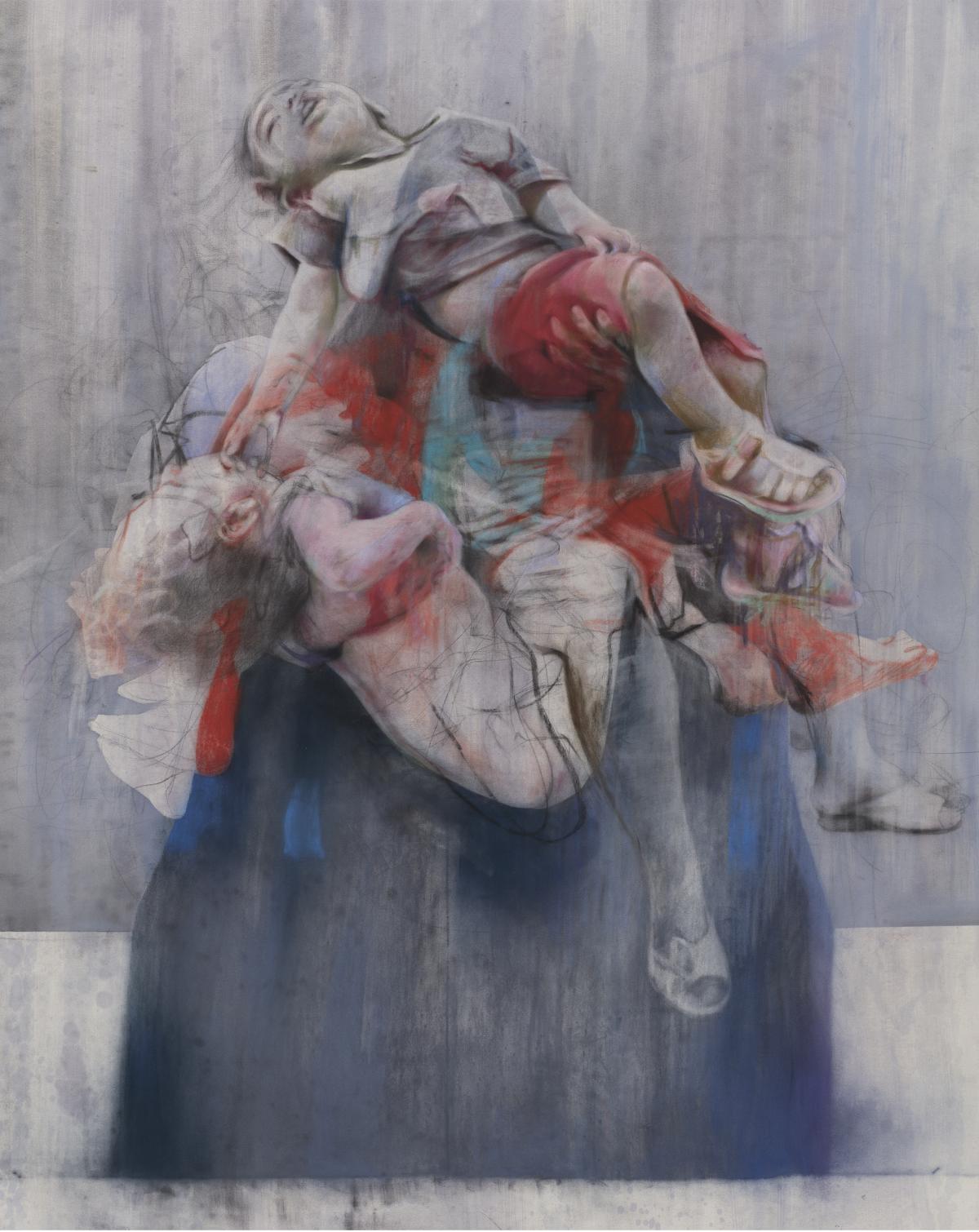
Aleppo
in exhibition ‘All Too Human’ pieta of people carrying bodies out from war zones. she used lots of photographs of a woman in burqa and lots of bodies.
Jenny Saville Aleppo
“I have been working on Pietas [depictions of the Virgin Mary holding the dead body of Christ] quite a bit, and a series of children being carried.
“Over 20 years I have collecting images of babies being carried out of bombings, war situations, in Pieta poses knowing that one day I will do a piece, so this work has been a long time in the making.
“Aleppo is the first one I have released like it.
“I have done paintings linked to war before, but not linked to a political situation – I have endless images from the internet, or from newspapers, of babies that have been killed in these bombings, and when I finished the piece, I have two children myself, how long will it be before we as humans know not to do this?
“When I was titling it, I thought I would link it – for the first time – to what is going on in Syria.
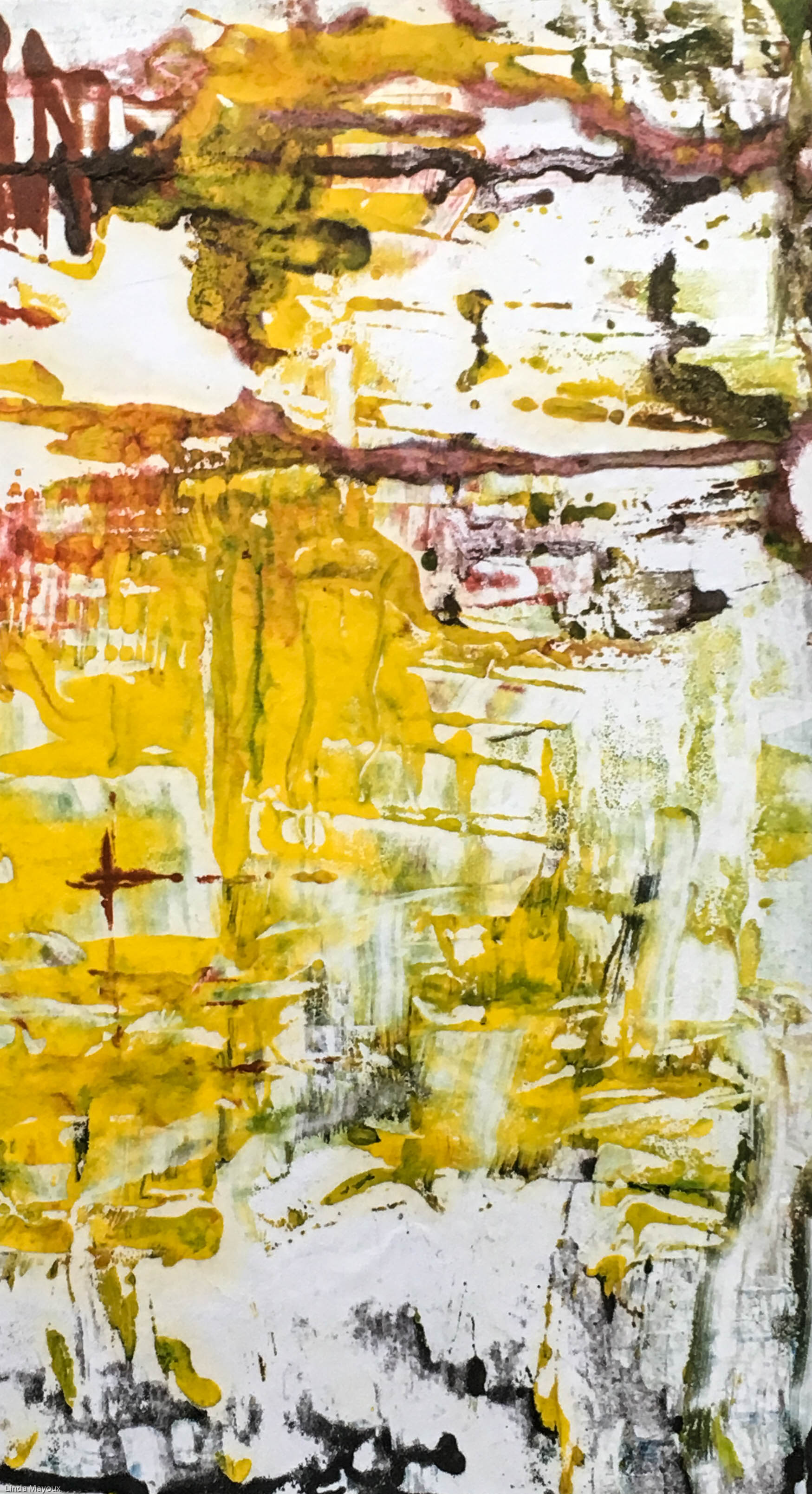
Use Akua water-based relief inks and impasto medium applied with palette knife, then selectively scraped. This replicates the appearance of squeejee and acrylic paint.
Drip blending medium and/or liquid ink pigment and use gravity to make further marks
Hand print on thin Japanese paper to retain delicate markings and as much as possible of the impasto
About Richter’s painting technique
Squeejee techniques
Bibliography
Godfrey, M. & Serota, N., (2011) Gerhard Richter: Panorama, London: Tate Publishing
.
Storr, R., (2009) Gerhard Richter: The Cage Paintings, London: Tate Publishing.
!!for further exploration and development
lifelines and energy fields.
Life and death merging in fearful union
If you look at my paintings with unfettered eyes, you may find forces in yourself you did not know existed
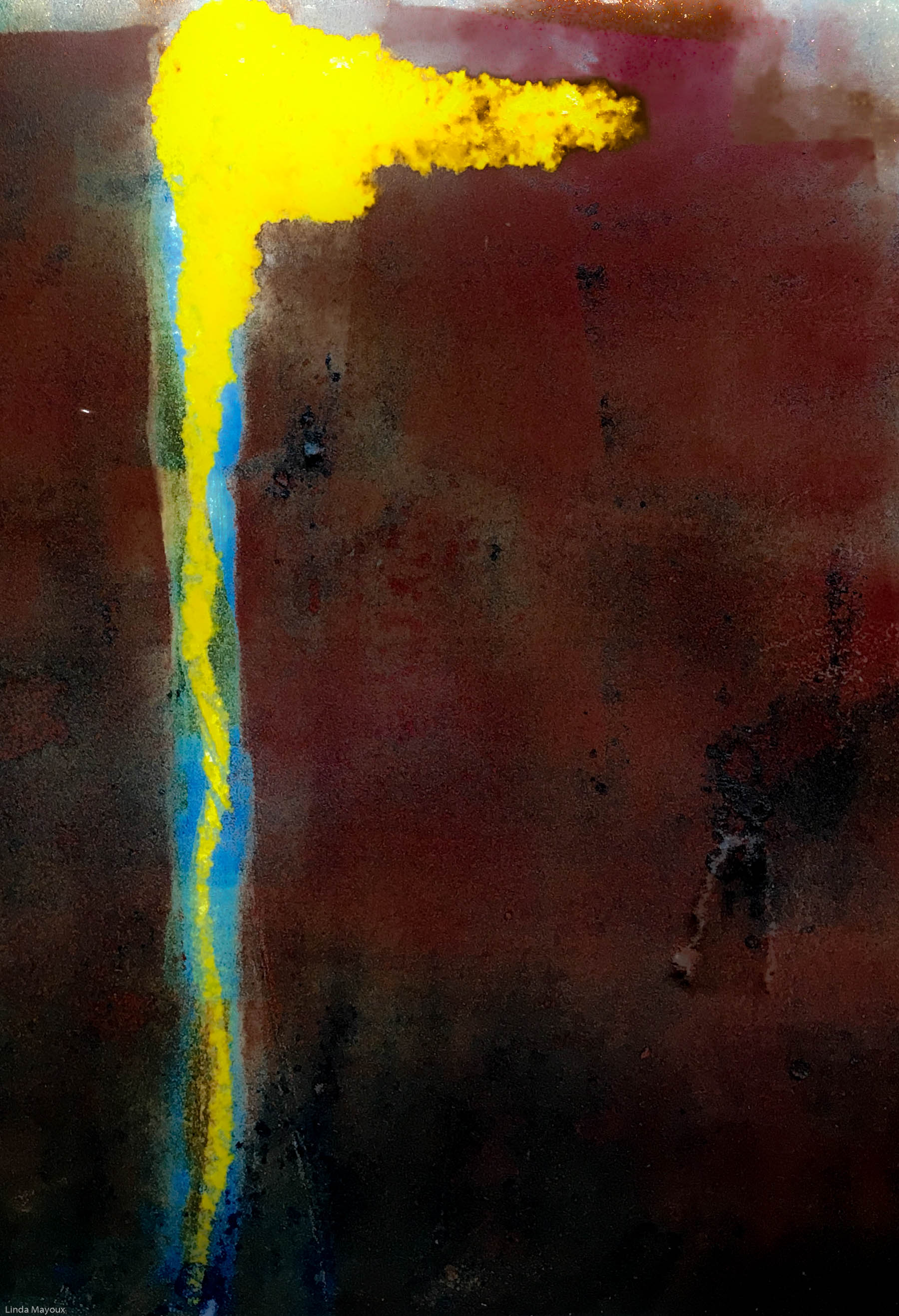
Experiments so far – flashes and cracks of vertical colour like fate striking out of the blue. It would be very interesting to revisit some of my other abstracts that lack impact eg Project 2.1 Formal Abstracts and some of my life abstracts and develop them further using mark-making and colour contrasts that express the energy and turmoil of Clyfford Still’s paintings.
Clifford Still experiment
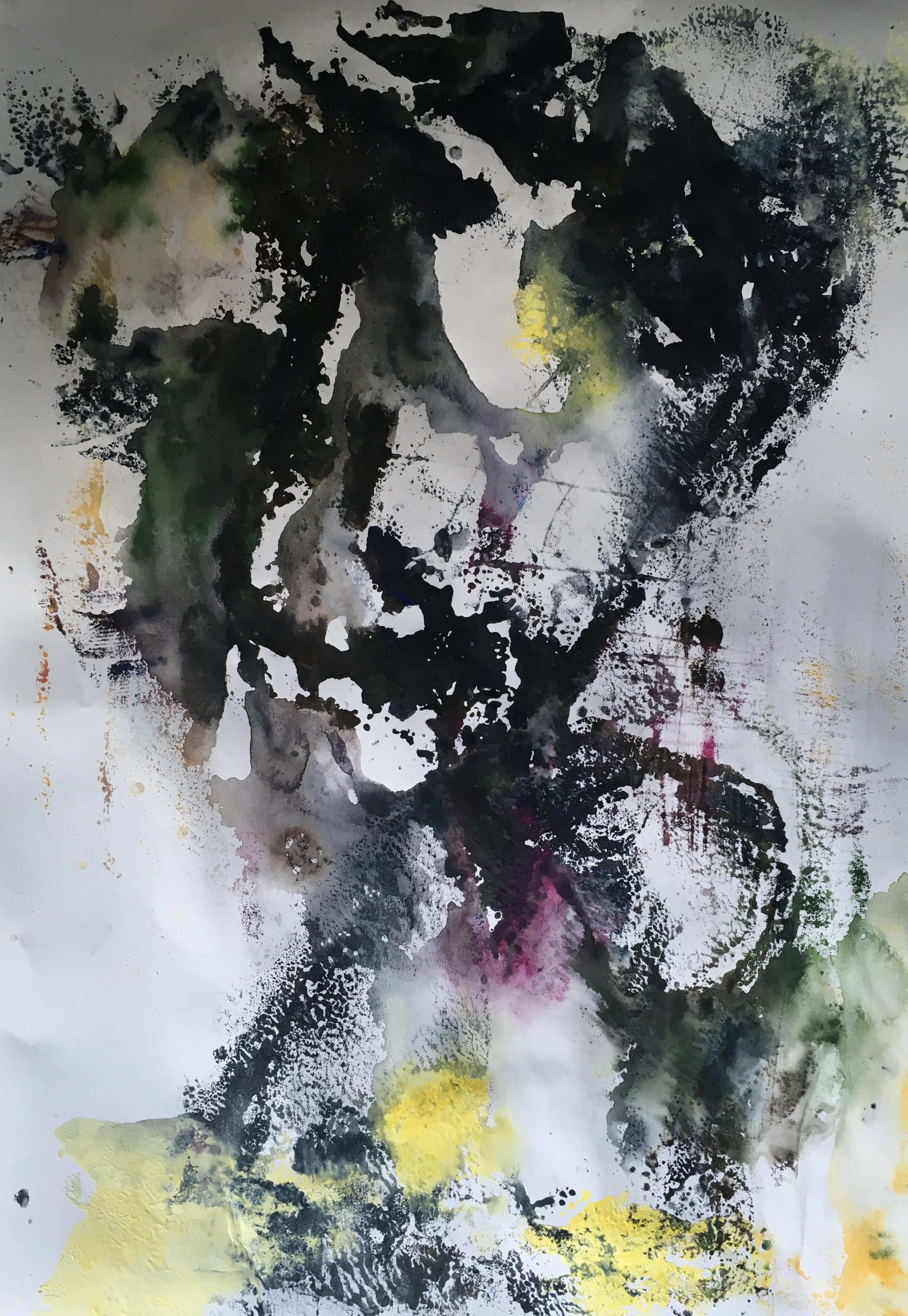
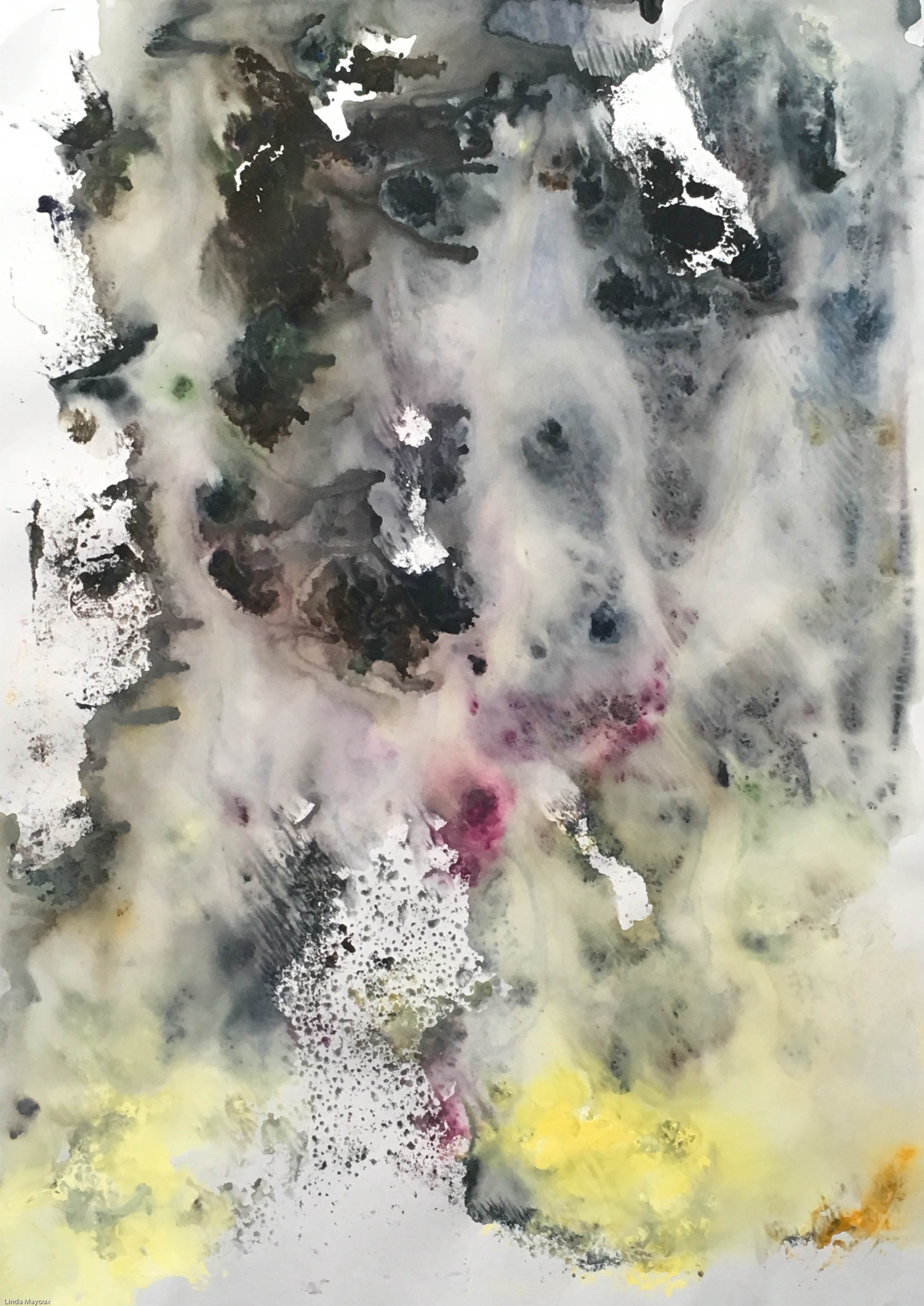
Life Abstract 6
Untitled Abstract: colour exploration
Untitled Red 3
Issues for my printmaking:
Importance of verticality
Use of palette knife
Monoprint: contrast between thick impasto textured areas and thin ‘lifeline’ streaks. Can use different ink.
Collagraph: can use large shapes that are heavily textured, with small delicate rivulets of colour in between
Linocut: again can texture the linocut and overprint with similar colours to create depth over thin incised lines
Videos
‘Energies, forces, feelings all those things that are embodied with being alive’
interest in vertical and horizontal and what is means to being in the world. ‘verticality expresses a sort of life force. When we are alive we move through the world vertically, when we die we become horizontal. Things grow vertically, when they die they fall over.’
Techniques: interest in gesture. most distinctive feature is use of palette knife. roughness and skins contrast with delicate ‘lifelines’. Paintings take weeks or months of construction.
Museum in Denver Colorado
Bibliography
Anfam, D. (ed.) (2017) Abstract Expressionism, London: Royal Academy of the Arts.