See parts 2and3
Lithography is a planographic process based on the principle that oil and water do not mix. It uses a chemical process on a plate to form:
Plates are of different types: generally prepared lithographic stones, aluminium photo lithographic plates but in ‘kitchen lithography’ can also use aluminium foil. Through sponging and keeping the plate wet and then rolling ink on top, the ink adheres only to the water-rejecting areas.
Lithographic inks and crayons can produced a wide range of very interesting textured and water-colour-type effects, close to drawing or painting on paper. Single plates can be monochrome, or use rainbow rolling techniques. For truly multi-colour prints separate plates are prepared for each colour and overprinted.


The process is quite difficult and time-consuming, requiring a lithography press because of the thickness of the stone. But corrections can be made through stopping out with acetone. Great care mush be taken with the press because unevenness can cause parts of the image to be missed – this can be corrected through adding packing.


See You Tube tutorials below
This is an easier process that produces plates that can be printed on an etching press. But a special exposure unit is needed to produce the plates.


D’arcy Hughes, A. & Vernon-Morris, H., (2008) The Printmaking Bible: the complete guide to materials and techniques, San Francisco: Chronicle Books.
Grabowski, B. & Flick, B., (2009) Printmaking: A Complete Guide to Materials and processes, London: Lawrence King Publishing.
Griffiths, A., (1980) Prints and Printmaking: An introduction to the history and techniques, London: British Museum Press.
Lloyd, R., (2014) Hockney Printmaker, London: Acala Arts & Heritage Publishers Ltd.
Martin, J., (1993) The Encyclopedia of Printmaking Techniques, London: Quarto Publishing.
Meyrick, R., (2013) Sydney Lee Prints: A Catalogue Raisonnee, London: Royal Academy of the Arts.
Pogue, D., (2012) Printmaking Revolution : new advancements in technology, safety and sustainability, New York: Watson-Guptill publications.
Porzio, D. (ed.) (1982) Lithography: 200 years of art, history & technique, London: Bracken Books.
Salamon, F., (1972) The History of Prints and Printmaking from Durer to Picasso: A guide to collecting, New York, Sat Louis, San Francisco: American Heritage Press.
Stobart, J., (2001) Printmaking for Beginners, London: A&C Black.
Woods, L., (2011) The Printmaking Handbook: Simple techniques and step-be-step projects, London: Search Press.
British Museum
Picasso post-war prints: lithographs and aquatints (27 January – 3 March 2017)
Fitzwilliam Museum
Degas, Desboutin and Rembrandt: parallels in prints (27 October 2017 – 25 February 2018)
Degas: A Passion for Perfection (3 October 2017 – 14 January 2018) prints in various media
Degas: Caricature and Modernity ( 12 September 2017 – 21 January 2018) lithographs and drypoints
A succinct overview of markmaking and the lithographic process.
Another good overview with different types of markmaking
Kanemitsu
Canadian artists
Printing
Uses metal plate, waterbased drawing media, paint thinner and silicon, with gum-based inks.
Uses aluminium foil, some sort of grease for drawing and cola to etch.
This is a very simple process. But not clear what the grease is – vaseline? Soap? But I really like the zen/manga-like energy of the bold brush line.
This version looks more complicated in that it sands and dusts the plate. The look is more craftsy, using lithograph crayons. But because the etch is much cruder the crayons do not seem to have the same artistic subtlety as they do in stone lithography.


I have explored many different types of paper – effects of the same printing plate vary significantly between for example:
The ways in which different types of paper absorb the ink also depends on:
In general thin papers are much more responsive to sensitive hand printing, high quality printmaking papers retain more fine detail.
There are a much wider range of papers to explore than those I have experimented with so far. Some of those listed below would be particularly interesting for texturing in combining printmaking with digital techniques.
Paper can be produced with a wide variety of properties, depending on its intended use:
Other surfaces that can be used for printing, bookmaking and collage include:
??
Banana paper
Leather paper
Mummy paper
Oak Tag Paper
Tyvek paper
Paper is usually described by its size, weight, finish and stability. The kind of stock you choose will be informed by the nature of the job you’re doing.
weight: Expressed in grammes per square metre (g/m2 or usually just g) of the paper. 50g is very light. Printing paper is generally between 60g and 120g. Standard photocopying paper is usually 80gsm. Anything heavier than 160 g is considered card. 240g upwards are heavy papers. A brochure would havepages of 100 or 130gsm and a cover of 250 or 350gsm.
bulk: The thickness of paper is often measured by caliper, which is typically given in thousandths of an inch in the United States and in thousandths of a mm in the rest of the world. Paper may be between 0.07 and 0.18 millimetres (0.0028 and 0.0071 in) thick.
Textured finishes, watermarks and wire patterns imitating hand-made laid paper can be created by the use of appropriate rollers in the later stages of the machine.
Wove paper does not exhibit Handmade paper similarly exhibits “deckle edges”, or rough and feathery borders.
grain : The fibres in the paper run in the machine direction. Sheets are usually cut “long-grain”, i.e. with the grain parallel to the longer dimension of the sheet.
‘laidlines’ : “Laidlines” are small regular lines left behind on paper when it was handmade in a mould made from rows of metal wires or bamboo. Laidlines are very close together. They run perpendicular to the “chainlines”, which are further apart.
All paper produced by paper machines as the Fourdrinier Machine are wove paper, i.e. the wire mesh that transports the web leaves a pattern that has the same density along the paper grain and across the grain.
texture : cold-pressed, hot-pressed, handmade
opacity : linked to weight. tissue paper vs very thick papers.
finish: paper can be finished in many different ways; for example, gloss paper is highly finished with a shiny texture, silk paper is smooth. If you want a totally matt paper (often used for forms as it is easier to write on and for an ‘arty’ finish) you would probably use a cartridge paper.
surface coating : Coated paper has a thin layer of material such as calcium carbonate or china clay applied to one or both sides in order to create a surface more suitable for high-resolution halftone screens. (Uncoated papers are rarely suitable for screens above 150 lpi.)
Coated or uncoated papers may have their surfaces polished by calendering.
Coated papers are divided into matte, semi-matte or silk, and gloss. Gloss papers give the highest optical density in the printed image.
colour : Paper can be dyed to any colour, but professional printing is always done on white stock.
absorbency : affects spread of ink and effects of using water-based effects. linked to sizing and coating.
pHvalue: acidity/alkalinity:
lignin/bleach
Paper made from mechanical pulp contains significant amounts of lignin, a major component in wood. In the presence of light and oxygen, lignin reacts to give yellow materials, which is why newsprint and other mechanical paper yellows with age.
Paper made from bleached kraft or sulfite pulps does not contain significant amounts of lignin and is therefore better suited for books, documents and other applications where whiteness of the paper is essential.
Paper made from wood pulp is not necessarily less durable than a rag paper. The ageing behavior of a paper is determined by its manufacture, not the original source of the fibres. Furthermore, tests sponsored by the Library of Congress prove that all paper is at risk of acid decay, because cellulose itself produces formic, acetic, lactic and oxalic acids.
When sending to a commercial printer you need to check paper quality – the weight and finish of the paper – with your client. Most printers can give you a swatch of the papers they recommend for you to share with your client and keep for future reference.
A key focus in my printmaking is experimentation with different inks:
For ink experimentation with mixed inks see:
Although I also use oil-based inks, I am particularly interested in pushing the potential of water-based and water-soluble inks because I am allergic to solvents so can only use these in very small amounts. This means I also experiment a lot with inks during the cleaning-up process – rolling onto scrap paper and printing from the inking plate – in order to minimise the ink that needs to be cleaned off rollers and plates. These papers are then used in colllage.
used in:


Schminke water-soluble inks
used in:


")


used in:


Holbein Duo water-soluble oil paint
Caligo safewash
Hawthorne ink
used in:


Graver, M. (2011). Non-toxic printmaking. London, A&C Black.
Hoskins, S. (2004). Inks. London, A&C Black.
!! Post in process
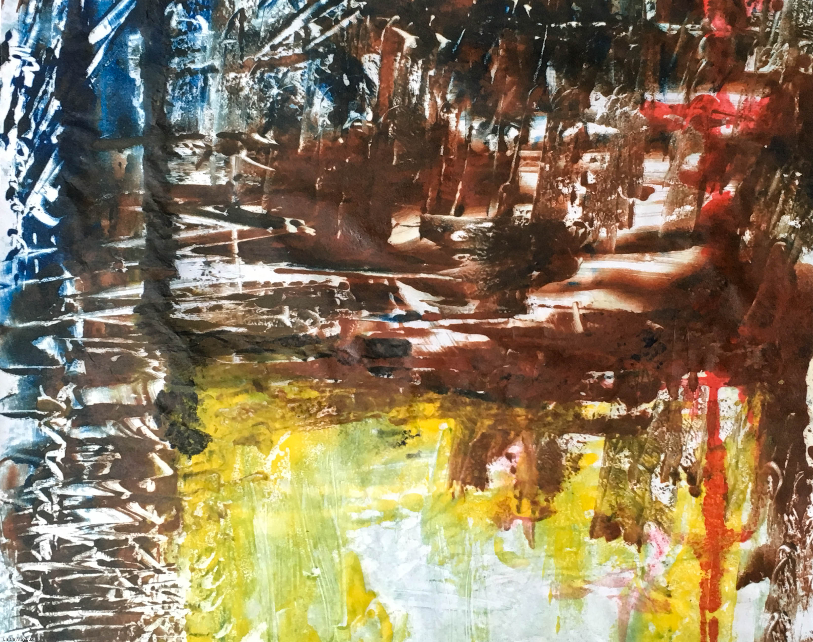
For details of my own collagraph prints and techniques see: Collagraph Techniques
There is no exact date for the beginnings of collagraph printing. It evolved alongside other intaglio and relief printing, particularly with the move towards abstraction, introduction of ‘found’ materials and use of collage and mixed media in 1950s and 1960s. It was also helped by the widespread availability of new, cheap materials like acrylics and very strong adhesives.
Pierre Roche – sculptor developed gypsographic printing using bas-relief plaster engraving – inked in relief and printed by hand onto dampened paper, leaving a slightly raised blind embossing. Later he added layers of an adhesive called gypsum onto metal plate for an embossed effect.
Google images for Pierre Roche collagraph
Bauhaus: Klee, Picasso, Braque, Schwitters and Moholy-Nagy used collage materials and this was adopted by printmakers.
Rolf Nesch: one of the first artists to have consciously used collage to create collagraph printing plates. He gave depth and texture to prints by soldering out metal shapes and wire to metal printing plates. He then took this further by drilling holes in plates and sewing to the base plate. The prints were so deep he hneeded 8 blankets to get the right pressure and very heavy strong paper.
For more details on the work of Rolf Nesch, click here.
William Hayter developed viscosity printing – a technique that allowed a single printing plate to be printed in many colours. The basic principle is that the viscosity or stickiness of an ink can be reduced by adding linseed oil. A stiff viscous ink will absorb and mix with an oily ink laid over the top. But if an ink full of oil is placed on the plate first, it will reject a dry viscous ink and will not mix with it.
Google images for William Hayter collagraph
Richard Hamilton mixed painting with forms of printmaking, such as collotype, lithograph and silkscreen.
Google images for Richard Hamilton collagraph
Joan Miro created numerous collagraphs combining carborundum, aquatint and etching.
Google images for Miro collagraph
Henry Moore used collograph and resist techniques in versions of his drawings
Google images for Henry Moore collograph
Brenda Hartill has been very influential in UK, building on Hayter’s techniques of viscosity printing.
Click here for more details of Hartill’s work
Hughie O-Donoghue produces large abstract figures using acrylic and carborundum
Click here for more details of O’Donoghue’s work
Other collagraph artists:
D’arcy Hughes, A. & Vernon-Morris, H., (2008) The Printmaking Bible: the complete guide to materials and techniques, San Francisco: Chronicle Books.
Grabowski, B. & Flick, B., (2009) Printmaking: A Complete Guide to Materials and processes, London: Lawrence King Publishing.
Hartill, B. & Clarke, R., (2005) Collagraphs and mixed media printmaking, London: A&C Black.
Major-George, K., (2011) Collagraph: a journey through texture, UK: Major Impact.
Martin, J., (1993) The Encyclopedia of Printmaking Techniques,London: Quarto Publishing.
Stobart, J., (2001) Printmaking for Beginners, London: A&C Black.
Woods, L., (2011) The Printmaking Handbook: Simple techniques and step-be-step projects, London: Search Press.
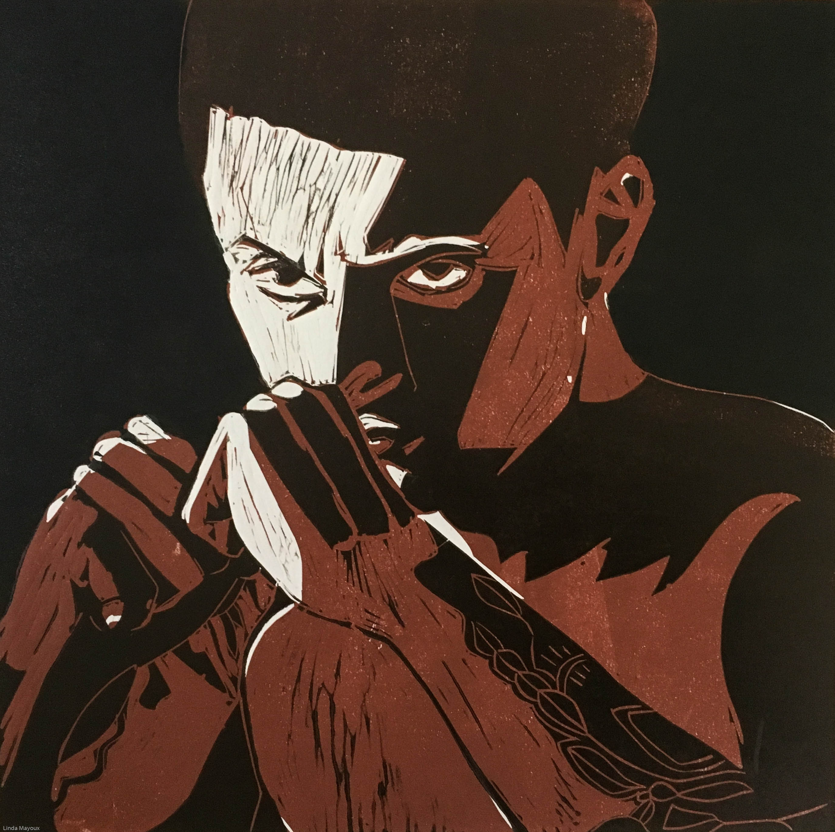
See also post: Linocut Technique
Linocut uses a cheap, versatile material that gives possibilities for dynamic mark-making and bold shapes with simplified colour. It has been used by for many different types of prints including portraits, political works, landscapes and typography. It has been particularly popular as a medium for political protest, including the Russian Revolution and US Civil Rights movements.
Earlier artists applied many of the techniques earlier developed for woodcut – both markmaking and use of tone and structure. Some were influenced by Japanese woodcut traditions as well as Western wood engraving and African and Oceanic art. Linocut artists from the Grosvenor School and Russian Revolution (see below) were influenced by major art movements of the twentieth century, particularly cubism, futurism and constructivism. Others developed new directions with Picasso’s use of the reduction linocut (that can also be done with any other surface like wood). Contemporary linocut artists used a wide variety of experimental techniques, using abrasive solutions as well as power tools to create a range of marks and tones.
Linoleum was invented in the early 1860s and first used for printing in 1890 in Germany for the manufacture of wallpaper.
Franz Ciceck, an Austrian artist and teacher was one of the first to popularise lino for artists’ prints. He recognised the medium’s potential to instruct children in colour and design: it was cheap, easily worked with simple tools, adaptable to water-based inks, and versatile. He toured Europe and North America with examples by his pupils and influenced art education worldwide.
In the early 20th century linocut became very popular as an artistic medium.
German Expressionists 1905-1920s : The first major artist to adopt linocut as a medium was Erich Heckel, and his earliest linocut is dated 1903. Artists from Die Brucke regularly used linocut instead of woodcut from 1905 to 1920s. These focused on bold shapes and expressive distortion in monochrome prints. The use of lino was ideal for this, although the fine lines and use of woodgrain etxture in some of the woodcuts was not possible.
This German Expressionist tradition has been continued by modern artists like Georg Baselitz who produces very large linocuts and combination prints often on subjects of political protest.
In revolutionary Russia important linocuts were produced from about 1918.
Lyubov’ Popova was a Russian avant-garde and ‘new woman’ artist (Cubist, Suprematist and Constructivist) painter and designer. She produced a number of linocuts in constructivist style.
The printmakers of the Grosvenor School (see C.S. Ackley, 2008) produced very dynamic linocuts with strong curvature distortion influenced by the Vorticist and Futurist movements. Key artists were:
The work of the Grosvenor School has also influenced some contemporary linocut artists like the Canadian Gary Ratushniak who was trained by Sybil Andrews draws also on native America traditions.
Edward Bawden
Edward Bawden is another English artist and illustrator who often worked in watercolour, but also produced many linocuts. His work is more figurative and many of his paintings are from his experience as war artist in the Second World War.
Matisse produced 70 linocuts between 1938 and 1952. These are similar in both style and subject matter to his black and white monoprints of figures. They use a fluid expressive white-line technique that takes advantage of the variation in line that can be achieved as linocut tools glide through the the soft material..
See S. Coppel, S. (1998)
Picasso used linoleum for popular posters in the early 1950s. In 1959 he began a series of innovative colour linocuts, developing the reduction print technique. He developed a method of printing in different colours progressive states cut on a single block, so that the finished print comprises layered impressions of all the states.
Linocuts were very popular as effective and cheap media for mass communication by African American artists involved in the American Civil Rights movement. Influenced by both African and Mexican art they depicted images of racial and sexual issues. Key proponents were:
Recently there has been a resurgence of interest in linocut as an art form. It is a key part of the many printmaking courses as an easier introduction to relief printing than woodcut. It has therefore become widely used for things like greetings cards. But there are also contemporary linocut artists doing innovative work – including very large pieces that exploit its potential for being cut into smaller blocks and because of its relatively light weight. There has been development of a wide range surface etching and texturing techniques using different tools.
Some of the sources I have looked at (in alphabetical order – unfortunately websites for other artists I looked at were fleeting and disappeared since I started the course).
Recent acquisitions two sets of Picasso linocuts (10 January – 6 May 2014)
Linocuts are a type of relief print in which the artist cuts the design into linoleum or similar materials like vinyl and floor tiles as the printing surface, using gouges and knives. The softness and lack of grain of linoleum enable the artist to cut smoothly in every direction but very fine lines can crumble.
Texture can be created through techniques like sanding and use of abrasive materials, monoprint techniques during inking and use of bleach and other etching media.
Masks can be used over portions of the image, parts of the image can be hand-coloured.
Blocks can also be rotated in different colours or tones to make abstract images.


For my linocuts in Printmaking 2 see:
Project 1.3 landscape composition
Project 5.1: Grand Arcade: Memories Revisited
I also did more experimental linocuts in Printmaking 1 that provided the basis for my work and notes here.
For approaches by other printmakers and artists see also linocut inspiration
Strong tones, simple shapes, patterns and textures are important.
Lino is a direct printing process so the image will be reversed when printed. It is useful to check the design through using a mirror.
It is likely that any sketch will need to be adjusted or simplified to make a good linocut image. To simplify the shapes, adjust the edges and clarify the movement of the eye though the image. It is very useful to do Notan structure drawings to check the underlying tonal structure and dominant shapes. It is particularly useful to do this digitally using a programme on the iPad like Procreate. This enables you to design specific brushes that mimic linocut tools and freely and quickly experiment with different versions, interpretations and colours of a design.
Images can be constructed through positive and/or negative shapes. Linocuts can be mostly cut away to leave lines on paper background, or mostly the colour of the ink. Or a combination of the two. It is worth experimenting with digitally reversing the tonal values to explore different interpretations of an image. It can also be done using white chalk on black paper, experimenting with different marks to simulate linocut marks. Black and white collage can also be useful.
Tracing paper or a lightbox can be used to help reverse the image.
This can be done using tracing paper and a soft pencil, or carbon paper. Or simply drawing on.
It is useful also to go over the black areas with pencil or ink and brush so that the cuts will be clearly seen.
Cut marks are part of the identity of a linocut. These can give a sense of movement and life. They can also give a wide variety of textural contrast. Sometimes a clean area with no cut marks is required.
Cut along the surface of the lino – you don’t need top cut deep. Even pressure can create a smooth line.
Varying the pressure and angle of the tool and/or speed of cutting gives a more varied and expressive line.
If using a large lino block, or cutting away large areas, it is best to mount the lino on a solid surface like hardboard with glue. This will keep the plate rigid through repeated use. This is particularly important in reduction or combination prints.
Tools
Safety
Proofing
It is useful to check the image as you go along by lying a thin piece of paper over the lino and using pencil or a graphite stick. This helps avoid over-cutting and better judgement of shapes. At a later stage it is useful to do proof prints.
Inking the plate
Use relief inks – water-based or oil-based. Relief inks are stiffer than etching inks.
Mix the ink into the colour you want with a palette knife. Use thinner ink if you have a lot of fine cuts.
Use a hard roller to get sharp outlines. A softer roller will go slightly inside the cuts and give a softer image. Ideally the width of the roller should be bigger than the block. Use a small roller to go over finer areas if necessary – check the corners and edges in particular.
You need an even coating of ink that is not thick or lumpy. The ink on the roller should look like fine suede and make a very gentle swish when rolling out. There should be no spots or marks in the ink because these will be transferred to the block, and probably to the paper. It is much better to apply several layers of thin ink than one thick layer – ink that is too thick may ooze down into the cut marks and loss of detail will occur.
You can re-ink the lino several times for the same colour, or to mix colours.
Papers
Relief prints are usually printed onto smooth dry paper, but can be printed on dampened paper.
Thinner more sensitive papers can be used, particularly if printing by hand.
Registration
Registration enables you to print an edition with every print being positioned in the same place on each sheet of paper. It also enables you to over print a new layer of colour over a previous print.
Registration methods include:
In all these cases the top left hand corner of the back of the paper should be marked to ensure it is placed the right way up.
Printing
The linocut can be printed in a simple screw or lever press or by hand, by rubbing the paper against the inked block with a spoon, rolling pin or baren (a slightly concave disc sheathed in bamboo), or by laying the inked linoleum on to the paper and hammering the back of the block. These hand-printing methods can also be used to print on to textiles, or the inked block can be turned on to fabric stretched on the floor and trodden on by the printer. Hand printing can give a more sensitive image.
If using a printing press, the paper can be put on top of the block if you want some embossing. Also if you want to selectively dampen the paper to give texture to the inking. If you want easy registration by eye then put the paper down first and place the block on top.
If corners have been cut back, or to avoid ridge marks at the edges of the lino block on the paper, use lino runners along the edge to stop the rollers sinking onto the paper.
Editioning (single colour or multi-block)
Number the prints in the order you take them. Marked Print No/Total prints.
The edition is only true if the block or blocks remain true without any additional cutting during the print run. It is usual to print all pages of the first colour together, then the next etc. (But not if you are changing the colours of ink on the blocks). The first print is labelled the artist’s proof.
A multi-block linoprint is where each colour is printed from a separate lino block, cut to match the original design.
To begin you need to create a design that can be printed in two or more colours (often 3 colours is good). In some cases a black registration block is used containing the finished design to help cut the different layers and also unify the image at the end.
When you have drawn your design outlines and solid dark areas you can colour in areas of your design with pens.
Printing is generally done light to dark, using light colours for the largest areas on the least-cut block. This enables layering of colours to produce a range of different tones and hues as the inks mix and overlay each other.
Block 1: lightest with only the areas that will remain white cut out. This image then needs to be transferred from the paper to Block 2 while the ink is still wet.
Block 2: darker colours with colour of block 1 cut out. This image then needs to be transferred from the paper to Block 3 etc if more colour blocks are used while the ink is still wet.
Blocks 3+ and so on.
Registration block goes last.
REGISTRATION IS KEY!!!
A technique that creates a multiple colour print from one block.
First prepare a coloured design and transfer it to the block as in other methods. It is useful to have a master tracing to work from as successive layers will disappear. Colouring areas to be retained helps prevent mistakes.
The first cuts are the colour of the paper to be printed on. The surface is then reduced for each successive colour, usually working from the lightest to the darkest. Remember ‘CUT TO SAVE’ previous colour. Some cuts can also be masked if you make a mistake.
As you cannot go back, a batch of prints large enough for the print run should be done at each stage.
Reduction prints are usually printed in opaque inks as you want each successive colour to sit on top of the previous layer (is this true?? Or do you want mixing???)


