


Overview and Assessment
Self portraits are different from portraits because you never see yourself as you ‘are’. Always through reflections – that are reversed – or photographs. And how we see ourselves is inevitably coloured by how you feel from the ‘inside’. Unless working from a photograph it is also difficult for an artist to represent themselves in profile. The easiest way to draw is a frontal portrait bgecause you can watch while you draw.
I found it quite therapeutic in some ways to sit in front of mirror drawing myself – trying to get the mouth and eyes ‘right’. But I also found it a bit stressful because I had to look very closely at myself and think about exactly what I was trying to say. I also found that what I could draw from the mirror was somewhat limited by the poses that I could consistently replicate – looking between my drawing and the mirror. So I decided to take some photos on my iPad – a view familiar to me from Skypes and hangouts – and experiment more with different faces and expressions. From these I did some A2 sketches that provided the basis for my prints..
I was very self-obsessed at the time. The self portraits were all about my inner thoughts and appearance to the outside world. I decided not to include objects of a background – partly because this was the subject of Assignment 3. But mostly because I was looming large and not really looking outside myself.
Initially I thought of doing a series of large A2 monoprints, combining subtractive monochrome images with back-tracing like the base image for Portrait 3. Somewhat in the style of Egon Schiele mixed with Lucien Freud, Luc Tuymans and Marlene Dumas. But I was not sure I could make these varied enough as a series. By the time I had finished the sketches I had also started to feel ‘smaller’. So I thought of trying photo-lithography and/or drypoint. I prepared a series of photo-lithography plates but in the end was unable to attend the studio session to process these. I produced 6 drypoint images of the same size as my iPad screen. My final submission consists of three contrasting images selected from the three processes:
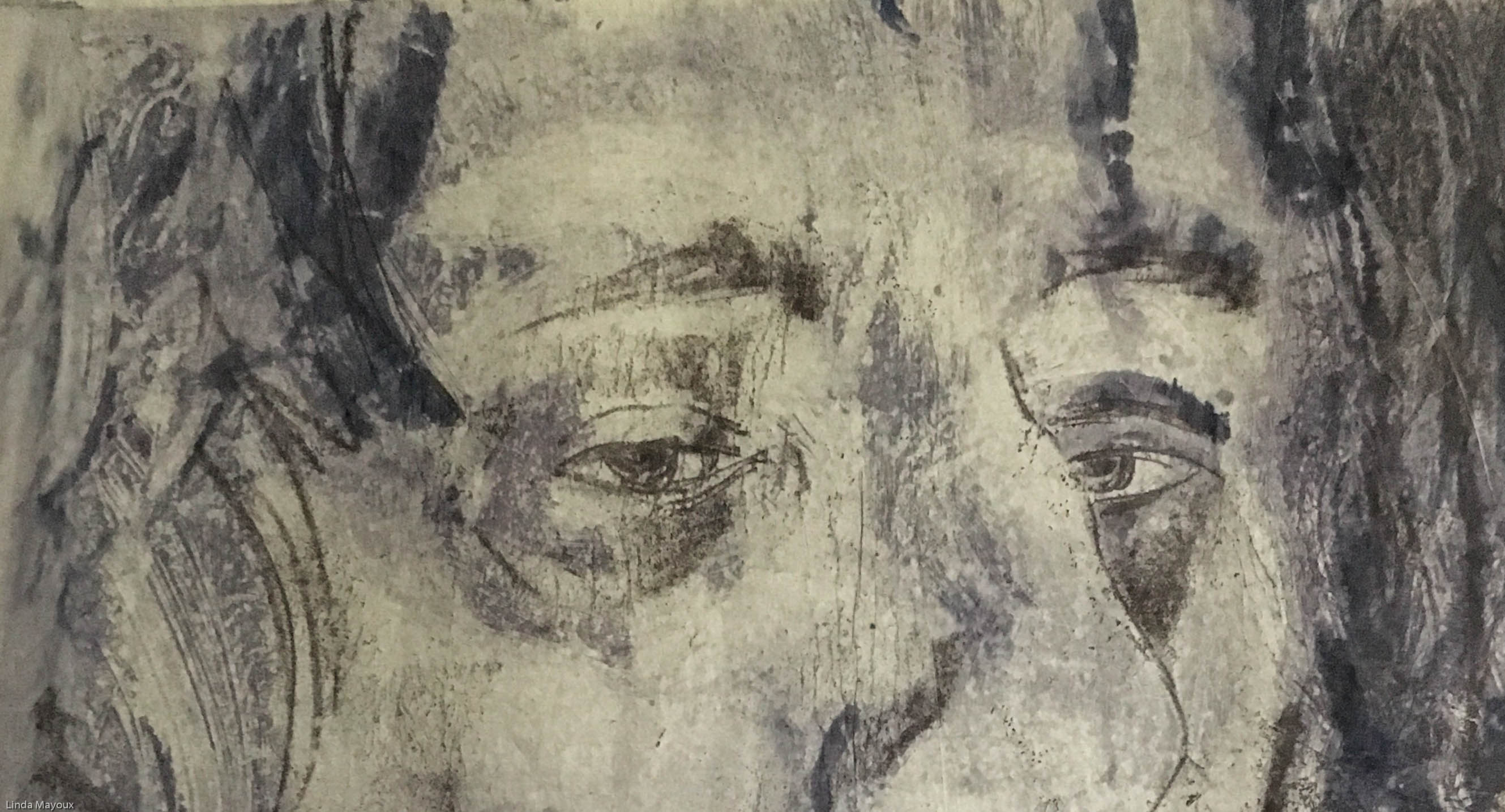
- ‘Self Image’ an A2 combination monoprint – backtracing on top of substractive ghost print using water-based Schminke ink on tissue paper. This ‘self image’ is a fairly accurate portrayal of the way I was feeling when I was working on this project. This was very much how I saw myself – even if others said (kindly?) that that is not how I look to them. It is large because I was totally self-obsessed. The lines and creases over the face, and the tightness of the lips are how I felt growing older – and meaner? Then the way the eyes are looking in slightly different directions – the eye at the front down and avoiding the viewers gaze. The eye at the back is the one that engages somewhat aggressively. The tissue paper is fragile, a layered mask.
- iPad Reflection an iPad-size Drypoint captures myself as I see myself chins and all distorted in the iPad screen, but also trying to capture something of my caring side’
- Mirror Image an iPad-size photolithography plate ready to print. Based on my first sketch was A3 white chalk on black from the mirror trying to get a subtle impression of movement and indeterminacy (a la Mona Lisa).
These prints are much more in a drawing than painting style. I was quite pleased with the drawings as capturing my facial expressions and some of the facets of my character just through the drawings of my face. The subsequent distortions and plays with the images was also potentially interesting, but maybe veering too much towards illustration caricature than actually reflecting ‘me’ and how I felt inside.
Experimentation
Approaches to drawing face


I looked at my more linear black and white life drawings.


Self Portrait 1: Mirror Reflection
This first portrait is based on a white chalk drawing on black paper – facing myself in the mirror. I was really trying to get an accurate portrait, and spent a long time on the eyes and mouth – constantly changing and adjusting to get a subtle impression of movement and indeterminacy (a la Mona Lisa). I did not include a background, because the background behind my mirror did not add anything, and because I was so self-absorbed in the observation of my face and drawing. Self-obsessed with appearance.

I thought this would make a good subtractive monoprint portrait – drawing compositional inspiration from self portraits by Kathe Kohlwitz, Marlene Dumas and Luc Tuymans. I was also inspired by some photolithograps by Norma Young at a workshop at Curwen Study Centre in 2017. And technical inspiration from the monoprints of Benedetto Castiglione.


But – following suggestion from my tutor – I decided to do some iPad size drypoints. These were not as successful as some of my other drypoints – although I really like the water-colour effect of the masking tape, the hair looks like a mummy cocoon and the face needs a lot more work.


My final version so far is a photolithography plate that I plan to print when I have access to a studio with the technical equipment.

Portrait 2: iPad reflection
Having done one frontal drawing I was wondering how I could vary the view, and thought of doing a portrait similar to the way I often see myself – distorted in video skype where the screen is too close. I took some photos on my iPad and then did a large A2 charcoal sketch from these. Some of the early ‘mistakes’ reminded me of some of the distorted self-portraits of Tracey Emin.
The final drawing I found quite effective – it captures the expression of my eyes when I am in a kind mood. I then photographed the sketch and experimented with different colours and tonal range using Pixelmator on my iPad. I thought this image was quite doable as a back-traced monoprint on for example newsprint. But might possibly be a bit boring.


In the end I decided to do these as drypoints – the most successful of the series. I think I manage to retain the expression of the eyes well, and I like the drawn effects.


Portrait 3: Self Image
The third portrait was another iPad view I often glimpse as I look down at the screen – the haughty aloof look. Reminiscent of some of the self-portraits of Egon Schiele, Ernst Heckel and Tracey Emin. I did another A2 charcoal sketch from the iPad photo. From this I experimented with back-traced monoprint and subtractive monoprint.


This latter I printed as a ghost print on tissue paper and really liked the wrinkled pinched appearance of this. I then added some stronger marks in back-traced monoprint in a slightly darker colour on top for the final combination print.

This ‘self image’ is a fairly accurate portrayal of the way I was feeling when I was working on this project. This was very much how I saw myself – even if others said (kindly?) that that is not how I look to them. It is large because I was totally self-obsessed. The lines and creases over the face, and the tightness of the lips are how I felt growing older – and meaner? Then the way the eyes are looking in slightly different directions – the eye at the front down and avoiding the viewers gaze. The eye at the back is the one that engages somewhat aggressively. The tissue paper is fragile, a layered mask.
I did two drypoints of the same image, but do not find these as interesting. I also printed the


Distortions like Tracey Emin in Pixelmator were quite fun as an alternative take. But although these were fun, and I could have used these for Drypoint, they really did not reflect how I myself was feeling as much as the large fragile and’crispy’ wrinkled monoprint.


Final reflections
I found it quite therapeutic in some ways to sit in front of mirror drawing myself – trying to get the mouth and eyes ‘right’. But I also found it a bit stressful because I had to look very closely at myself and think about exactly what I was trying to say. I was very self-obsessed at the time. The self portraits were all about my inner thoughts and appearance to the outside world. I decided not to include objects of a background – partly because this was the subject of Assignment 3. But mostly because I was looming large and not really looking outside myself.
These prints are much more in a drawing than painting style. I was quite pleased with the drawings as capturing my facial expressions and some of the facets of my character just through the drawings of my face. The subsequent distortions and plays with the images was also potentially interesting, but maybe veering too much towards illustration caricature than actually reflecting ‘me’ and how I felt inside.