

Rosie is from Dartmoor in Devon. She grew up doing lots of writing, running and drawing of the moors. Likes knitting and painting landscapes.
When I met her as model at a life drawing day she had just finished a degree in Spanish and Latin American Studies. She was about to go to Los Angeles and planning to emigrate to US – Trump permitting.
Overview and assessment
The collaged monoprint portraits originated in an expressionist oil pastel life drawing. This assignment was initially intended to be the portrait of a friend – from life or from photos or a portrait from a magazine or newspaper. But as I wanted to work from my own sketches and photos, I decided to use models from a local life drawing day. Like most of the models in life drawing sessions, Rosie was not someone I knew well, but , but someone I met briefly in a fairly formal setting. I had a brief opportunity to talk to her over lunch – but was conscious also of her need to rest.
The thing that struck me most was her eyes and gaze – someone I found interesting and would have liked to get to know more – a mystery. So the portrait, although based on drawings and photos, became my own construction of her narrative – Rosie as I imagined her to be based on first impressions – a young woman about to set out on a new journey. But aware of the challenges, still vulnerable and somewhat anxious underneath about whether she would succeed and the wider political situation and context.
Clearly the portrait also says more about myself that Rosie – looking back at the time when I had just graduated and setting out travelling. And also the mystique of short encounters with people with similar views who one is unlikely to meet again.
- Rosie in Red and White drawing on Frida Kahlo and also the vibrant colours of Salgado presents Rosie as boldly looking forward, imagining gleaming ‘white-washed’ American Dream skyscrapers of Los Angeles. I like the colour intensity, and the facial distortion enlarging the right side of her face is deliberate to increase the sense of power. I like the cut out cartoon effect – reminiscent of Roy Lichtenstein – maybe it is all too good to be true.
- Rose in Green and Red is much more whistful and diffident -is the brilliant background is a new dawn or LA burning under Trump? I like the softness of the marks and lines from the ink on pastel paper, and the accidental smudged indefiniteness of the mouth.
But the series takes a conventionally ‘classical’ approach – the pose was determined partly by the mostly classical poses of the life drawing class. I could however have done smaller sketches from less conventional viewpoints, rather than my usual approach of drawing large on an easel that entails a certain eye-level.
Technically I was aiming at a painterly approach – using similar methods to Degas’ monoprints and inspired by painters like Andre Salgado and Jenny Saville. But I got rather bogged down in technique. A first completely unsuccessful image in yellow and blue I discuss below. The portraits also lack the depth of narrative that would have been possible with someone I knew well or was able to collect background information about from secondary sources.
Comparing these prints with painting, although the monoprint technique with water-based paints is ‘painterly’ and uses different types of brushes and mark-making and the collaging could equally be done with paintings:
- in printmaking what is on the plate is what is printed and is difficult to erase or eliminate. Not only is it very difficult to do precise over-painting to change an image to correct it. It is also difficult to do multiple overlays of paint to get the type of subtle lack of definition in Mona Lisa’s smile , or to portray constantly shifting movement over time as for in the portraits of Jenny Saville.
- there is an inherent unpredictability – as with the water-based inks in Assignment 1 Willows – about what of the image on the plate will actually print. ‘What you see is often not at all what you get’.
- this unpredictability can sometimes produce unexpected strength of expression in a way that might not occur with a more planned controlled painting technique – for example some of the delicacy of the marks in Rosie in Green and Red.
Inspiration
The portraits – like the original pastel portrait – were inspired by:
- Fauvist and expressionist paintings: see Expressionism: woodcuts and paintings
- The fiercely proud self-portraits of Frida Kahlo
- The colourful portraits of Andrew Salgado from an exhibition of his work at Canadian Embassy in London
- Roy Lichtenstein’s pop art images of the American Dream
- I later realised that much of my approach draws conventionally on da Vinci’s Mona Lisa, and started to reflect why this was.
Development of the Image
Pastel drawing and crops
The original pastel drawing was influenced by Degas impressionist interest in light. The pose is deliberately looking into the distance and not at the viewer. Although this was partly determined by the life drawing poses the other artists requested and because direct and prolonged eye contact would have been inappropriate in this context. But it also accentuated the idea of unknowability as well as her own indeterminacy about the future. I chose the dark blue background primarily to contrast with the light on the figure. But it also increases a sense of mystery.


With Rosie’s permission I also took some photos for reference.
I originally thought of doing the image as a 3-plate woodcut or screenprint. I did some digital colour and cropping experimentation on my iPad overlaying the original pastel drawing on my iPad.


Of these I think images 2 and 9 are the most effective. But I then decided that I wanted to try something new, rather than do an image similar to the linocut in Project 3.1 Leon or too closely following Andy Warhol.
Oilpaint Monoprint experiments
I went back to the original concept of my drawing and decided to take a more painterly approach, based partly on Degas oil paint monoprints and the experience I had started to develop with water-based inks in Assignment 1 Willows.
As the project asked me to do three different colours interpretations I decided to base these partly on fauvist painters like Derain and Jawlensky to explore the emotional impacts of colour in portraits. For a fauvist effect I wanted a coloured background and started to experiment using coloured pastel paper.


This proved quite a difficult technique because, particularly as pastel paper is quite absorbent, it was difficult to predict which parts of the paint would print and which would not, particularly in hot weather. Even using Holbein water-soluble oil paints on damp paper. But I quite liked the somewhat haphazard and soft textures – much less sharp than printing on a printed colour background. I decided to persevere with the approach, adding pastel as Degas himself had done. Then I tried collaging together the most successful parts of the prints into one image and liked the aesthetic of the cut-out line and stronger contrast between the figure and background.
Portrait 1: Rosie in Blue and Yellow
The first colour composition I tried was based largely on the lemon yellows and blue background of the original drawing and although, unsuccessful, the challenges helped me to develop the technique used in the other images . This image was more difficult than the others because of the strong contrast between the colours, accentuating the technical unpredictabilities of the technique. I could not get the colours to work and in the end decided to try using pastel. I was also not happy with that, and started to cut out and collage the bits I liked to see if things could work that way. I found that collaging the blue figure with a yellow background of another unsuccessful print had much more impact. Though the actual portrait was much too ‘sweet’. I have omitted it from the portfolio.


So I did a new portrait with a more angular style and collaged this onto the background of an unsuccessful yellow portrait. But although this is an improvement, it still does not work. So I gave up with these colours and omitted this print from my final submission (it is relegated to my Sketchlog).
Portrait 2 Rosie in Red and White
The second portrait I wanted to make more fiery and determined – on red paper. This portrait was inspired by the use of vibrant colours like greens and turquoise by Andrew Salgado. Following the earlier collage idea I decided to use the original background to the red image for Portrait 3. Adding the white background from an unsuccessful portrait on white paper gives a much more contrasting image – a warm portrait against the cold purity of the city. I think aesthetically this is an interesting image – with its white-washed American Dream and Roy Lichtenstein-like cartoon effect.


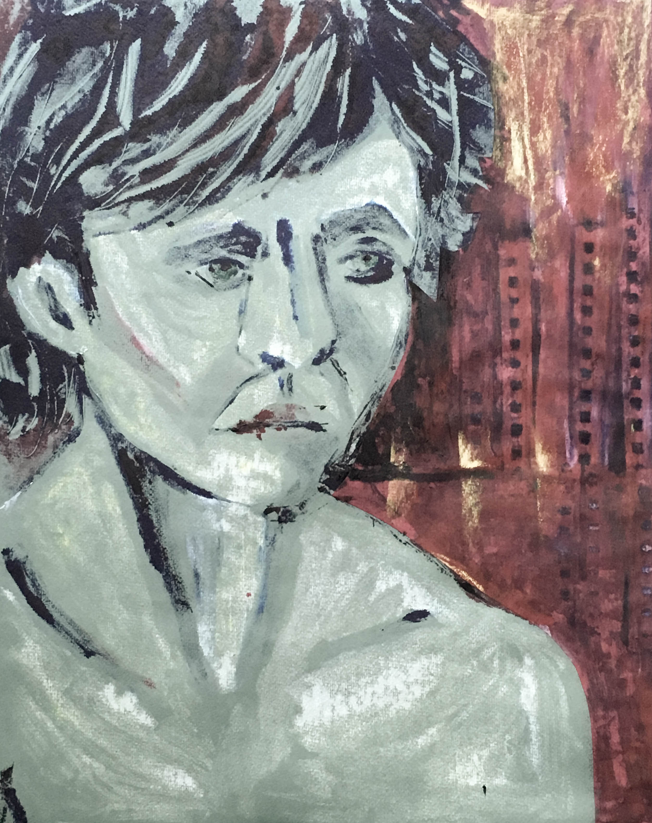
Portrait 3 Rosie in Green and Red
The final image was the first portrait where the monoprint was quite successful without any pastel – I liked the delicate whistfulness of the paint marks. Although the original portrait worked quite well, the background was a bit pale. In order to make the portrait fit with the rest of the series I collaged the burning red background from the original Rose in red. The whistfulness of the face now becomes more meaningful – is Los Angeles on fire with a new dawn. Or burning because of Trump who may not let Rosie stay?


Other life drawings that were considered


Final Reflections
The series takes a conventionally ‘classical’ approach – the pose was determined partly by the mostly classical poses of the life drawing class. I could however have done smaller sketches from less conventional viewpoints, rather than my usual approach of drawing large on an easel that entails a certain eye-level.
Technically I was aiming at a painterly approach – using similar methods to Degas’ monoprints and inspired by painters like Andrew Salgado and Jenny Saville. But I got rather bogged down in technique. A first completely unsuccessful image in yellow and blue I discuss below. The portraits also lack the depth of narrative that would have been possible with someone I knew well or was able to collect background information about from secondary sources.
Comparing these prints with painting, although the monoprint technique with water-based paints is ‘painterly’ and uses different types of brushes and mark-making and the collaging could equally be done with paintings:
- in printmaking what is on the plate is what is printed and is difficult to erase or eliminate. Not only is it very difficult to do precise over-painting to change an image to correct it. It is also difficult to do multiple overlays of paint to get the type of subtle lack of definition in Mona Lisa’s smile , or to portray constantly shifting movement over time as for in the portraits of Jenny Saville.
- there is an inherent unpredictability – as with the water-based inks in Assignment 1 Willows – about what of the image on the plate will actually print. ‘What you see is often not at all what you get’.
- this unpredictability can sometimes produce unexpected strength of expression in a way that might not occur with a more planned controlled painting technique – for example some of the delicacy of the marks in Rosie in Green and Red.