


I have explored many different types of paper – effects of the same printing plate vary significantly between for example:
- different colours and qualities of printmaking paper (Project 1.1 A Landscape in Waiting and Project 3.1 Leo)
- hot and cold-pressed watercolour paper of different weights (Assignment 1: Willows)
- cartridge drawing paper (Assignment 2: Human Condition)
- Japanese thin and thick papers (Assignment 3: Mushrooms)
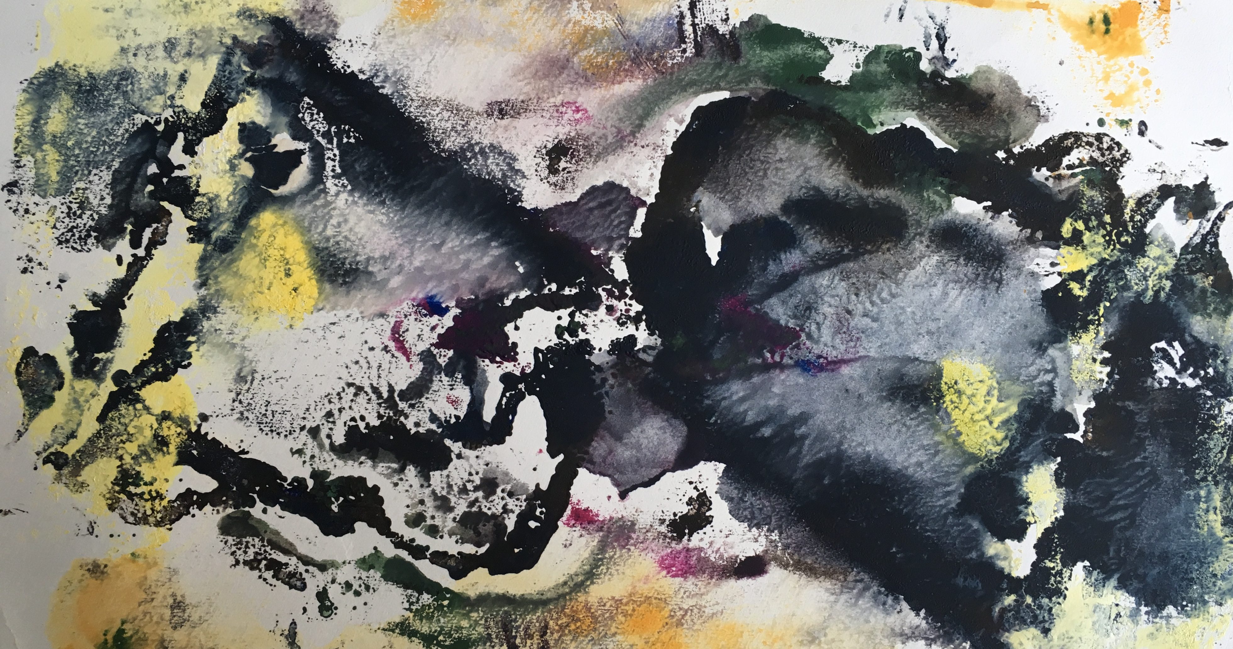
- newsprint (Assignment 4: Life in Red White Black and Project 5.2: Edge of Nightmare)
- tissue paper (Project 4.2 Self Image July 2018)
The ways in which different types of paper absorb the ink also depends on:
- the type of ink
- how dry/activated the ink is
- how wet or damp the paper is
- pressure and type of press/handprinting
In general thin papers are much more responsive to sensitive hand printing, high quality printmaking papers retain more fine detail.
There are a much wider range of papers to explore than those I have experimented with so far. Some of those listed below would be particularly interesting for texturing in combining printmaking with digital techniques.
Paper types
Paper can be produced with a wide variety of properties, depending on its intended use:
- Printing papers of wide variety. This includes book paper, cartridge paper, newsprint, rice paper, silk paper, rag paper, cotton paper.
- Writing paper suitable for stationery requirements. This includes ledger, bank, and bond paper.
- Blotting papers containing little or no size.
- Photography papers: matt, glossy and silk
- Inkjet art papers
- Drawing papers usually with rough surfaces used by artists and designers including Bristol Board, thick ink papers, pastel papers, graph and isometric paper, construction paper, sugar papers, papers for oil pastel, Moleskin sketch papers, tracing papers
- Painting papers eg watercolour
- Printmaking papers for use in a printing press or for hand printing. This includes Japanese hosho and washi papers, Chinese xuan papers and high end machine-made papers like Somerset white and Arches.
- Handmade papers including most decorative papers, Ingres papers, Japanese paper and tissues, all characterized by lack of grain direction.
Other surfaces that can be used for printing, bookmaking and collage include:
- Industrial papers including cigarette paper, grease and waterproof paper, toilet tissue, sandpaper, emery paper, fish paper (vulcanized fibres for electrical insulation), litmus paper, universal indicator paper, paper chromatography, and filter paper.
- Wrapping papers for the protection of goods and merchandise. This includes wax and kraft papers, glossy gold and silver papers, corrugated box paper, brown paper, paper bag, envelopes, paper string.
- Construction papers: papier-mâché, origami, paper planes, quilling, paper honeycomb, used as a core material in composite materials, paper engineering, construction paper and paper clothing
- Wallpaper
- Sellotape and masking tape
- Foil like aluminium and other types of be pained on and distressed
- Cards and cardboard: Card and paper stock for crafts use comes in a wide variety of textures and colors.
- Canvases, linen and wove paper
- Plastic sheets: drypoint sheets, OHP slides
- Cleaning papers: toilet paper, handkerchiefs, paper towels, facial tissue and cat litter.
??
Banana paper
Leather paper
Mummy paper
Oak Tag Paper
Tyvek paper
Paper characteristics
Paper is usually described by its size, weight, finish and stability. The kind of stock you choose will be informed by the nature of the job you’re doing.
Paper sizes
Weight, bulk and thickness
weight: Expressed in grammes per square metre (g/m2 or usually just g) of the paper. 50g is very light. Printing paper is generally between 60g and 120g. Standard photocopying paper is usually 80gsm. Anything heavier than 160 g is considered card. 240g upwards are heavy papers. A brochure would havepages of 100 or 130gsm and a cover of 250 or 350gsm.
bulk: The thickness of paper is often measured by caliper, which is typically given in thousandths of an inch in the United States and in thousandths of a mm in the rest of the world. Paper may be between 0.07 and 0.18 millimetres (0.0028 and 0.0071 in) thick.
Surface characteristics
Textured finishes, watermarks and wire patterns imitating hand-made laid paper can be created by the use of appropriate rollers in the later stages of the machine.
Wove paper does not exhibit Handmade paper similarly exhibits “deckle edges”, or rough and feathery borders.
grain : The fibres in the paper run in the machine direction. Sheets are usually cut “long-grain”, i.e. with the grain parallel to the longer dimension of the sheet.
‘laidlines’ : “Laidlines” are small regular lines left behind on paper when it was handmade in a mould made from rows of metal wires or bamboo. Laidlines are very close together. They run perpendicular to the “chainlines”, which are further apart.
All paper produced by paper machines as the Fourdrinier Machine are wove paper, i.e. the wire mesh that transports the web leaves a pattern that has the same density along the paper grain and across the grain.
texture : cold-pressed, hot-pressed, handmade
opacity : linked to weight. tissue paper vs very thick papers.
finish: paper can be finished in many different ways; for example, gloss paper is highly finished with a shiny texture, silk paper is smooth. If you want a totally matt paper (often used for forms as it is easier to write on and for an ‘arty’ finish) you would probably use a cartridge paper.
surface coating : Coated paper has a thin layer of material such as calcium carbonate or china clay applied to one or both sides in order to create a surface more suitable for high-resolution halftone screens. (Uncoated papers are rarely suitable for screens above 150 lpi.)
Coated or uncoated papers may have their surfaces polished by calendering.
Coated papers are divided into matte, semi-matte or silk, and gloss. Gloss papers give the highest optical density in the printed image.
colour : Paper can be dyed to any colour, but professional printing is always done on white stock.
absorbency : affects spread of ink and effects of using water-based effects. linked to sizing and coating.
Stability over time is affected by:
pHvalue: acidity/alkalinity:
- wood pulp paper: Alum (a variety of aluminium sulfate salts) was added in significant amounts to early wood pulp paper to assist in sizing – making it somewhat water resistant so that inks did not “run” or spread uncontrollably. However the cellulose fibres that make up paper are hydrolyzed by acid and eventually degrade until the paper disintegrated in a process that has come to be known as “slow fire”.
- rag paper: documents written on rag paper were significantly more stable.
- The use of non-acidic additives to make paper is becoming more prevalent, and the stability of these papers is less of an issue.
lignin/bleach
Paper made from mechanical pulp contains significant amounts of lignin, a major component in wood. In the presence of light and oxygen, lignin reacts to give yellow materials, which is why newsprint and other mechanical paper yellows with age.
Paper made from bleached kraft or sulfite pulps does not contain significant amounts of lignin and is therefore better suited for books, documents and other applications where whiteness of the paper is essential.
Paper made from wood pulp is not necessarily less durable than a rag paper. The ageing behavior of a paper is determined by its manufacture, not the original source of the fibres. Furthermore, tests sponsored by the Library of Congress prove that all paper is at risk of acid decay, because cellulose itself produces formic, acetic, lactic and oxalic acids.
When sending to a commercial printer you need to check paper quality – the weight and finish of the paper – with your client. Most printers can give you a swatch of the papers they recommend for you to share with your client and keep for future reference.


")


