Schminke water-based inks are the first inks I ever used. They are artist-quality linoprint inks, made with high-quality organic and inorganic pigments on a gum arabic base. They have good lightfastness (at least 4-5 stars). They dry within 15 minutes to be wipe-proof but not waterproof and can be overprinted if necessary. There are 15 colours and 3 effect colours.
They can be used for:
linocut: the fast-drying time means they can be quickly overprinted and give a sharp line
monoprint: being water-based, they are also diluted with water which can produce very beautiful water-colour effects on monoprint. They can also be laid onto softfoam and keep their texture well when used with a palette-knife.
In-depth video on history and development of techniques of Japanese woodcut from monochrome through painted monochrome prints to multiblock printing. It looks at its influence on Western artists like Van Gogh and Monet following the exhibition of Japanese art for the first time at the Paris Exhibition of 1867. It also looks at the modern day revival of ukiyo-e prints as paintings on shops in Tokyo regeneration.
Japanese woodblock prints with Paul Binnie
Lecture on background and underlying ideas in Japanese printing techniques.
Japanese woodblock printing History Ukiyo-e Jose Ortega
History of Japanese printing and way it spread and related to earlier Chinese and Buddhist prints.
Technique
The technique for printing texts and images was generally similar. The obvious differences were the volume produced when working with texts (many pages for a single work), and the complexity of multiple colours in some images. Images in books were almost always in monochrome (black ink only), and for a time art prints were likewise monochrome or done in only two or three colours.
The text or image was first drawn onto washi (Japanese paper), then glued face-down onto a plank of wood, usually cherry. Wood was then cut away, based on the drawing outlines. A small wooden hard object called a baren was used to press or burnish the paper against the inked woodblock to apply the ink to the paper. Although this may have been done purely by hand at first, complex wooden mechanisms were soon invented and adopted to help hold the woodblock perfectly still and apply proper pressure in the printing process. This was especially helpful with the introduction of multiple colours that had to be applied with precision over previous ink layers.
While, again, text was nearly always monochrome, as were images in books, the growth of the popularity of ukiyo-e brought with it demand for ever increasing numbers of colors and complexity of techniques. The stages of this development follow:
Sumizuri-e (墨摺り絵?, “ink printed pictures”)—monochrome printing using only black ink
Benizuri-e (紅摺り絵?, “crimson printed pictures”)—red ink details or highlights added by hand after the printing process;green was sometimes used as well
Tan-e (丹絵?)—orange highlights using a red pigment called tan
Aizuri-e (藍摺り絵?, “indigo printed pictures”), Murasaki-e (紫絵?, “purple pictures”), and other styles in which a single color was used in addition to, or instead of, black ink
Urushi-e (漆絵?)—a method that thickened the ink with glue, emboldening the image. Printers often used gold, mica, and other substances to enhance the image further. Urushi-e can also refer to paintings using lacquer instead of paint. Lacquer was rarely, if ever, used on prints.
Nishiki-e (錦絵?, “brocade pictures”)—a method of using multiple blocks for separate portions of the image, using a number of colors to achieve complex and detailed images. A separate block was carved to apply only the part of the image designated for a single color. Registration marks called kentō (見当) were used to ensure correspondence between the application of each block.
Contemporary Japanese woodblock
Katsutoshi Yuasa
Keizaburo Matsuzaki
Bibliography
Clark, T. (ed.) (2017) Hokusai: Beyond the Great Wave, London: Thames & Hudson and British Museum.
Pollard, C. & Watanabe, M. I., (2014) Hiroshige: Landscape, cityscape, Oxford: Ashmolean Museum.
Schroer, A. (ed.) (2005) Hiroshige, Berlin, Munich, London, New York: Prestel.
Schroer, A., (ed.) (2005) Hokusai, Berlin, Munich, London, New York: Prestel.
Exhibitions
Hokusai: Beyond the Great Wave (25 May – 13 August 2017)
From these I did a first series of prints using mostly foamboard. I found that when I tried to combine foamboard and softfoam it was difficult to register the image because softfoam changes size quite dramatically when it goes under the press. It is also difficult to draw on first because it is so soft so the slightest mark will show. The main technique that is possible is to start with softfoam and then do a print onto the foamboard. Then work with the foamboard making marks where needed from the impression. Then clean the ink off before re-inking. But it still only works if you do hand printing, if you want to use the softfoam again. It also only really works with water-based inks that dry quickly and rather unpredictably.
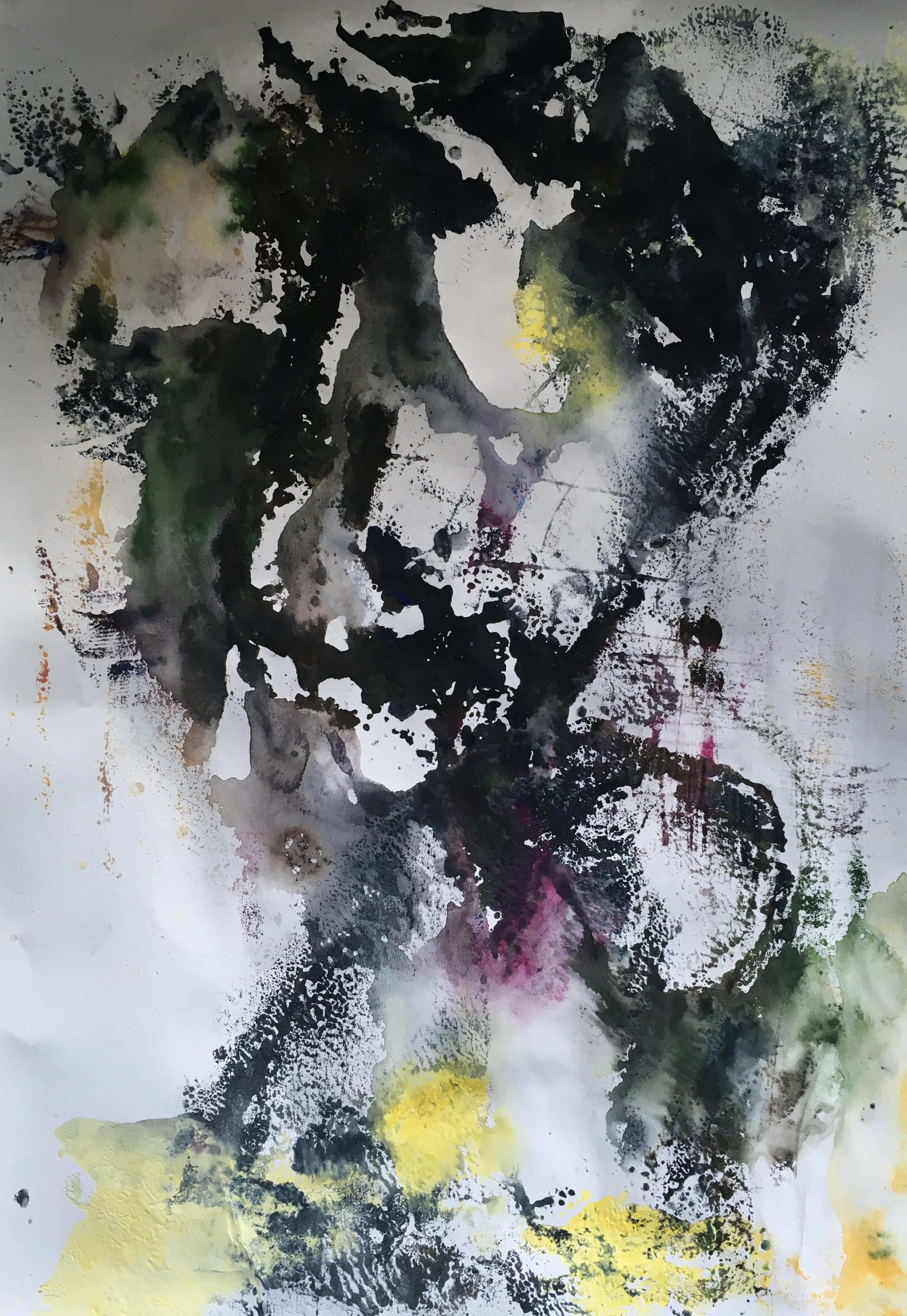
I also found using too many colours made things very messy – as this was a colour project, I decided to simplify things and use only softfoam. I found that when I cropped the prints below, some of them made more effective images – inspiration for further prints later. It would have been difficult to predict the effect through thumbnails because so much depended on the precise effects of the ink. It is very difficult to see where the ink is drying more quickly and so what prints and what does not – part of the joy but also frustration of the medium. These were the prints I sent to my tutor. But I was not very happy with them – more a work in progress to continue later than anything finished.
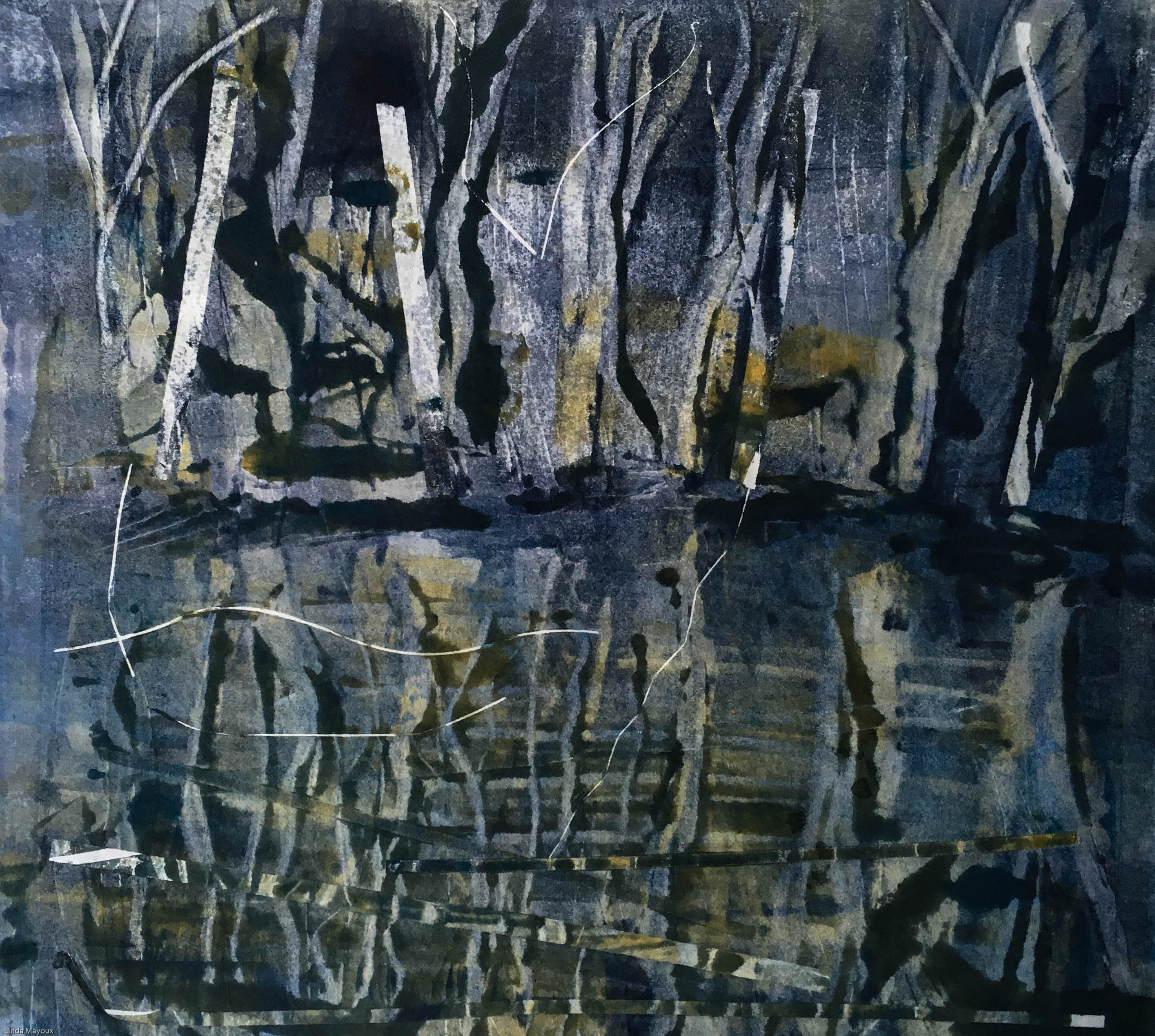
Stepping Stones
So I started again with a different set of sketches, again based on a photo. I used only foamboard and a limited palette, building up the tonal colours. I continued to use Caligo water-based ink but I chose to work with thin Hosho paper to increase the misty effect and also to make sensitive hand-printing easier.
Because this was a series and I was using only one plate, I chose my colours and sequencing very carefully – starting with yellow ochre and brown, then going to blue. I was also able to alter my wiping out and some of the details as I progressed. But how much the ink was drying and where as I worked remained a bit upredictable.
I first used it for the Japanese landscape series ‘Stepping Stones’ in Printmaking 1. I really like the hazy effects.I used one softfoam plate inking several sheets with the same layer, but re-inking with different shades of a similar colour – starting with yellows then going to browns and then blues to produce a range of different prints. Although using softfoam in this way limits the amount of colour contrast that is possible, it does build up beautiful subtle tone and colour variation.
The focus of the assignment was on contrasting markmaking – I combined wiping out for the stones, scratching out with a screwdriver for the bamboos. I also used a drypoint tool on its side and with its point to get a range of different marks. A key issue though was how to make the stones recede into the background through making the outlines and contrast reduce in sharpness towards the back. I managed to achieve a range of dramatic contrasts in the marks from soft edged stones to very fine lines and bold sweeping lines.
Carborundum printmaking is a printmaking technique in which the image is created by adding light passages to a dark field to create gradients of tone and a sandy texture. . It can be used on its own as a collagraph plate, or in combination with other techniques on any plate to which it can be made to adhere eg combined relief and/or intaglio collagraph plates (as in the feature image to this post), also drypoint and woodcut.
Carborundum was originally used by printmakers to grind down lithography stones. It works because when the carborundum adheres to the plate the ink sits around it. The grit is available in several grades – fine, medium and coarse – each giving different effects.
Bibliography of sources consulted:
Stobart, J., (2001) Printmaking for Beginners, London, A&C Black.
Preparing the plate
Normally, cardboard or wood plates are coated in a layer of carborundum or screen, and the lights are created by filling in the texture with screen filler or glue. The carborundum grit can be applied in a number of different ways:
Painting onto the plate with a liquid glue and then sprinkling the carborundum onto it
Mixing different amounts of glue with it and then painting them on in sections, the more grit used the darker. Example: one spoon of carborundum to five spoons of glue will be much lighter than five spoons of carborundum to five spoons of glue.
Using stencils to apply the glue and sprinkling different amounts of carborundum through the different stencils.
Using any of the above, then scratching into the plate and textures with a drypoint needle or other instrument.
Printing the plate
Carborundum prints may be printed as intaglio plates. To print a carborundum print, the surface is covered in ink, and then the surface is wiped clean with tarlatan cloth or newspaper, leaving ink only in the texture of the screen or carborundum. A damp piece of paper is placed on top, and the plate and paper are run through a printing press that, through pressure, transfers the ink from the recesses of the plate to the paper.
Very large editions are not possible as a small amount of carborundum comes off every time it is wiped down.
Screen printing is a printing technique whereby a mesh is used to transfer ink onto a substrate, except in areas made impermeable to the ink by a blocking stencil.
I used screenprinting as a supporting technique in:
There are various terms used for what is essentially the same technique. But they all have the following in common:
Use of a frame (generally wood or aluminium) on which a mesh is mounted under tension. The mesh can be of different types: eg silk, polyester, nylon or metal and of varying degrees of fineness depending on the type of surface to be printed.
A stencil is formed on the mesh by blocking off parts of the screen in the negative image of the design to be printed; that is, the open spaces are where the ink will appear on the substrate. The stencil can be made through different techniques: direct stencils made with photoscreen techniques or using masking solutions and indirect stencils used as masks.
Mesh/frame preparation: The surface to be printed (commonly referred to as a pallet) is coated with a wide ‘pallet tape’ to protect the ‘pallet’ from any unwanted ink leaking through the screen and potentially staining the ‘pallet’ or transferring unwanted ink onto the next substrate. Next, the screen and frame are lined with a tape. The type of tape used in for this purpose often depends upon the ink that is to be printed onto the substrate. These aggressive tapes are generally used for UV and water-based inks due to the inks’ lower viscosities. The last process in the ‘pre-press’ is blocking out any unwanted ‘pin-holes’ in the emulsion. If these holes are left in the emulsion, the ink will continue through and leave unwanted marks. To block out these holes, materials such as tapes, speciality emulsions and ‘block-out pens’ may be used effectively.
A blade or squeegee is moved across the screen to fill or ‘flood’ the open mesh apertures with ink, and a reverse stroke then prints the image as the screen touches the substrate momentarily along a line of contact. This causes the ink to wet the substrate and be pulled out of the mesh apertures as the screen springs back after the blade has passed.
One colour is printed at a time, so several screens are layered to produce a multicoloured image or design. Hinge clamps keep the screen in place for easy registration
Bibliography
Adam, R. & Robertson, C., (2003) Screenprinting: the complete water-based system, London: Thames & Hudson.
Barker, D., Traditional Techniques in Contemporary Chinese Printmaking, London: A & C Black.
D’arcy Hughes, A. & Vernon-Morris, H., (2008) The Printmaking Bible: the complete guide to materials and techniques, San Francisco: Chronicle Books.
Grabowski, B. & Flick, B., (2009) Printmaking: A Complete Guide to Materials and processes, London: Lawrence King Publishing.
Griffiths, A., (1980) Prints and Printmaking: An introduction to the history and techniques, London: British Museum Press.
Martin, J., (1993) The Encyclopedia of Printmaking Techniques, London: Quarto Publishing.
Pogue, D., (2012) Printmaking Revolution : new advancements in technology, safety and sustainability, New York: watson-guptill publications.
Stobart, J., (2001) Printmaking for Beginners, London: A&C Black.
Stromquist, A., (2004) Simple Screenprinting: basic techniques and creative projects, New York: Lark Books.
Woods, L., (2011) The Printmaking Handbook: Simple techniques and step-be-step projects, London: Search Press.
Video Tutorials
Overview
!!
11
11
11
!!
Speedball Art
Screen Printing Products
How to Use Speedball Screen Print Materials
Stencils
Cut paper
Drawing Emulsion
Drawing fluid
Drawing fluid
Drawing fluid
Photo
Artists
Andy Warhol
Will Kuhlke
Oli Fowler
Barton
Catspit
Monoprint screenprints
Poster Art
Valdez
!!
!!
https://www.youtube.com/watch?v=adMYcD7lScQised’ area of varnish is created. When cured at the end of the process, the varnish yields a Braille effect, hence the term ‘High Build’.
References
Adam, R. and C. Robertson (2003). Screenprinting: the complete water-based system. London, Thames & Hudson.
Grabowski, B. and B. Flick (2009). Printmaking: A Complete Guide to Materials and processes. London, Lawrence King Publishing.
Pogue, D. (2012). Printmaking Revolution : new advancements in technology, safety and sustainability. New York, watson-guptill publications.
Stromquist, A. (2004). Simple Screenprinting: basic techniques and creative projects. New York, Lark Books.
Williamson, C. (2011). Reinventing Screenprinting. London, A&C Black.
She has a studio in Cottenham in the Cambridgeshire Fens.
My prints explore the notion of time and landscape through a contemplative exploration of surface. The sources of my prints can come from working in the open air or expressing landscape filtered through memory…I am captivated by the ancient semi-natural landscapes typical of my native west Cornwall where a blurred line exists between nature and human activity. Recent works of the Fens focus on the meeting point of land, horizon and sky, their flatness altering the perception of distance. ‘
From interview with Iona in Cambridge 4th Feb 2017:
Her landscapes have a strong geometric structure of contrasting colours and textures. She mainly uses a combination of carborundum, drypoint and monoprint techniques. A mix of a binder (polyurethane varnish) and carborundum grit is applied onto the surface of a plate and sealed with the same varnish. The binder has to withstand a lot of working but should not be so thick as to hide the grit texture of the carborundum. To contrast the carborundum, drypoint is added to produce an incised line. The plate is then inked up using etching ink and copperplate oil with a brush or roller.
Originally she worked in black and white. Now she also works in colour from memory and notes. Colour is built up by layering carborundum plates or more often overlaid though monoprint. Dry ink can be added as a third pass. Ink can be laid on thickly for more embossing. She can use the same base plate but with different seasons. Editions of 40. Or 10-15. She gets commissions where people ask for specific colours.
The technique allows working directly in the landscape to paint on the carborundum and the drypoint plates, and large images can be produced. She prints on thick Somerset paper, printing to the edge of the paper to “leave the composition as unconstrained as the landscapes from which I seek inspiration”. She mounts with nonreflective glass.
Lithography is a planographic process based on the principle that oil and water do not mix. It uses a chemical process on a plate to form:
printing areas that are oleophilic (oil-loving)/ hydrphobic (water-rejecting)
non printing areas that are oleophobic (oil-rejecting)/ hydrophilic (water-loving)
Plates are of different types: generally prepared lithographic stones, aluminium photo lithographic plates but in ‘kitchen lithography’ can also use aluminium foil. Through sponging and keeping the plate wet and then rolling ink on top, the ink adheres only to the water-rejecting areas.
Lithographic inks and crayons can produced a wide range of very interesting textured and water-colour-type effects, close to drawing or painting on paper. Single plates can be monochrome, or use rainbow rolling techniques. For truly multi-colour prints separate plates are prepared for each colour and overprinted.
The process is quite difficult and time-consuming, requiring a lithography press because of the thickness of the stone. But corrections can be made through stopping out with acetone. Great care mush be taken with the press because unevenness can cause parts of the image to be missed – this can be corrected through adding packing.
Stone lithography plate
Mark-making with lithographic inks and tusche
Finishing the plate with scrim
Stopping out mistakes
indentation on the lithography press leaves blank area
See You Tube tutorials below
Photolithography
I started to explore photolithography for tonal textures in Assignment 1 Willows
This is an easier process that produces plates that can be printed on an etching press. But a special exposure unit is needed to produce the plates.
Willow photolithograph 3
Willow photolithograph 2
Willow photolithograph 1
Self Portrait: Mirror Image
Self Portrait 2
Self Portrait 3
Bibliography
D’arcy Hughes, A. & Vernon-Morris, H., (2008) The Printmaking Bible: the complete guide to materials and techniques, San Francisco: Chronicle Books.
Grabowski, B. & Flick, B., (2009) Printmaking: A Complete Guide to Materials and processes, London: Lawrence King Publishing.
Griffiths, A., (1980) Prints and Printmaking: An introduction to the history and techniques, London: British Museum Press.
Lloyd, R., (2014) Hockney Printmaker, London: Acala Arts & Heritage Publishers Ltd.
Martin, J., (1993) The Encyclopedia of Printmaking Techniques, London: Quarto Publishing.
Meyrick, R., (2013) Sydney Lee Prints: A Catalogue Raisonnee, London: Royal Academy of the Arts.
Pogue, D., (2012) Printmaking Revolution : new advancements in technology, safety and sustainability, New York: Watson-Guptill publications.
Porzio, D. (ed.) (1982) Lithography: 200 years of art, history & technique, London: Bracken Books.
Salamon, F., (1972) The History of Prints and Printmaking from Durer to Picasso: A guide to collecting, New York, Sat Louis, San Francisco: American Heritage Press.
Stobart, J., (2001) Printmaking for Beginners, London: A&C Black.
Woods, L., (2011) The Printmaking Handbook: Simple techniques and step-be-step projects, London: Search Press.
A succinct overview of markmaking and the lithographic process.
Another good overview with different types of markmaking
Kanemitsu
Canadian artists
Photolithography
Printing
Waterless lithography
Uses metal plate, waterbased drawing media, paint thinner and silicon, with gum-based inks.
Paper lithography
Kitchen lithography
Uses aluminium foil, some sort of grease for drawing and cola to etch.
This is a very simple process. But not clear what the grease is – vaseline? Soap? But I really like the zen/manga-like energy of the bold brush line.
This version looks more complicated in that it sands and dusts the plate. The look is more craftsy, using lithograph crayons. But because the etch is much cruder the crayons do not seem to have the same artistic subtlety as they do in stone lithography.