Some key considerations in landscape composition are:
what shape is the picture? 19C conventions were usually landscape format with broad vistas. But some late 19C landscapes and also earlier drawings were much more focused on particular elements in portrait format eg trees. Japanese and Chinese landscapes were also often vertical. There can also be very long thin panoramas, or tall thin verticals also.
what sort of terrain is depicted? 19C conventions and also Chinese and Japanese landscapes were concerned with mountains, trees, flat fields, sky, water, river. Sometimes cottages, houses, castles.
what is in it? Are there people? 19C conventions and before generally used landscape as a backdrop to religious or historical paintings. ‘Landscape paintings’ in both Western and Asian traditions generally had one or two people or a small group of people dwarfed by the natural elements. Sometimes they are excluded altogether eg Monet’s waterlillies and abstract landscapes like Richter.
how are the subjects arranged? According to rule of thirds composition. Pleasing. But might have high, low or central horizons, and diagonals and triangular relationships or swirling circles.
how might you describe the ‘mood‘ of the picture. Awestruck, calm, Turner’s turbulence. David’s mystique. Whistler’s mistiness. Colour and dramatic distortions in Hockney.
Landscape Composition: some established wisdoms
There are many books and You Tube videos on landscape composition, most of which are pretty conventional.
1) Developing an Eye for Landscape Composition gives an overview of conventional concepts:
rule of thirds
tonal planes
different shape paths like S, L etc for leading the eye into the image
triangulation
rabattement
repetition and use of odd-numbers
It also gives examples from artists like Cezanne who broke the rules.
2) Golden Section discusses the development, theory and uses of the Golden Section as a compositional tool.
3) Landscape Painting Techniques discusses ways of using shapes to lead the eye into an image.
Designing a Landscape Image: my suggested process
3 quick 15 minute sketches of the same scene. Concentrate on capturing the sense of the place by recording the scale of the elements in the scene in relationship to each other. For each quick sketch change your viewpoint so that the relationship between the objects varies. Think carefully how the features appear on the page and the perspective.
Line drawing: Spend up to an hour drawing the scene in detail using only lines. Pay particular attention to the shapes of leaves, trees, buildings and hills and try not to take any short cuts. You can draw some of the bricks in a wall, or grass in a field, for example, without drawing them all but make sure you have enough information in your drawing to remember everything.
Tonal drawing: Make a couple more drawings of the scene in different lights. For example, make one during the morning and one in half light at the end of the day, or even at night. Concentrate on the tonal relationships between the features and the sky. Identify the lightest and darkest areas and work the middle tones into your sketches between these two extremes.
Colour: Make descriptive colour notes from your scene. Use coloured media to record the colours – watercolour, pencils, crayons or similar.
Photographs can be used as a reminder but always use them after your sketches. Sometimes it can be useful to sketch from your photograph to help understand the scene you are trying to represent.
Final design: Try a few ideas out by making quick sketches in the middle of a piece of paper so that you can extend the image out in any direction. Develop the idea to cover the page using elements from your drawings. Then try masking off sections of your drawing with a pair of L-shaped cards, looking for a balanced design which has visual interest from tonal contrast, detail, texture, and so on.Then draw this composition again taking into account any changes you consider necessary.
Etching was used by goldsmiths and other metal-workers in order to decorate metal items such as guns, armour, cups and plates. The technique has been known in Europe since the Middle Ages at least, and may go back to antiquity.
The process as applied to printmaking is believed to have been invented by Daniel Hopfer (circa 1470–1536) of Augsburg, Germany. (See Google images)
In Renaissance Italy with a switch to copper plates, etching soon came to challenge engraving as the most popular medium for artists in printmaking.
Jacques Callot (1592–1635) from Nancy in Lorraine (now part of France) made significant technical advances, attributed with developing:
the échoppe, a type of etching-needle with a slanting oval section at the end. This enabled etchers to create a swelling line, as engravers were able to do.
an improved, harder, recipe for the etching ground, using lute-makers’ varnish rather than a wax-based formula. This enabled lines to be more deeply bitten, prolonging the life of the plate in printing, and also greatly reducing the risk of “foul-biting”, where acid gets through the ground to the plate where it is not intended to, producing spots or blotches on the image. This meant etchers could do highly detailed work that was previously the monopoly of engravers.
more extensive and sophisticated use of multiple “stoppings-out”letting the acid bite lightly over the whole plate, then stopping-out those parts of the work which the artist wishes to keep light in tone by covering them with ground before bathing the plate in acid again. He achieved unprecedented subtlety in effects of distance and light and shade by careful control of this process.
Most of his prints were relatively small—up to about six inches or 15 cm on their longest dimension, but packed with detail.(See Google images).
One of his followers, the Parisian Abraham Bosse, spread Callot’s innovations all over Europe with the first published manual of etching, which was translated into Italian, Dutch, German and English.
17th and 18th century was the great age of etching:
Adler, K., (2006) Mary Cassatt: Prints, London: National Gallery.
Bikker, J., Webber, G. J. M., Wiesman, M. W. & Hinterding, E., (2014) Rembrandt: the late works, London: National Gallery.
Bikker, J. & Weber, G. J. M., (2015) Rembrandt: The Late Works, London: National Gallery.
Cate, P. D. & Grivel, M., (1992) From Pissaro to Picasso: color etching in France, Paris: Flammarion.
Cohen, J. (ed.) (1995) Picasso: Inside the Image, London: Thames & Hudson.
Coppel, S., (1998) Picasso and Printmaking in Paris, London: South BGank Publishing.
D’arcy Hughes, A. & Vernon-Morris, H., (2008) The Printmaking Bible: the complete guide to materials and techniques, San Francisco: Chronicle Books.
Freud, L., (2008) On Paper, London: Jonathan Cape.
Grabowski, B. & Flick, B., (2009) Printmaking: A Complete Guide to Materials and processes, London: Lawrence King Publishing.
Griffiths, A., (1980) Prints and Printmaking: An introduction to the history and techniques, London: British Museum Press.
Guse, E.-G. & Morat, F. A., (2008) Georio Morandi: paintings, watercolours, drawings, etchings, Munich, Berlin, London, New York: Prestel.
Hambling, M., (2009) The Sea, Salford Quays: The Lowry Press.
Lloyd, R., (2014) Hockney Printmaker, London: Acala Arts & Heritage Publishers Ltd.
Martin, J., (1993) The Encyclopedia of Printmaking Techniques, London: Quarto Publishing.
Meyrick, R., (2013) Sydney Lee Prints: A Catalogue Raisonnee, London: Royal Academy of the Arts.
Pogue, D., (2012) Printmaking Revolution : new advancements in technology, safety and sustainability, New York: watson-guptill publications.
Royalton-Kisch, M., (2006) Rembrandt as Printmaker, London: Hayward Gallery Touring.
Salamon, F., (1972) The History of Prints and Printmaking from Durer to Picasso: A guide to collecting, New York, Sat Louis, San Francisco: American Heritage Press.
Stobart, J., (2001) Printmaking for Beginners, London: A&C Black.
Woods, L., (2011) The Printmaking Handbook: Simple techniques and step-be-step projects, London: Search Press.
Wye, D., (2017) Louise Bourgeois: An Unfolding Portrait, New York: MoMA.
Zigrosser, C., (1951) Prints and Drawings of Kathhe Kollwitz, New York: Dover Publications.
I am a regular visitor to the major London Galleries and have also visited exhibitions relevant to this course in Cambridge, Suffolk, Netherlands and USA. Below is a list of relevant exhibitions that I refer to for inspiration in this course, with a particular focus on exhibitions visited while studying the course: October 2016 – September 2018. Galleries are listed in alphabetical order with the most recent exhibitions visited first.
Drypoint technique appears to have been invented by the Housebook Master, a south German 15th-century artist, all of whose prints are in drypoint only. See google images of his prints.
Albrecht Dürer produced 3 drypoints before abandoning the technique (Google images)
Rembrandt used drypoint frequently, but usually in conjunction with etching and engraving. (Google images)
Alex Katz used drypoint with aquatint to create several of his famous works, such as “Sunny” and “The Swimmer”.
Mary Cassatt used drypoint and aquatint with various colours.
Pablo Picasso, 1909, Two Nude Figures (Deux figures nues), steel-faced drypoint on Arches laid paper, 13 x 11 cm
David Brown Milne is credited as the first to produce coloured drypoints by the use of multiple plates, one for each colour. (See Google images)
Louise Bourgeois produced powerful autobiographical images in drypoint.
Contemporary printmakers whose drypoints I very much admire include:
Adler, K., (2006) Mary Cassatt: Prints, London: National Gallery.
Bikker, J., Webber, G. J. M., Wiesman, M. W. & Hinterding, E., (2014) Rembrandt: the late works, London: National Gallery.
Cohen, J. (ed.) (1995) Picasso: Inside the Image, London: Thames & Hudson.
Coppel, S., (1998) Picasso and Printmaking in Paris, London: South BGank Publishing.
Griffiths, A., (1980) Prints and Printmaking: An introduction to the history and techniques, London: British Museum Press.
Malbert, R., (2016) Louise Bourgeois: Autobiographical prints, London: Hayward Publishing.
Marquis, A., (2018) Marcellin Desboutin, Cambridge: Fitzwilliam Museum.
Martin, J., (1993) The Encyclopedia of Printmaking Techniques, London: Quarto Publishing.
Muller-Westermann, I. (ed.) (2015) Louise Bourgeois: I Have Been to Hell and Back, Ostfildern, Germany: Hatje Cantz Verlag.
Salamon, F., (1972) The History of Prints and Printmaking from Durer to Picasso: A guide to collecting, New York, Sat Louis, San Francisco: American Heritage Press.
Stobart, J., (2001) Printmaking for Beginners, London: A&C Black.
Wye, D., (2017) Louise Bourgeois: An Unfolding Portrait, New York: MoMA.
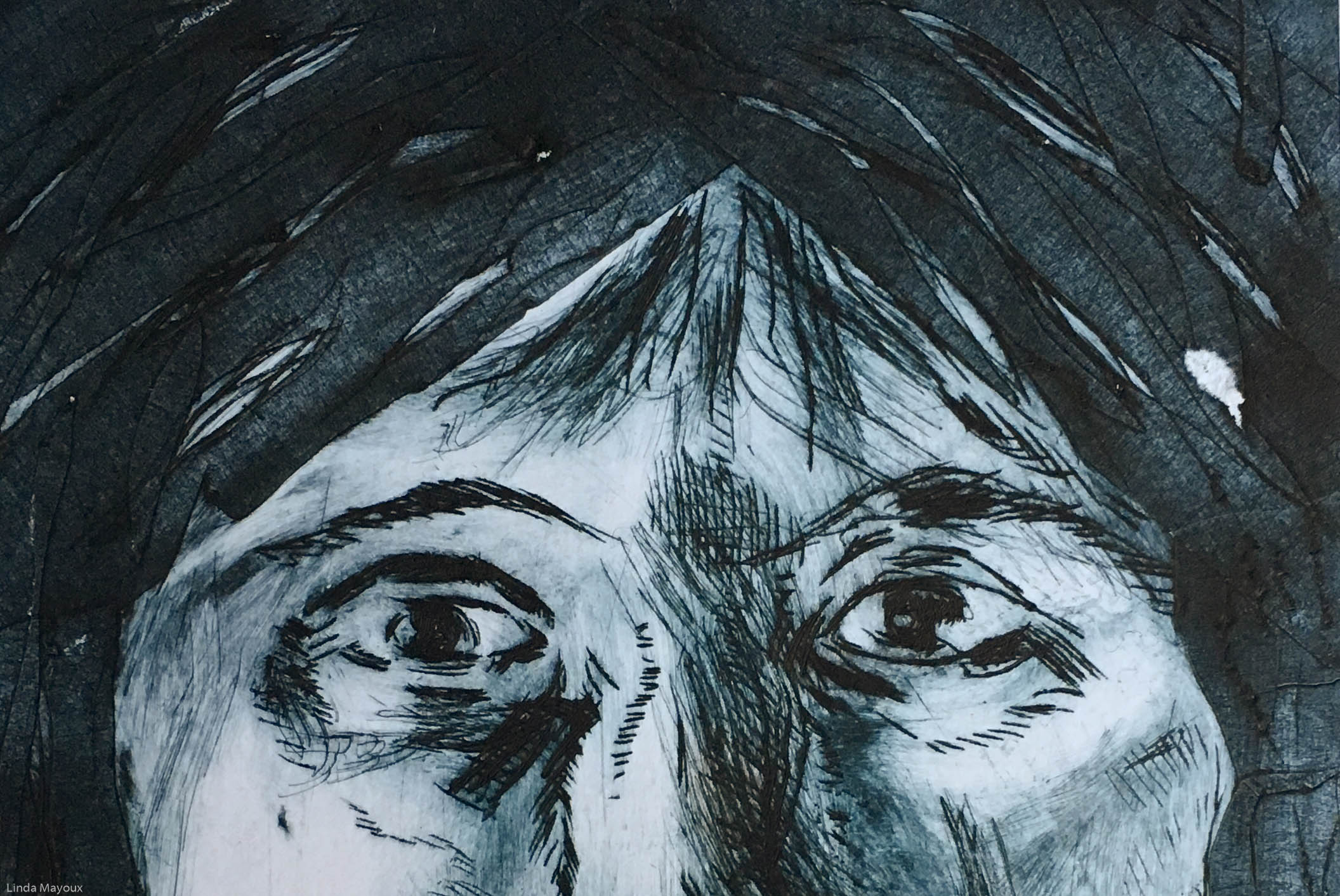
Drypoint is an intaglio technique in which an image is incised into a plate in a range of ways that enable combination of dynamic lines, including very fine lines, with tonal and textural effects.
Self Reflected 2
Self Image Drypoint
1 Evil No Speak
5 Bottle
6 Bonzai
3 Mask
There are many possible variations:
different types of incising tools: with a hard-pointed “needle” of sharp metal or diamond point or power tools like dremel and a range of other more experimental incising tools.
different types of plate, including inkjet transparencies, acetate, perspex, card, zinc and also collagraph which differ in their degree of resistance to different tools and thereby give different qualities of line.
the plate can be modified with the addition of adhesive materials like carborundum, varnish, masking tape.
some types of plate like transparencies and card can be cut into shapes and overlaid to produce very complex effects.
final prints can be collaged to increase 3D effects and tonal depth and colour combinations.
For ways in which other printmakers and artists have used and adapted Drypoint see: Drypoint inspiration
Drypoint process
1) Making the plate
Traditionally the plate was copper, but now acetate, zinc, or plexiglas are also commonly used. Drypoint technique of using the needle is like using a pencil. Any sharp object can theoretically be used to make a drypoint, as long as it can be used to carve lines into metal. Dentistry tools, nails, and metal files can all be used to produce drypoints. However, certain types of needles are created specifically for drypoints:
Diamond-tipped needles carve easily through any metal and never need sharpening, but they are expensive.
Carbide-tipped steel needles can also be used to great effect, and are cheaper than diamond-tipped needles, but they need frequent sharpening to maintain a sharp point. Steel needles were traditionally used.
The lines produced by printing a drypoint are formed by the burr thrown up at the edge of the incised lines, in addition to the depressions formed in the surface of the plate. A larger burr, formed by a steep angle of the tool, will hold a lot of ink, producing a characteristically soft, dense line that differentiates drypoint from other intaglio methods such as etching or engraving which produce a smooth, hard-edged line.
The size or characteristics of the burr usually depend not on how much pressure is applied, but on the angle of the needle.
A perpendicular angle will leave little to no burr, while the smaller the angle gets to either side, the larger the burr pileup.
The deepest drypoint lines leave enough burr on either side of them that they prevent the paper from pushing down into the center of the stroke, creating a feathery black line with a fine, white center.
A lighter line may have no burr at all, creating a very fine line in the final print by holding very little ink.
Typically different types of line are produced on different types of plate.
Giant of Nara zinc plate
Giant of Nara perspex
Giant of Nara card plate
Ink doodle on card
Self Portrait: iPad reflection
Materials like masking tape, carborundum and other adhesives can be added to the plate to give different effects in terms of texture, and also the type of line that can be produced.
Self Portrait: iPad reflection
Self Portrait: mirror image
Printing process
As with etching and other intaglio techniques, the inking process and different tonal and wiping in different parts of the plate can produce radically different images and emphasis.
Applying the ink
After the image is finished, or at least ready to proof, the artist applies ink to the plate with a dauber or brush. Too much pressure will flatten the burrs and ruin the image.
Wiping the ink
Once the plate is completely covered with a thin layer, a tarlatan cloth is used to wipe away excess ink, and paper (typically pages from old phone books) may be used for a final wipe of the lightest areas of the image. Some printmakers will use their bare hand instead to wipe these areas. Compared to other intaglio techniques:
Less pressure is applied to achieve desirable lines, because the burrs forming the image are more fragile than etched or engraved lines, but also because the ink rests on the plate surface, instead of pressed down into indentations.
Direction of wiping matters because ink tends to pile up in the lee of the burr. If the printer wipes in the direction of the lines with their hand, they may remove most of the ink, leaving a light gray line. If they wipe perpendicularly to the line, they can actually increase the pile of ink on the other side of the line, darkening the printed line.
Subtractive monoprint techniques can also be used to create lines and images in the ink. In the image below, the small white figure at the bottom was made by drawing into the ink with a sharpened pencil.
1 Evil No Speak
Printing
Once the desired amount of ink is removed, the plate is run through an etching press on a piece of dampened paper to produce a print. It is best to put the softer blankets just above the plate to reduce the flattening of the burr.
Because the pressure of printing quickly destroys the burr, drypoint is useful only for comparatively small editions; as few as ten or twenty impressions with burr can be made, and after the burr has gone, the comparatively shallow lines will wear out relatively quickly.
Runs of prints can be made on different types of paper without re-inking as a series of ghost prints that can then be collaged to create depth. This is best done using thin paper.
2 Spider
6 Bonzai
Bibliography
Adler, K., (2006) Mary Cassatt: Prints, London: National Gallery.
Bikker, J., Webber, G. J. M., Wiesman, M. W. & Hinterding, E., (2014) Rembrandt: the late works, London: National Gallery.
Cohen, J. (ed.) (1995) Picasso: Inside the Image, London: Thames & Hudson.
Coppel, S., (1998) Picasso and Printmaking in Paris, London: South BGank Publishing.
Griffiths, A., (1980) Prints and Printmaking: An introduction to the history and techniques, London: British Museum Press.
Malbert, R., (2016) Louise Bourgeois: Autobiographical prints, London: Hayward Publishing.
Marquis, A., (2018) Marcellin Desboutin, Cambridge: Fitzwilliam Museum.
Martin, J., (1993) The Encyclopedia of Printmaking Techniques, London: Quarto Publishing.
Muller-Westermann, I. (ed.) (2015) Louise Bourgeois: I Have Been to Hell and Back, Ostfildern, Germany: Hatje Cantz Verlag.
Salamon, F., (1972) The History of Prints and Printmaking from Durer to Picasso: A guide to collecting, New York, Sat Louis, San Francisco: American Heritage Press.
Stobart, J., (2001) Printmaking for Beginners, London: A&C Black.
Wye, D., (2017) Louise Bourgeois: An Unfolding Portrait, New York: MoMA.
Tutorials
Best tutorials for Drypoint on plastic
Very simple step by step overviews.
2) On plastic. Talks more about ink and ink removal. Using dirty tarlatan removes more ink because oil attracts oil. Don’t press too hard because you are trying to get the ink to bounce off. Make sure to wipe off the edge. Use damp paper. Uses marked Plexiglass for registration. There should be a ridge around the plate if pressure is right.
3) On copper. Discusses different tools and the mark-making process. With examples of different artists. Tones made through stippling, roulettes, mezzotint rocker. Roulettes with a fine tooth create subtle tones. Roulettes with coarse tooth create darker tones. Sandpaper can be used. Steel wool to create subtle tone. Try metal bristle brush.
Collagraphy (sometimes spelled collography) is a printmaking process in which materials are applied to a rigid substrate (such as cardboard, paperboard, wood or metal). The word is derived from the Greek word koll or kolla, meaning glue, and graph, meaning the activity of drawing. Collagraph plates can be cut into shapes and combined with other techniques like masking and intaglio. In this way different line qualities, tonal and textural effects, embossing and colour mixes can be achieved
Untitled Brown 3Human Condition: FuryMushrooms Card cut collagraph
Grabowski, B. & Flick, B., (2009) Printmaking: A Complete Guide to Materials and processes, London, Lawrence King Publishing.
Hartill, B. & Clarke, R., (2005) Collagraphs and mixed media printmaking, London, A&C Black.
OCA Course Guide
My own notes from the projects
Collagraph process
The relief plate can be printed to make complex images through combining:
relief: the ink sitting on the higher parts of the plate can be textured through use of different materials, inking using monotype techniques and using different rollers
intaglio: inking the lower parts of the plate using a poupee and drypoint techniques, burnishing the relief. The relief parts of the plate can also be incised and drawn into with different tools.
combination: using different textures, tones or colours. This often also takes advantages of differences in viscosity of ink that can be obtained through using different amounts of extender.
Many layers can be superimposed using registration techniques. Plates can be cut. Masks and chine colle can be added.
1) Making the Plate
The plate can be made from any sturdy materials, cut to any size. Or different size plates can be combined as long as allowance is made for some degree of embossing around the plate. Sometimes it may be necessary to seal the plate before gluing on objects.
Any low relief materials can be glued onto the plate. Collagraphs can pick up fine detail so it is not necessary to have high relief. Thin materials like tissue or glassene paper print very well and these can transfer surface texture and shape when printing. Different surfaces absorb in different ways and these differences can be exploited to the full. Smooth surfaces can be burnished to remove ink and give subtle tones.
Shapes and images can be implied through creative use of contrasting textures and surfaces, creating complex narratives.
Human Condition: Love Mushrooms
Simple bold arrangements of shapes and textures also work well – abstract qualities creating a surface of great interest and visual effects.
Human Condition: FallenAbstract Landscape 2Untitled Red 3Scream crop
plant materials will last longer if the leaves etc are dried out and no longer contain moisture.
carborundim grit mixed with glue can give a dense mark.
glue, acrylic gesso and tile adhesives and even thick impasto acrylic paint can be used and sculpted or drawn into on the plate in low relief.
the surface of the plate can be cut or scored into as long as the marks are not too deep from the top parts of the print.
BUT
no one material should stand too proud or it will stop the area around it from printing. Try not to use anything thicker than a piece of mountboard to give a good even printing across the plate.
Do not use anything sharp or it can cut the blankets on the press.
When the glue has dried thoroughly, give 2 coats of varnish or shellac to stop paper sticking to the plate and enable it to be cleaned.
2) Inking the plate
Careful inking can produce very delicate and varied texturing and tonal effects using the different plate textures and edges, as in the series of mushroom collagraphs below.
Before inking for the first time, to help the plate separate from the paper, rub a small quantity of oil into the surface with cotton wool.
Intaglio
Because different materials hold onto ink in different ways, it is useful to mix etching ink with plate oil or extender to loosen the ink, making it easier to wipe and thin the saturated ink colour. 50/50 is good to start with and can then be adjusted after proofing. Different materials will require different proportions and each plate is unique. Different inks and percentages will also give different effects.
Wipe off with tissue/scrim.
Relief
Applying the ink can be done with different implements and stiff relief ink :
brushes of different types and sizes can paint and texture the plate much as with monoprint.
toothbrushes
rollers – soft rollers will push ink further into the plate. If you want to just cover the highest parts use a hard roller. Small rollers can get ink into different areas of colour. Big rollers give a consistent sweep.
dollies made up of rolled J-cloths bound with masking tape.
cotton buds, particularly for tight corners
wipe off/burnish areas with tissue paper, newspaper, scrim or j-cloths give different effects.
fingers protected by latex gloves can also be used for painterly effects.
After inking solvents and other texturing media can be used. Lines can also be drawn into the ink and the ink can be smeared and mixed.
Abstract Landscape 1Madonna Abstract
3) Printing the plate
Types of paper
Paper can be of varying types depending on the effect required eg the relative importance and amount of detail of relief and intaglio, extent of embossing and inking techniques used.
Untitled Red 4Untitled Cyan 4Untitled Brown 3
250-300 gms printing or watercolour paper is best used damp. This is good for embossing techniques and smearing marks as in Untitled Red 4 and Untitled Cyan 4.
Hosho paper works well but do not dampen it – though a dampened cloth can be used next to the paper to activate the ink. The mushroom series above used thin Hosho paper for high detail and delicacy. Untitled Brown uses thick hosho for more embossed and texturing/markmaking in the ink.
thinner paper can be used, including tissue paper or newsprint if more vague images are required.
Preparation of the paper varies depending on the effect desired:
for intaglio use damp paper or a damp cloth next to the paper to activate the ink.
for relief dry or damp.
Press
It is quite difficult to get good handpulled collagraph prints if intaglio is important as the paper will not go down into the incised marks.
Best results are obtained with an etching press. Experiment with different amounts and types of packing paper. The thicker and softer the packing eg blotting paper, the more it will push the print into the recesses of the plate – and the quicker the plate will flatten and potentially degrade. You can also reverse the blankets to put the softer blanket next to the paper.
Putting the paper on top of the plate pushes down for intaglio.
Putting the plate on top of the paper gives a clear relief.
Clean the plate
Use cooking oil but this will always leave an (often interesting) shadow. Different effects can be built up in this way.
Abstract Embossed collagraph prints
OCA Course Guide for Project 2.1: Formal Abstract Prints
Design
Choose your subject can be chosen from any figurative source, a sketch, painting or photograph but it must have a good underlying compositional structure. Look at your subject. In your learning log write down why you chose it and what attracts you to it. This is important information to establish as it may help you when you come to abstract your design from your subject. You may have been drawn to the colours, or the shapes or the formal arrangement of elements.
Simplify the formal geometry of the image you have chosen so that the proportions and way the shapes interlock are based on the original image. work through a formal process gradually simplifying a theme until you reach a balance of geometric shapes and proportions. You will have to make several studies until you are happy with the final arrangement.
2 Preparing the Plate
Once the geometric shapes have been organised and put together they can be transferred to the card used for the relief collotype block. Each shape should be cut out with as much accuracy as possible so that they will perfectly fit together. When you have cut out enough pieces begin to construct your block. Starting with the base glue your shapes down using a thin, even layer of glue such as PVA wood glue. Continue to build up your block keeping each shape at a different level. Don’t use more than four layers as the block will be too deep and there is the risk of the paper tearing when you print from it. When you have finished, sandwich the block between two sheets of blotting paper and some newspaper, place a heavy weight on top and leave it on a hard surface overnight or until dry. It is important the block dries as evenly and flat as possible so don’t be tempted to take it out of the paper until it is totally dry. Once it is dry, coat the bottom and edges with shellac varnish (or similar waterproof varnish). Leave to dry and then varnish the top surface. If the card absorbs the varnish repeat the process until all the surfaces are fully coated with a hard layer of varnish.
I printed out the final image on A4 paper and stuck it to 3 pieces of back card. And cut out 3 versions on different thicknesses of card. From these pieces I then made 3 alternate plates with different proportions of card on different parts of the image, sticking these onto the backplate paper with PVA glue. I used 3 coast of diamond hard varnish, and pressed the 3 plates for a couple of days.
photograph imagephotograph on cardplate 1plate 2
3) Preparing the paper
The effect of a relief collotype or collagraph print is to combine colour with an embossed image. To achieve this successfully you need a strong, rag based watercolour paper (200gms). Your supplier will be able to help you with more information. Cut your paper to size and immerse it completely in warm water. It will need to soak for at least ten minutes so it is soaked right through and its fibres are softened and pliable. When ready place your paper between two sheets of blotting paper which will absorb the excess surface water without drying out the paper. You need the paper to be evenly damp all the way through but not soaking wet on the outside. Several sheets of paper can be prepared at once and sandwiched between blotting paper in readiness for your printing. If they dry out you will need to repeat the soaking process.
I used Bockingford following the above instructions. But actually found that Japanese Hosho paper with a damp J-cloth on the back also got a good emboss.
4) Inking the block
Once your relief collotype block is dry you are ready to ink it up. You can use water or oil based block printing ink. The oil based ink will give you a longer working time as it will dry much slower than water-based ink. Water-based ink, on the other hand doesn’t need solvents to clean it up, but will dry fairly fast. Using an old toothbrush apply the printing ink in small smooth strokes to cover your block. Alternatively you might like to add the ink with a dabber. When the block is covered in ink you can wipe away some of the colour to vary its intensity in places and reveal some of the varnished areas. Wiping the ink away will allow the block surface to emboss the paper without printing any colour.
I used Hawthorne oil-based inks, sometimes with transparent medium. And used toothbrush, small roller and poupee to get different effects. Some of the ink was quite stiff as it had been left for a while. Experimenting with different viscosities, overlaying smooth ink with thinker ink on a roller, and making brushmarks achieved some quite interesting effects. But it was sometimes difficult to predict exactly how they would print, depending also on the printing pressure and dampness of the paper.
5) Printing the block You can take your print in one impression as all your colours have been applied to the block. As you are aiming to get the colours of your design printed with an embossed impression of the block as well you will need to apply a strong, firm pressure from a soft roller. If you have a small, flat bed press you can use that. Place your inked relief collotype block ink side up on a sheet of blotting paper and lay your dampened printing paper over the top. On this, place another sheet of blotting paper. Secure the corners of the blotting paper to your table top with masking tape to reduce the risk of the papers slipping. Using a firm pressure by putting your weight behind the covered rolling pin roll it across the paper. You will need to achieve this in one go. Alternatively you may hand emboss the print through a clean towel to avoid tearing the paper. The damp paper is forced onto your relief block and will pick up the ink as well as be pushed into the relief of your block. Once rolled, remove the tape from the blotting paper and lift your print.
It should be stored flat between two sheets of blotting paper but not weighted as this will flatten your relief.
On an etching press I did not need tape. But I found it necessary to swap around the blankets on my etching press to put the soft blanket at the bottom to get the best emboss.
6) Cleaning the block for the next print
Clean your relief block and carefully dry it. You may repeat your printing process in the same colours or try a new colour scheme. In each case make the printed surface as perfect as you can taking into account the texture of the paper you are using, the quality of the ink and the effect of the relief collage block.
I made several prints just re-inking the plate. I really like the way the different ink colours and textures mix, and the coloured lines from left-over ink.
Bibliography
D’arcy Hughes, A. & Vernon-Morris, H., (2008) The Printmaking Bible: the complete guide to materials and techniques, San Francisco: Chronicle Books.
Grabowski, B. & Flick, B., (2009) Printmaking: A Complete Guide to Materials and processes, London: Lawrence King Publishing.
Hartill, B. & Clarke, R., (2005) Collagraphs and mixed media printmaking, London: A&C Black.
Major-George, K., (2011) Collagraph: a journey through texture, UK: Major Impact.
Martin, J., (1993) The Encyclopedia of Printmaking Techniques, London: Quarto Publishing.
Stobart, J., (2001) Printmaking for Beginners, London: A&C Black.
Woods, L., (2011) The Printmaking Handbook: Simple techniques and step-be-step projects, London: Search Press.
Etching is traditionally the process of using strong acid or mordant to cut into the unprotected parts of a metal surface to create a design in intaglio (incised) in the metal. As a method of printmaking, it is, along with engraving, the most important technique for old master prints. It was used by Rembrandt with differential inking to get very varied chiaroscuro effects.
1) Preparing the plate: different types of etching
Etching is done on metal plates that differ both in durability and ease/speed of etching. The type of metal used for the plate impacts the number of prints the plate will produce. The firm pressure of the printing press slowly rubs out the finer details of the image with every pass-through.
Copper is a traditional metal, and is still preferred, for etching, as it bites evenly, holds texture well, and does not distort the color of the ink when wiped. It can produce a few hundred printings of a strongly etched imaged before the degradation is considered too great by the artist. At that point, the artist can manually restore the plate by re-etching it, essentially putting ground back on and retracing their lines; alternatively, plates can be electro-plated before printing with a harder metal to preserve the surface.
Zinc is cheaper. As a softer metal, etching times are shorter, but it does not bite as cleanly as copper does, and it alters some colours of ink. Softness also leads to faster degradation of the image in the press.
Steel is growing in popularity as an etching substrate. Increases in the prices of copper and zinc have steered steel to an acceptable alternative. The line quality of steel is less fine than copper, but finer than zinc. Steel has a natural and rich aquatint.
The plate needs first to be cleaned to be clear from marks and finger prints. With Whiting.
The plate is then covered with a waxy ground that is resistant to acid. The nature of the ground affects the type of line, possibilities for tonal additions and inking. There are a number of distinct methods.
Hard ground
This gives a sharp and defined line with tone achieved either through different types of cross-hatching and/or differential wiping of the plate.
Pencil sketch for etching
St John’s
St John’s monochrome etching 2
St John’s College colour etching 2.
St John’s College colour etching 3.
Hard ground can be applied in two ways.
Solid hard ground comes in a hard waxy block. To apply hard ground of this variety, the plate to be etched is placed upon a hot-plate (set at 70 degrees C), a kind of metal worktop that is heated up. The plate heats up and the ground is applied by hand, melting onto the plate as it is applied. The ground is spread over the plate as evenly as possible using a roller. Once applied the etching plate is removed from the hot-plate and allowed to cool which hardens the ground.
Liquid hard ground comes in a can and is applied with a brush upon the plate to be etched. Exposed to air the hard ground will harden. Some printmakers use oil/tar based as hard ground, although often bitumen is used to protect steel plates from rust and copper plates from ageing.
The design is then drawn (in reverse) with an etching-needle or échoppe where want a line to appear in the finished piece, so exposing the bare metal. The échoppe, a tool with a slanted oval section, is also used for “swelling” lines. An “echoppe” point can be made from an ordinary tempered steel etching needle, by grinding the point back on a carborundum stone, at a 45–60 degree angle. The “echoppe” works on the same principle that makes a fountain pen’s line more attractive than a ballpoint’s: The slight swelling variation caused by the natural movement of the hand “warms up” the line, and although hardly noticeable in any individual line, has a very attractive overall effect on the finished plate. It can be drawn with in the same way as an ordinary needle.
The work on the plate can also be added to by repeating the whole process; this creates an etching which exists in more than one state.
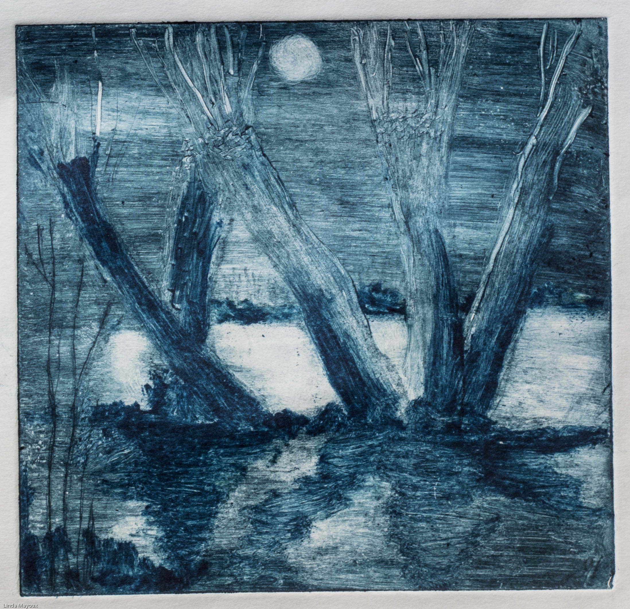
Soft ground
Gives a softer line with more variation in thickness, where tone can also be achieved through cross-hatching and shading as in ink drawing, and differential inking.
Willows
Willows
Willows Etching 1
Willows Etching 3 brown moon
Willows Etching 1 moonlight
Willows Etching 1 winter sunset
This uses a special softer ground. The artist places a piece of paper (or cloth etc. in modern uses) over the ground and draws on it. The print resembles a drawing.
Soft ground also comes in liquid form and is allowed to dry but it does not dry hard like hard ground and is impressionable. After the soft ground has dried the printmaker may apply materials such as leaves, objects, hand prints and so on which will penetrate the soft ground and expose the plate underneath.
After the ground has hardened the artist “smokes” the plate, classically with 3 beeswax tapers, applying the flame to the plate to darken the ground and make it easier to see what parts of the plate are exposed. Smoking not only darkens the plate but adds a small amount of wax. Afterwards the artist uses a sharp tool to scratch into the ground, exposing the metal.
Aquatint
Aquatint uses acid-resistant resin to achieve tonal effects.
St John’s college aquatint 1.
St John’s college aquatint 2.
Particulate resin is evenly distributed on the plate using a special box. Resin is hazardous to health and it is important not to inhale.
The plate is then heated to form a screen ground of uniform, but less than perfect, density.
After etching, any exposed surface will result in a roughened (i.e., darkened) surface. Areas that are to be light in the final print are protected by varnishing between acid baths. Successive turns of varnishing and placing the plate in acid create areas of tone difficult or impossible to achieve by drawing through a wax ground.
Sugar lift
This gives a more painterly line.
Willows Etching 2
Willows Etching2
Willows Etching2
Willows Etching2
Willows Etching2
Willows Etching2
Designs in a syrupy solution of sugar or Camp Coffee are painted onto the metal surface prior to it being coated in a liquid etching ground or ‘stop out’ varnish. When later the plate is placed in hot water the sugar dissolves and lifts off leaving the image. The plate can then be etched.
Relief etching was invented by William Blake in about 1788, and he has been almost the only artist to use it in its original form. However, from 1880–1950 a photo-mechanical (“line-block”) variant was the dominant form of commercial printing for images. A similar process to etching, but printed as a relief print, so it is the “white” background areas which are exposed to the acid, and the areas to print “black” which are covered with ground. Blake’s exact technique remains controversial. He used the technique to print texts and images together, writing the text and drawing lines with an acid-resistant medium.
Carbograph etching
Invented in 2006 and yields an image like that of a charcoal drawing:
The plate is then completely submerged in a bath of acid technically called the mordant (French for “biting”) or etchant, or has acid washed over it. Ferric chloride may be used for etching copper or zinc plates, whereas nitric acid may be used for etching zinc or steel plates.
The acid “bites” into the metal (it dissolves part of the metal) where it is exposed, leaving behind lines sunk into the plate. The waxy resist prevents the acid from biting the parts of the plate which have been covered.
The strength of the acid determines the speed of the etching process. Typical solutions are 1 part FeCl3 to 1 part water and 1 part nitric to 3 parts water.
The longer the plate remains in the acid the deeper the “bites” become.
During the etching process the printmaker uses a bird feather or similar item to wave away bubbles and detritus produced by the dissolving process, from the surface of the plate, or the plate may be periodically lifted from the acid bath. If a bubble is allowed to remain on the plate then it will stop the acid biting into the plate where the bubble touches it. Zinc produces more bubbles much more rapidly than copper and steel and some artists use this to produce interesting round bubble-like circles within their prints for a Milky Way effect.
The detritus is powdery dissolved metal that fills the etched grooves and can also block the acid from biting evenly into the exposed plate surfaces. Another way to remove detritus from a plate is to place the plate to be etched face down within the acid upon plasticine balls or marbles, although the drawback of this technique is the exposure to bubbles and the inability to remove them readily.
For aquatinting a printmaker will often use a test strip of metal about a centimetre to three centimetres wide. The strip will be dipped into the acid for a specific number of minutes or seconds. The metal strip will then be removed and the acid washed off with water. Part of the strip will be covered in ground and then the strip is redipped into the acid and the process repeated. The ground will then be removed from the strip and the strip inked up and printed. This will show the printmaker the different degrees or depths of the etch, and therefore the strength of the ink color, based upon how long the plate is left in the acid.
Spit-biting
A mixture of nitric acid and/or gum arabic and/or rosin and/or water (or almost never – saliva) is applied to certain areas of the plate with a brush, dripped, spattered or painted onto a metal surface giving interesting results. The plate may be aquatinted for this purpose or exposed directly to the acid.
3) Cleaning the plate
The plate is removed from the acid and washed over with water to remove the acid. The remaining ground is removed with a solvent such as turpentine. Turpentine is often removed from the plate using methylated spirits since turpentine is greasy and can affect the application of ink and the printing of the plate.
Foul-biting
Example of foul bite in acid etching (Wikipedia)
Foul-bite or “over-biting” is common in etching, and is the effect of minuscule amounts of acid leaking through the ground to create minor pitting and burning on the surface. This incidental roughening may be removed by smoothing and polishing the surface, but artists often leave faux-bite, or deliberately court it by handling the plate roughly, because it is viewed as a desirable mark of the process.
4) Inking
The remaining ground is then cleaned off the plate. The plate is inked all over, and then the ink wiped off the surface, leaving only the ink in the etched lines.
A piece of matte board, a plastic “card”, or a wad of cloth is often used to push the ink into the incised lines.
Oil based etching inks
Akua inks – don’t find these too good.
The surface is wiped clean with a piece of stiff fabric known as tarlatan and then wiped with newsprint paper; some printmakers prefer to use the blade part of their hand or palm at the base of their thumb. You may also use a folded piece of organza silk to do the final wipe.
If copper or zinc plates are used, then the plate surface is left very clean and therefore white in the print. If steel plate is used, then the plate’s natural tooth gives the print a grey background similar to the effects of aquatinting. As a result, steel plates do not need aquatinting as gradual exposure of the plate via successive dips into acid will produce the same result.
Differential inking can significantly affect the impact of the image – as exploited by eg Rembrandt and can be seen on the markmaking on the etching plate in the prints below.
Willows Etching2
Willows Etching2
Willows Etching2
5) Printing
The plate is then put through a high-pressure printing press together with a sheet of paper (often moistened to soften it).
The paper picks up the ink from the etched lines, making a print. The process can be repeated many times; typically several hundred impressions (copies) could be printed before the plate shows much sign of wear.
Printing the plate is done by covering the surface with printing ink, then rubbing the ink off the surface with tarlatan cloth or newsprint, leaving ink in the roughened areas and lines. Damp paper is placed on the plate, and both are run through a printing press; the pressure forces the paper into contact with the ink, transferring the image (c.f., chine-collé).
Nontoxic etching
Growing concerns about the health effects of acids and solvents led to the development of less toxic etching methods in the late 20th century. An early innovation was the use of floor wax as a hard ground for coating the plate. Others, such as printmakers Mark Zaffron and Keith Howard, developed systems using acrylic polymers as a ground and ferric chloride for etching. The polymers are removed with sodium carbonate (washing soda) solution, rather than solvents. When used for etching, ferric chloride does not produce a corrosive gas, as acids do, thus eliminating another danger of traditional etching.
The traditional aquatint, which uses either powdered rosin or enamel spray paint, is replaced with an airbrush application of the acrylic polymer hard ground. Again, no solvents are needed beyond the soda ash solution, though a ventilation hood is needed due to acrylic particulates from the air brush spray.
The traditional soft ground, requiring solvents for removal from the plate, is replaced with water-based relief printing ink. The ink receives impressions like traditional soft ground, resists the ferric chloride etchant, yet can be cleaned up with warm water and either soda ash solution or ammonia.
Anodic etching has been used in industrial processes for over a century. The etching power is a source of direct current. The item to be etched (anode) is connected to its positive pole. A receiver plate (cathode) is connected to its negative pole. Both, spaced slightly apart, are immersed in a suitable aqueous solution of a suitable electrolyte. The current pushes the metal out from the anode into solution and deposits it as metal on the cathode. Shortly before 1990, two groups working independently developed different ways of applying it to creating intaglio printing plates.
In the patented Electroetch system, invented by Marion and Omri Behr, in contrast to certain nontoxic etching methods, an etched plate can be reworked as often as the artist desires.The system uses voltages below 2 volts which exposes the uneven metal crystals in the etched areas resulting in superior ink retention and printed image appearance of quality equivalent to traditional acid methods. With polarity reversed the low voltage provides a simpler method of making mezzotint plates as well as the “steel facing”copper plates.
Some of the earliest printmaking workshops experimenting with, developing and promoting nontoxic techniques include Grafisk Eksperimentarium, in Copenhagen, Denmark, Edinburgh Printmakers, in Scotland, and New Grounds Print Workshop, in Albuquerque, New Mexico.
Photo-etching
Light sensitive polymer plates allow for photorealistic etchings. A photo-sensitive coating is applied to the plate by either the plate supplier or the artist. Light is projected onto the plate as a negative image to expose it. Photopolymer plates are either washed in hot water or under other chemicals according to the plate manufacturers’ instructions. Areas of the photo-etch image may be stopped-out before etching to exclude them from the final image on the plate, or removed or lightened by scraping and burnishing once the plate has been etched. Once the photo-etching process is complete, the plate can be worked further as a normal intaglio plate, using drypoint, further etching, engraving, etc. The final result is an intaglio plate which is printed like any other.
Bibliography
Adler, K., (2006) Mary Cassatt: Prints, London: National Gallery.
Bikker, J., Webber, G. J. M., Wiesman, M. W. & Hinterding, E., (2014) Rembrandt: the late works, London: National Gallery.
Bikker, J. & Weber, G. J. M., (2015) Rembrandt: The Late Works, London: National Gallery.
Cate, P. D. & Grivel, M., (1992) From Pissaro to Picasso: color etching in France, Paris: Flammarion.
Cohen, J. (ed.) (1995) Picasso: Inside the Image, London: Thames & Hudson.
Coppel, S., (1998) Picasso and Printmaking in Paris, London: South BGank Publishing.
D’arcy Hughes, A. & Vernon-Morris, H., (2008) The Printmaking Bible: the complete guide to materials and techniques, San Francisco: Chronicle Books.
Freud, L., (2008) On Paper, London: Jonathan Cape.
Grabowski, B. & Flick, B., (2009) Printmaking: A Complete Guide to Materials and processes, London: Lawrence King Publishing.
Griffiths, A., (1980) Prints and Printmaking: An introduction to the history and techniques, London: British Museum Press.
Guse, E.-G. & Morat, F. A., (2008) Georio Morandi: paintings, watercolours, drawings, etchings, Munich, Berlin, London, New York: Prestel.
Hambling, M., (2009) The Sea, Salford Quays: The Lowry Press.
Lloyd, R., (2014) Hockney Printmaker, London: Acala Arts & Heritage Publishers Ltd.
Martin, J., (1993) The Encyclopedia of Printmaking Techniques, London: Quarto Publishing.
Meyrick, R., (2013) Sydney Lee Prints: A Catalogue Raisonnee, London: Royal Academy of the Arts.
Pogue, D., (2012) Printmaking Revolution : new advancements in technology, safety and sustainability, New York: watson-guptill publications.
Royalton-Kisch, M., (2006) Rembrandt as Printmaker, London: Hayward Gallery Touring.
Salamon, F., (1972) The History of Prints and Printmaking from Durer to Picasso: A guide to collecting, New York, Sat Louis, San Francisco: American Heritage Press.
Stobart, J., (2001) Printmaking for Beginners, London: A&C Black.
Woods, L., (2011) The Printmaking Handbook: Simple techniques and step-be-step projects, London: Search Press.
Wye, D., (2017) Louise Bourgeois: An Unfolding Portrait, New York: MoMA.
Zigrosser, C., (1951) Prints and Drawings of Kathhe Kollwitz, New York: Dover Publications.
Stencilling to create visual images dates back to representations of hands on Paleolothic cave walls.
Screen printing using silk mesh first appeared in a recognizable form in China during the Song Dynasty (960–1279 AD). It was then adapted by other Asian countries like Japan, and was furthered by creating newer methods.
Screen printing was largely introduced to Western Europe from Asia sometime in the late 18th century, but did not gain large acceptance or use in Europe until silk mesh was more available for trade from the east and a profitable outlet for the medium discovered.
Photoscreen processes started to be developed in the 1910s introducing photo-imaged stencils for commercial printing. Several printers experimenting with photo-reactive chemicals used the well-known actinic light–activated cross linking or hardening traits of potassium, sodium or ammonium chromate and dichromate chemicals with glues and gelatin compounds. Roy Beck, Charles Peter and Edward Owens studied and experimented with chromic acid salt sensitized emulsions for photo-reactive stencils. Commercial screen printing now uses sensitizers far safer and less toxic than bichromates. Currently there are large selections of pre-sensitized and “user mixed” sensitized emulsion chemicals for creating photo-reactive stencils.
A group of artists who later formed the National Serigraphic Society, including WPA artist Anthony Velonis, coined the word Serigraphy in the 1930s to differentiate the artistic application of screen printing from the industrial use of the process.”Serigraphy” is a compound word formed from Latin “sēricum” (silk) and Greek “graphein” (to write or draw).
The Printers’ National Environmental Assistance Center says “Screenprinting is arguably the most versatile of all printing processes. Since rudimentary screenprinting materials are so affordable and readily available, it has been used frequently in underground settings and subcultures, and the non-professional look of such DIY culture screenprints have become a significant cultural aesthetic seen on movie posters, record album covers, flyers, shirts, commercial fonts in advertising, in artwork and elsewhere.
1960s to present
Andy Warhol
Sister Mary Corita Kent, gained international fame for her vibrant serigraphs during the 1960s and 1970s. Her works were rainbow colored, contained words that were both political and fostered peace and love and caring.
American entrepreneur, artist and inventor Michael Vasilantone started to use, develop, and sell a rotatable multicolour garment screen printing machine in 1960.[4] Vasilantone later filed for patent[5] on his invention in 1967 granted number 3,427,964 on February 18, 1969.[5] The original machine was manufactured to print logos and team information on bowling garments but soon directed to the new fad of printing on T-shirts. The Vasilantone patent was licensed by multiple manufacturers, the resulting production and boom in printed T-shirts made this garment screen printing machine popular. Screen printing on garments currently accounts for over half of the screen printing activity in the United States.[6]
Graphic screenprinting is widely used today to create mass or large batch produced graphics, such as posters or display stands. Full colour prints can be created by printing in CMYK (cyan, magenta, yellow and black (‘key’)).
Screen printing lends itself well to printing on canvas. Andy Warhol, Arthur Okamura, Robert Rauschenberg, Roy Lichtenstein, Harry Gottlieb and many other artists have used screen printing as an expression of creativity and artistic vision.
Charles Shearer is an artist printmaker and teacher from Orkney, currently based in London. He also creates paintings and drawings of scenes inspired from his extensive travels both in the UK and overseas.
Many of his prints are single or multiplate collagraphs made from cutting, drawing and sculpting into display board. The plates are then printed using stencils and roller techniques to produce complex and multicoloured prints. This is the technique I started to explore in Assignment 5 The Dreaming.
His subjects are often ‘creative interpretations’ from his own travel sketchbooks, mostly from Wales, Ireland and his travels between London and Orkney. A key underlying theme is ‘man’s [sic] order within nature’. ‘Of particular interest are deserted buildings and the landscapes surrounding them as he describes “in a landscape stands a grand Irish ruin all in glorious decay, to contrast with a desolate and rutted land beyond the industrial estate”.
There are often fun images in his work too such as his large monoprints of King Flamingo or Night Prowl. He experiments too with texture and materials such as in Bubblewrap Joe.
In addition to making his own work he teaches printmaking at numerous art schools and runs creative print workshops. For experimental prints I produced from a workshop on ‘Cardboard Cuts’ see Collagraph techniques
considers the different techniques she uses to communicate movement in her drawing, painting and printmaking and some of the learnings for my own printmaking practice.
Other notes and video links
Overview of her work
for British Museum ‘Touch’ exhibition 2016
“The border-line between what is tragic and what is comic interests me…They are a pathetic human way of trying to come to terms with the fact of our own death, the fact of other peoples’ deaths, the fact of the horror we see on the news everyday, the terrible things that happen. Some moments you cry, other moments you laugh” (Conversation with Judith Collins Hambling 1993 p13)
Drawing and portraits
My first introduction to Maggi Hambling was through the ‘George always’ exhibition at the National Portrait Gallery in 2009.
Then her wave and Walls of Water paintings shown at the National Gallery. These include a series of monotypes first shown at Malborough Fine Art (see the exhibition), then the Fitzwilliam Museum in Cambridge and the National Gallery.
More recently her work has been more political with the exhibitions, dealing with topics like global warming, migration and war:
Hambling, M. (1993). Towards Laughter. Sunderland, UK, Northern Centre for Contemporary Art.
Hambling, M. (1998). maggi & henrietta.
Hambling, M. (2006). Maggi Hambling the Works and Conversations with Andrew Lambirth. London, Unicorn Press Ltd.
Hambling, M. (2009). The Sea. Salford Quays, The Lowry Press.
Hambling, M. (2009). You Are the Sea. Great Britain, Lux Books.
Hambling, M. (2015). War, Requiem and Aftermath. London, Unicorn Press Ltd.
Ramkalawon, J. (2016). Maggi Hambling Touch: works on paper. London, Lund Humphries and British Museum.