


Single colour linocut: The Brief
This project involves planning, cutting and printing an image where the cuts in the lino will print as the colour of the printing paper and the ridges left on the lino will be inked.
- Select three impressions of your single colour linocut. You should choose those where the shapes are clear and well printed and show visual impact.
- Send other single colour linocuts you have made
To support your work you will have drawings and themes starting from original ideas and developed to the layout of your final prints.
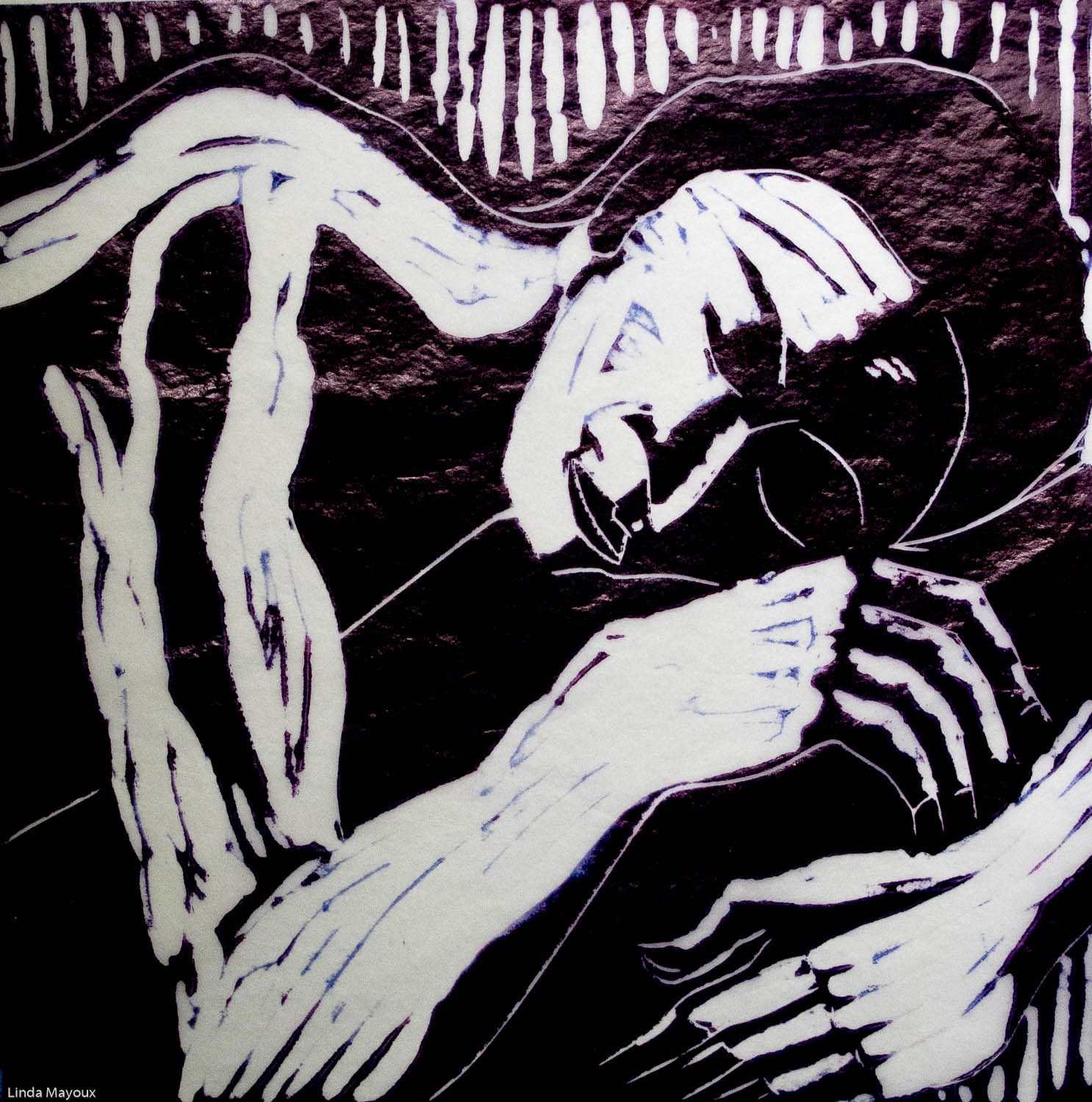
Single Colour Linocut: Dream
This linocut as the last one I did, having experimented a lot with markmaking and different types of paper and ink in the other linocuts below. I had looked at a lot of linocut and woodcut print artists and examined different styles – German expressionists (I was particularly interested in Munch and Nolde for this assignment) and also Albert Masri, a contemporary printmaker who combines abstract shapes with line around.
Women lying down is a staple at the end of any long life drawing class and I had done quite a few sketches. So I went through the sketches I had done and selected a few that I thought had potential for development as linocut. I also tries out some ideas as monoprints – different types of movement and markmaking and also colour. I wanted something dream-like. Sketch 1 I like, but the type of style it suggested was too much like the linocut ‘Window’ I had done (see below). I found the other more hazy sketches and the more dynamic monoprints I had done more interesting for this assignment. But the sketches themselves had not been done with linocut in mind and did not have enough detail.
Sketch 4 was the one I felt gave me most possibilities in relation to the style I was looking for. I was interested in an image that contrasted the peace of a woman sleeping, but with a more dynamic background as in the monoprints. Alternatively a relatively static background and a woman in turmoil. Using contrasting markmaking, and also different colour schemes, to portray this.
I had already experimented a lot with composition on the paper before I did the actual sketch and was happy that it would make a good print with pretty much the composition I had decided on for the original sketch. I preferred the square format of the sketch to the landscape format of the monoprint. The main question was exactly where and how large to place it on the plate. I experimented with some options for markmaking and different interpretations on my iPad before doing the final print.
In the final printing I tried different types of paper. Thick Japanese Hosho and ink cartridge paper absorb the ink quite a lot and give quite a flat effect – good if most of the image is carved, but not really subtle enough for what I was looking for for this print. Newsprint was quite interesting in the variety of printing. Watercolour paper – Bockingford or Arches – gave quite a bit of texture and more variety. Thin Japanese Hosho gave much more of a fragile feel – this is one interpretation I was looking for. But tissue paper was most intense and interesting. I found I could vary the tone quite a bit through the way I laid on the ink – though it was a bit unpredictable.
Dream Version 1 uses tissue paper and oil-based ink with a mixed magenta/ultramarine purple. I laid this over white Watercolour paper. I like the intense colours, and also the subtle tones the overlaid tissue paper gives.
In Dream version 2 I varied the ink – I mixed up a grey/brown/black and used different shades as a very subtle rainbow roll – browner at the top and greener to the bottom, but mixed.
Dream Version 3 I experimented with overlaying tissue paper on other coloured papers – as in St Michael’s Mount below. I tried both lemon yellow and orange, and different types of paper. I found tissue paper inked by hand was more interesting than bought tissue paper as an underlay, and also gave more translucency that the sort of flat colour I had used for St Michael’s Mount. All very subtle differences, but also quite a significant overall effect. By accident I found a sheet of tissue paper that had been part of some of my earlier textural experiments with colours of Cornwall. I tried that and it gave me a very interesting colour variation underlay. Having the different colours brings in more depth and perspective – the woman’s dark dreams in the sunlight.
Further linocuts
I experimented with different types of markmaking and different styles of linocut before doing the final prints above. Building on the seascape and rockpool experiments I had done for the previous project, I tried different subjects:
– portraits and narrative portraits
– abstract portraits/figures
– landscape
– flowers
Portrait 1: Woman
In this first linocut I was interested in seeing how I could use ideas from African masks, Expressionist woodcuts (eg Kirchner’s Head of David Mueller logbook p22 and Schmidt Rotluff’s heads p24) and US Civil Rights printmakers Elizabeth Catlett p32 and Margaret Burrows pp30 and 31). The style is very linear and follows the line of the face. I studied muscle and bone structure of the face through some anatomical diagrams before doing the linocut. I did some more cutting between the version I had submitted to my tutor and the final print. I quite liked this print – but it is probably too large for this style and not enough interest in the types of line. Actually a square crop might have been more interesting – I should have experimented more with thumbnails before doing it. I tried out a few alternative digital crops to see whether a different approach might hsve been more interesting. I do like the last longitudinal crop 5 – I think one of the problems with the print is its very standard format.

Portrait 2: Black Moon

My next experiment used a sketch I found quite interesting in my sketchbook. This suggested a much flatter outline figure – like Emma Goodman’s work with flat uniform line. I wanted to do something quite atmospheric, inspired by a Munch woodcut (logbook p23 don’t know title) and Lynd Ward’s stylised wood engravings (logbook pp 28 and 29). As my tutor said, my first attempt did not go far enough in the cutting. So I thought a lot more about the background, and got the idea of doing a black moon bearing down on the man, and leaving a very vague shape of some houses behind him. I like this final print. I then tried different types of paper, including newsprint and thick cartridge and different dark shades.
Portrait 3: Window

In this third portrait I again started with a sketch and then thought about how to translate it into linocut. This was another moody sketch and I wanted to experiment with a wood engraving style like Lynd Ward – just using the vein tool. I did a number of mock-ups on my iPad to try different treatments – see below and the video of how I developed things. I found there are actually very many decisions to be made about exactly where to put the shading, the exact shape of the shading and how densely to put the strokes to get different tones. It really is extremely subtle. I wanted something fairly minimalist in the background and experimented with different compositions – how much shading, exactly where to put the diagonal lines.
I am quite pleased with the final result. I found it printed best on newsprint to get the sort of grungy effect I wanted. I tried a number of very dark colours (see these in my logbook. But I preferred the dark blue or purple.
Portrait 4: City
In this final narrative portrait I wanted to vary the style more with more flat areas. I looked through my sketches and found these ones of Steve. I started with doing a digital invert that gave me quite an atmospheric chalk-like figure. Like someone at a nightclub in a strobe light. This also gave me ideas for the light and shade on the face. Then I started to experiment with my iPad using this image and came up with the narrative of a man approaching a city – somewhat inspired by my work on ‘On the Road’ for my Book Design course and watching the film. From there as I cut it developed a sort of life of its own. But I like the final result. Again I tried different types of paper, and for this one I felt that newsprint most captured the 60s/70s amateur print press feel I wanted.
Abstract Portraits
My next set of experiments pushed further some of the things I had started to be interested in with the portraits – how far can one abstract the figure or a face before it becomes unreadable. This drew a bit on the work of Masri, but also Andy Warhol and Alex Katz screenprints, Gaudier Brzewska’s the Wrestlers and the monoprint mask experiments in Assignment 1. This was also an exercise in solid block carving – how do I get areas of completely flat white in linocut. I thought it would be interesting to try and experiment with dual colour with a monochrome linocut but on coloured paper.
I started by looking through my sketches from life drawing and selected a number that I thought would be interesting to work with. I photographed the sketches with my iPad and experimented a bit with composition – but again I had actually thought a lot about composition before I did the sketches and in a couple of cases had already cropped them. For each of them I then experimented on my iPad with abstraction as can be seen in the video below – to see how far I could simplify before things became unrecognisable.
These were printed on catrdidge paper with waterbased inks to get a very matt, flat colour like screenprints. I do find these very interesting and this is an approach I would like to experiment with a lot more in future.
Some possible ideas I had were to abstract the hand sketches below.
Series 2: Cornwall Landscapes
St Michael’s Mount


I also experimented with landscapes – inspired partly by Chinese ink landscape paintings, but using ink sketches from my Cornwall sketchbook. I started with an ink sketch of St Michael’s Mount. But found the way I had done it in an A3 landscape format rather boring. So I cut it up and collaged it into what I found a more interesting composition. I then photographed this and experimented with different compositions and markmaking on my iPad as can be seen in the video below. I decided on a portrait composition in the end, exaggerating the diagonal of the pathway in the foreground and adding a sun. I tried a lot of variations on the clouds, and also adding details of figures.
Once I was happy with the composition I then experimented with papers and colours. I tried both mixed dark blues and browns and also light greys. For paper I liked fairly flat dark prints on thick Hosho paper and discovered the delicacy of tissue paper. I thought then of overlaying this on some of the spare squares I had left over from the duotone abstract portraits, and on coloured tissue paper. I tried blue, orange and yellow. But I like the yellow behind grey best because it looks like a delicate dawn. I also chose one of the thinner inked prints because I like the mistiness. I like these prints – though I think maybe some of the cutting on the hills is a bit too thick.
Miners
My first linocuts were taken from some photos of miners in a pamphlet on Geevor mine in Cornwall. Unfortunately it was not possible to sketch miners directly – the mine itself had closed. Even if the mine was still working, it is unlikely it would have been possible to do any drawings. But I found these images very dramatic, and good material for my first linocuts to learn about cutting and silhouetting shapes. The square one I was inspired also by the perspective distortions of the Grosvenor School printmakers. In response to my tutor’s comments I cut away some more to texture the rocks and better outline the shapes. I think these prints best in matt black on thick Hosho paper – a bit like the texture of coal. Newsprint in another possibility.
Flower: Calthus Lilly
This flower was one of my second linocut attempt, inspired by John Nash and Chinese woodblock flower prints (logbook p33). I really like the delicacy of the flower, particularly on thin Hosho paper or Watercolour paper. I found I could get a lot of interesting variation depending on how I inked on the ridges in the flower. But agree with my tutor that I need to think more about the background. I did explore some options for reworking on my iPad, but in the end could not find a more satisfactory way of doing it without redoing the whole print.

Some other ideas

Conclusions: What Makes a Good Monochrome Linocut?
Basically any subject can make a good monochrome linocut – figures, landscapes/townscapes, imaginary subjects, subjects around the house, abstracts. The treatment will depend on the type of subject and the mood you want to convey.
Monochrome linocut gives considerable flexibility in:
- composition and use of positive/negative space
- line quality and markmaking
- shapes and their interrelationship
- quality of printing itself from flat ink to much more sensitive hand-printing or embossing
Different moods are also achieved by paper texture and quality and subtleties of colour – even monochrome can be modulated by slight variations in colour on the block or even rainbow rolls and printing on different colours of paper.
In general good prints have:
- a solid underlying tonal shape structure appropriate to subject and mood – unless the aim is to convey chaos
- repetition/mirroring of shapes is often very effective
- using different qualities and types of line
- a variety of markmaking and pattern – though using a single tool as in wood engraving and varying tone through other means can also be effective
Methods for designing linocuts
- white chalk, pencil, pastel on black paper – these are the easiest and quickest but not always so inspiring
- scratching or rubbing out white areas from either charcoal or oil pastel – these are very good for getting more atmosphere and also oil pastel is very good for scratching out sharp lines and shapes.
- processing and inverting photographs to white on black – a simple inversion can often give interesting and surprising ideas than can then be further worked on either in Photoshop to simplify areas or taken further through analogue sketching
- iPad mockups in a programme like Procreate can be a very flexible way of quickly trying out many different ideas, subtle changes of tones, lines and shapes. Procreate also has a video export function so it is possible to look back and analyse decisions.