O’Donoghue was born in England but lived and worked for many years in County Kerry, Ireland. He graduated from Goldsmiths in 1982 and was Artist in Residence at the National Gallery, London from 1984-85.
His work is characterised by an engagement with the past. He uses figuration and abstraction to explore themes of human identity, memory, remembering and experience; and draws on history, mythology and personal records to create works which resonate with emotional intensity.
His printmaking includes very large carborundum plates of figures. He mixes fine grain carborundum, acrylic paste and black acrylic paint. He paints this on the plate with a thick brush, wiping off and reworking the image on the plate before it dries. This makes a complex, multi-layered texture. He often uses aluminium plates. Prints on thick Arches paper.
Hughie O’Donoghue installation at IMMA 2009
[wpdevart_youtube]pN40GM2yblE[/wpdevart_youtube]
The Measure of All Things Introduction
[wpdevart_youtube]exD4kjw79f0[/wpdevart_youtube]
‘The Road’
[wpdevart_youtube]rutqiIxsiOE[/wpdevart_youtube]
Lost Histories
[wpdevart_youtube]vey69MpKo3o[/wpdevart_youtube]
‘Artists never completely control the meaning of their work’
Toko Shinoda (篠田 桃紅Shinoda Tōkō?, born March 28, 1913) is a Japanese artist working with sumi ink paintings and lithograph prints. Her art merges traditional calligraphy with modern abstract expression. She says she prefers her paintings and original drawings, because sumi ink presents unlimited colour spectrum. In printmaking, Shinoda uses lithograph as her medium. Unlike woodcut that requires chisel, or etching that requires acid, lithograph allows Shinoda to work directly and spontaneously on the plate with her fluid brushstroke. Shinoda’s strokes are meant to suggest images and vitality of nature. She says, “Certain forms float up in my mind’s eye. Aromas, a blowing breeze, a rain-drenched gust of wind…the air in motion, my heart in motion. I try to capture these vague, evanescent images of the instant and put them into vivid form.” Shinoda’s print editions are small, usually ranging from twelve to fifty-five, and after each edition has been pulled, she often adds a stroke or two of sumi color by hand to each print.
Life
Shinoda was born in Manchuria where her father managed a tobacco factory. Two years later, her family returned to Japan. Influenced by her father’s love of sumi ink painting, calligraphy and Chinese poetry, Shinoda practiced calligraphy since she was six.
Shinoda traveled the United States from 1956 to 1958. During this time her works were bought by Charles Laughton and John Lewis of the Modern Jazz Quartet. Shinoda also became involved in the abstract expressionist movement of the time.
A 1983 interview in Timemagazine noted that “her trail-blazing accomplishments are analogous to Picasso’s”. Shinoda’s works had been exhibited in the Hague National Museum, the Art Institute of Chicago, Cincinnati Art Museum and other leading museums in the world.
She turned 100 in March 2013.
Books on her work
Takashina, Shuji. Okada, Shinoda, and Tsukata: Three Pioneers of Abstract Painting in 20th Century Japan. Washington: Phillips Collection, c1979.
Tolman, Mary and Tolman, Norman. Toko Shinoda: A New Appreciation. Rutland, Vermont: Charles E Tuttle Company, 1993.
Frans Masereel (31 July 1889 – 3 January 1972) was a Flemish painter and graphic artist who worked mainly in France. He is known especially for his woodcuts. His greatest work is generally said to be the wordless novel Mon Livre d’Heures (Passionate Journey). He completed over 20 other wordless novels in his career. Masereel’s woodcuts strongly influenced the work of Lynd Ward and later graphic artists such as Clifford Harper and Eric Drooker. There is a Frans Masereel Centre (Frans Masereel Centrum for Graphix) in the village of Kasterlee in Belgium.
Frans Masereel was born in the Belgian Blankenberge on 31 July 1889. He moved to Ghent in 1896, where he began to study at the École des Beaux-Arts in the class of Jean Delvin at the age of 18. In 1909 he went on trips to England and Germany, which inspired him to create his first etchings and woodcuts. In 1911 Masereel settled in Paris for four years and then emigrated to Switzerland, where he worked as a graphic artist for journals and magazines. His woodcut series, mainly of sociocritical content and of expressionistic form concept, made Masereel internationally known. Among these were the wordless novels 25 Images of a Man’s Passion (1918), Passionate Journey (1919), The Sun (1919), The Idea (1920) and Story Without Words (1920). At that time Masereel also drew illustrations for famous works of world literature by Thomas Mann, Émile Zola and Stefan Zweig. In 1921 Masereel returned to Paris, where he painted his famous street scenes, the Montmartre paintings. He lived for a time in Berlin, where his closest creative friend was George Grosz. After 1925 he lived near Boulogne-sur-Mer, where he painted predominantly coast areas, harbour views, and portraits of sailors and fishermen. During the 1930s his output declined. In 1940 he fled from Paris and lived in several cities in Southern France.
At the end of World War II Masereel was able to resume his artistic work and produced woodcuts and paintings. After 1946 he worked for several years as a teacher at the Hochschule der Bildenden Künste Saar (de) in Saarbrücken. In 1949 Masereel settled in Nice. In the following years until 1968 several series of woodcuts were published, which differ from his earlier “novels in picture’” in comprising variations of a subject instead of being a continuing narrative. He also designed decorations and costumes for numerous theatre productions. The artist was honoured in numerous exhibitions and became a member of several academies. Frans Masereel died in Avignon in 1972 and was entombed in Ghent. The cultural organizationMasereelfonds was named after him.
Influence
From Mon Livre d’Heures (A Passionate Journey, 1919)
The American graphic artist Lynd Ward was greatly influenced by Masereel in creating his novels in woodcuts.A number of cartoonists have cited Masereel as an influence on the development of the graphic novel: Art Spiegelman cited Mon Livre d’Heures as an early influence on his Maus.Will Eisner cited Masereel as an influence on his work, as has scratchboard novelist Eric Drooker.
Katarzyna’s work is extremely detailed linocut made of dot shading and very fine markmaking. It has a dreamy quality. I am not sure if this is partly done using etching techniques with bleach, or something like a mezzotint shader.
She also generally chooses dramatic composition – reflections, swirling sky and water. The compositions are often upside down reflections in water, or putting the dark area at the top right. This significantly increases the sense of drama and the unexpected even on apparently simple scenes of just trees and water.
Lynda Burke’s linocuts are mainly monochrome black and white. She has a strong sense of composition and design – using dramatic perspectives, grills and grids. With variety of markmaking and texturing in eg the skies. Some have hand-coloured splashes of red.
Bosham here the marks for the mackerel sky I find effective together with the long format and rather bleak landscape.
Biography
Lynda Burke was born in London in 1950 and has lived and worked there most of her life, in recent years sharing her time between Camden and Vence in the south of France.
After a two-year Fine Arts Foundation Course at East Ham Technical College in London she studied Painting at Winchester School of Art – DipAD / BA(Hons) – for three years under the guidance of established artists including Patrick Heron, graduating in 1972.
Throughout the 1970s, Lynda continued painting and print-making as well as raising a family. She regularly sold work privately and in solo exhibitions during the 1980s and 1990s, including commissions from The Distillers Company (now Diageo) and others. Her work is in private collections in England, France, United States, Japan, Singapore, Finland, Sweden, Switzerland and Italy.
Since the year 2000, Lynda has been an official guide at the original Tate Britain and the celebrated Tate Modern in London, leading regular tours around the vast galleries and bringing modern art to life for thousands of international visitors.
Since 2006 Lynda has been making art mainly in Vence, where she has also resumed an earlier interest in the medium of linocut prints, some of which can be seen on this site. As well as her Tate Modern tours in London she has also started a series of lectures on the famous artists of the Côte d’Azur.
Mark Graver is an award winning New Zealand based artist/printmaker specialising in Acrylic Resist Etching and Video Art.
Born in St.Albans, UK in 1964, he moved to New Zealand in 2003. He established the Wharepuke Print Studio in Kerikeri in 2005, New Zealand’s only dedicated acrylic resist etching studio, and in 2009 with partner Tania Booth, set up Art at Wharepuke a gallery specialising in international printmaking.
He is a tutor at Kerikeri NorthTec on the BAA Visual Arts degree course.
His current practice involves working with printmaking, digital video and sound with interest concentrated at the point where these approaches meet and cross – the editonable act/event/encounter of pulling a print or screening a film, the re-presenting of this act/event/encounter and its relationship with time and memory.
Assignment 6: as an influence on the monotype approach of Maggi Hambling
Degas produced many prints as well as paintings, and often worked in pastels over prints.
Lithographs
He produced lithographs from some of his paintings – some of these have a beautiful dreamy quality, benefiting from a monochrome treatment to enhance the total contrasts.
Degas After the Bath 1891–92 Lithograph, transfer, and crayon on laid paper; fifth (final) stateDegas La-Chanteuse-1888-89 lithograph
Etching
His etching uses a range of styles, often based on drawings of intimate scenes that have a . In ‘The laundress’ his energetic lines echo the frenzy of work in the laundry, and the ink tone on the plate conveys the steam and mist. His ‘whorehouse scenes’, some based on monoprints have an immediacy and poignancy not found in his painting.
Degas The laundress, 1879-80. Etching on copper plate.Degas Whorehouse scene ‘The drunk prostitutes’
Monoprints
Degas (1834-1917) took up monotype printing in 1874-75. In his lifetime Degas produced more than 250 subjects and 400 separate impressions in monotype, far exceeding his etchings or lithographs. He used ghost prints as a basis for pastels. Between 1876-1881 nearly 70% of his works in colour were monoprints enhanced with pastel, sometimes drawing with them, sometimes wetting them for watercolour effects to give different moods, and to add and take away figures.
Degas Le Sommeil c 1885 Courtesy of British Museum
Degas found monotype gave him greater freedom to improvise and be spontaneous than drawing on paper allowed. The ability to wipe and smear ink on the plate, and the darkness of tone from the ink, allow a range of mark=making and tone very difficult to achieve with charcoal. It was ideal for capturing secret and intimate scenes, such as women engaged in their toilet or in brothel scenes. He was influenced by Japanese woodblock prints and was interested in the ways shapes and lines can be organised on paper to indicate figures in movement. From 1870s he started to have problems with his eyesight, so he was more sensitive to light/dark contrasts and created dramatic chiaroscuro effects.
He was introduced to the process by his friend the amateur etcher Vicomte Ludovic Napoléon Lepic (1839-1889). Lepic enjoyed experimenting tonal wiping (l’eau forte mobile or variable etching) to create many variations on a basic landscape composition. He used one etched plate and wiped off this plate, and also ‘retroussage’, a way of adding ink to previously wiped plates to produce much richer tones on the prints.
Degas adopted this ‘dark-field’ method. He covered the entire surface of the printing plate in oily, slow-drying ink and then removed it as necessary to create the image. He scratched and brushed it, wiped it with a rag and manipulated it with his fingers to create the composition, before fixing it by printing it onto paper. He worked and reworked his plates, wiping off and adding ink with rags, fingers and brushes. Later he began to draw on the plate with Indian ink, often diluting it with turpentine and working directly on the plate with a paintbrush.
Degas usually printed two impressions of each monotype subject, one strong, the other weak. He would keep untouched the first impressions (this is a first impression), but he would rework the second with pastel or gouache.
A Strange New Beauty: Monoprint Landscapes
His monoprint landscapes, included in a MoMA exhibition in 2016, are particularly beautiful and innovative. These use oil based ink and solvents to produce misty effects with strong abstraction.
Edgar Degas, Factory Smoke, 1877–79, monotype on paper, 4¾ x 6¼ inches
Sources
Hauptman, J. (2016). Degas: A Strange New Beauty, New York: MoMA.
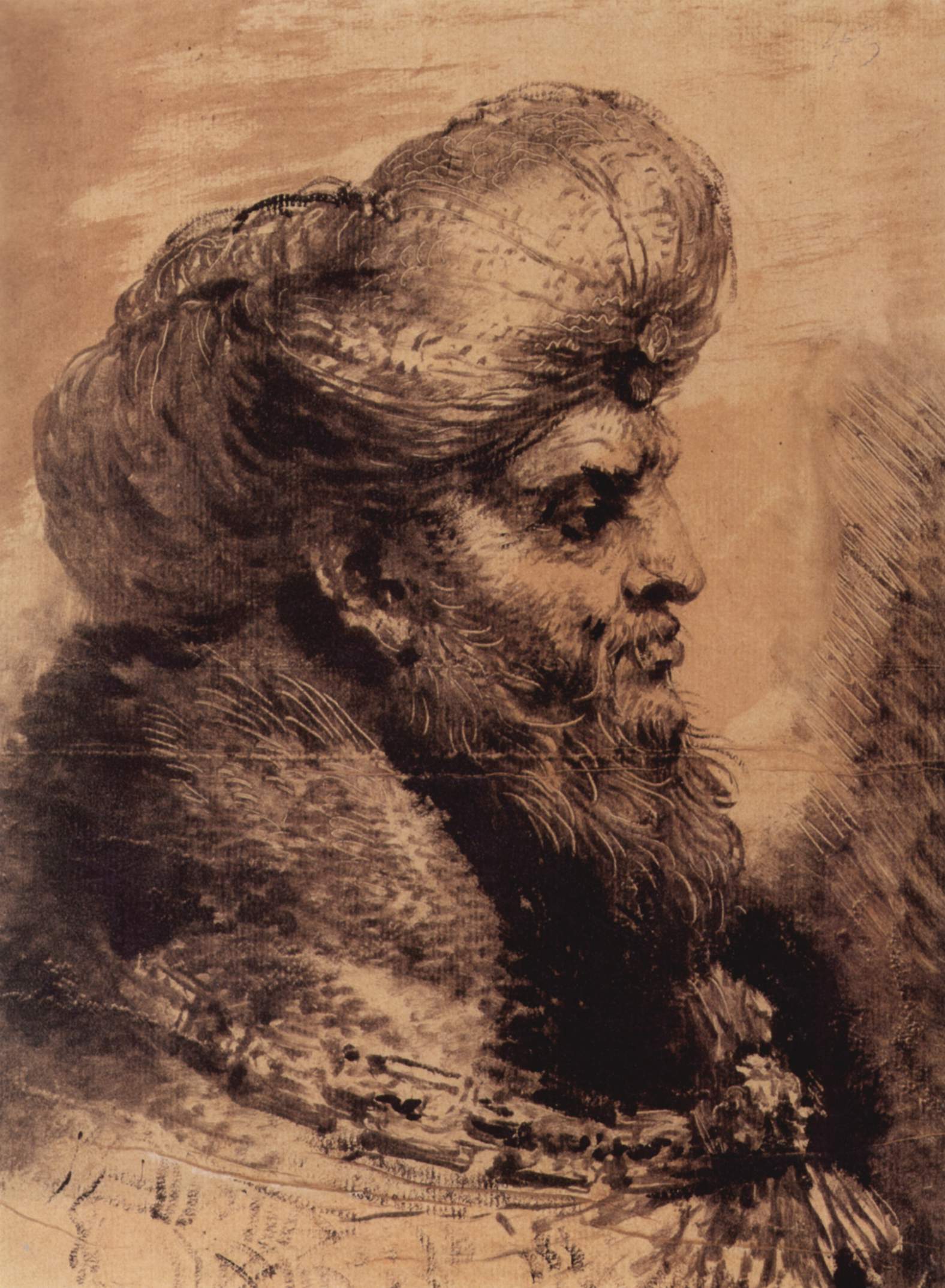
Kopf eines bärtigen Orientalen 1655 31.7 × 23.6 cm (12.5 × 9.3 in), Windsor Castle
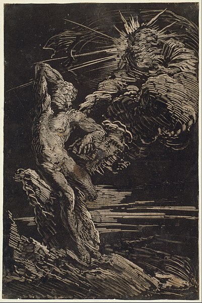
Giovanni Benedetto Castiglione (1609–64) was an Italian painter and etcher who was the first artist to produce brushed sketches intended as finished and final works of art (rather than as studies for another work).
Heavily influenced by Rembrandt he experimented with different inking variations on etchings. From there he invented the monotype process in the 1640s. He produced over twenty surviving monotypes, over half of which are set at night.
He normally worked from black to white. He drew directly into an unetched plate, drawing white lines with a stick, created tonal areas with his fingers, rags and brushes. He then printed using a printing press.
The Creation of Adam circa 1642 Monotype (dark manner) in black on ivory laid paper Height: 303 mm (11.93 in). Width: 203 mm (7.99 in).