Categories
Inspiration Linocut Media Printmakers

Linocut Inspiration

See also post: Linocut Technique

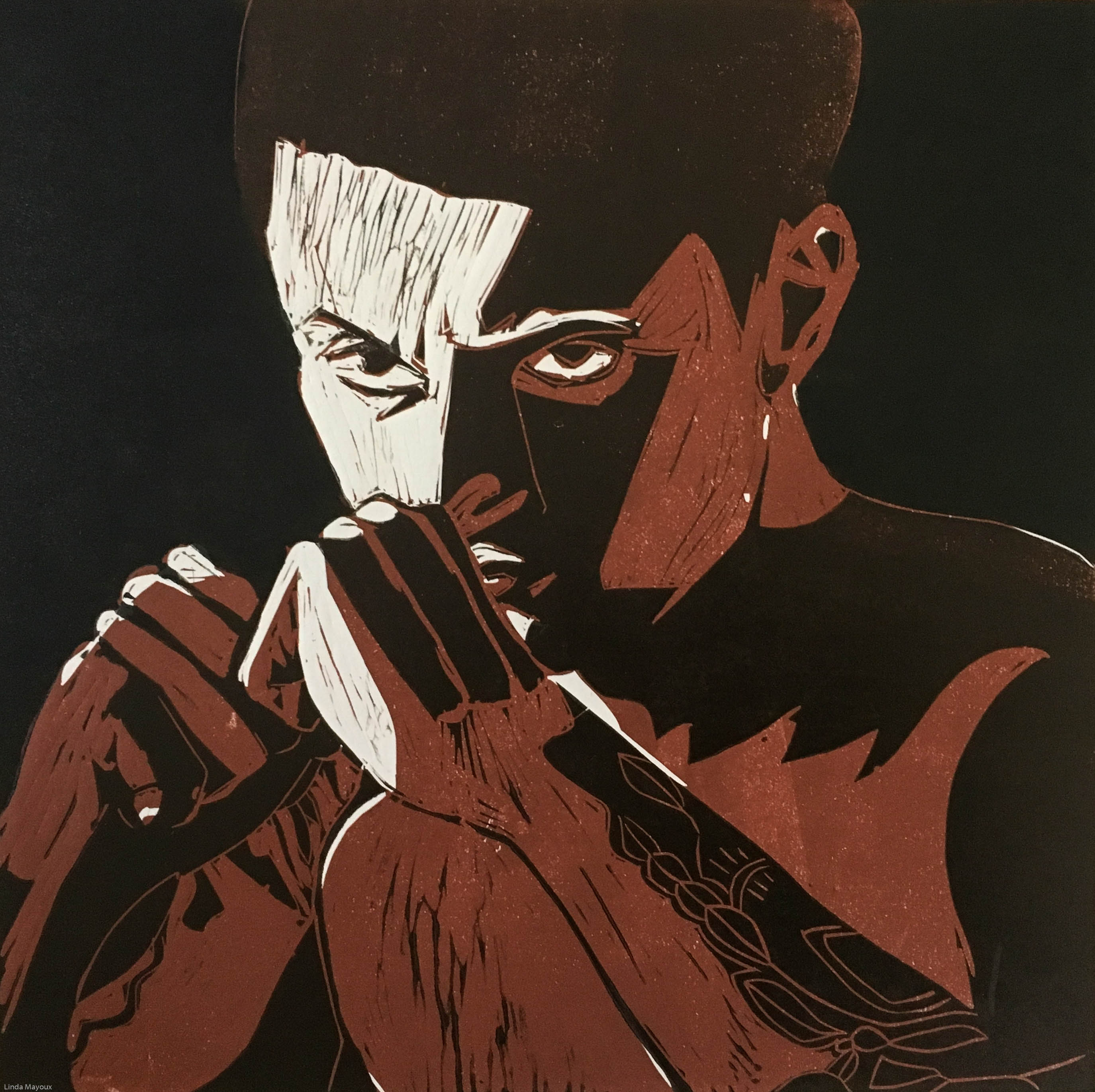
Linocut uses a cheap, versatile material that gives possibilities for dynamic mark-making and bold shapes with simplified colour. It has been used by for many different types of prints including portraits, political works, landscapes and typography. It has been particularly popular as a medium for political protest, including the Russian Revolution and US Civil Rights movements.

Earlier artists applied many of the techniques earlier developed for woodcut – both markmaking and use of tone and structure. Some were influenced by Japanese woodcut traditions as well as Western wood engraving and African and Oceanic art.  Linocut artists from the Grosvenor School and Russian Revolution (see below) were influenced by major art movements of the twentieth century, particularly cubism, futurism and constructivism. Others developed new directions with Picasso’s use of the reduction linocut (that can also be done with any other surface like wood). Contemporary linocut artists used a wide variety of experimental techniques, using abrasive solutions as well as power tools to create a range of marks and tones.

Nineteenth century

Linoleum was invented in the early 1860s and first used for printing in 1890 in Germany for the manufacture of wallpaper.

Franz Ciceck, an Austrian artist and teacher was one of the first to popularise lino for artists’ prints. He recognised the medium’s potential to instruct children in colour and design: it was cheap, easily worked with simple tools, adaptable to water-based inks, and versatile. He toured Europe and North America with examples by his pupils and influenced art education worldwide.

Twentieth century

In the early 20th century linocut became very popular as an artistic medium.

German Expressionists  1905-1920s : The first major artist to adopt linocut as a medium was Erich Heckel, and his earliest linocut is dated 1903. Artists from Die Brucke regularly used linocut instead of woodcut from 1905 to 1920s. These focused on bold shapes and expressive distortion in monochrome prints. The use of lino was ideal for this, although the fine lines and use of woodgrain etxture in some of the woodcuts was not possible.

This German Expressionist tradition has been continued by modern artists like Georg Baselitz who produces very large linocuts and combination prints often on subjects of political protest.

Russian Revolution

In revolutionary Russia important linocuts were produced from about 1918.

Lyubov’ Popova  was a Russian avant-garde and ‘new woman’ artist (Cubist, Suprematist and Constructivist) painter and designer. She produced a number of linocuts in constructivist style.

Grosvenor School

The printmakers of the Grosvenor School (see C.S. Ackley, 2008) produced very dynamic linocuts with strong curvature distortion influenced by the Vorticist and Futurist movements. Key artists were:

The work of the Grosvenor School has also influenced some contemporary linocut artists like the Canadian Gary Ratushniak who was trained by Sybil Andrews draws also on native America traditions.

Edward Bawden

Edward Bawden is another English artist and illustrator who often worked in watercolour, but also produced many linocuts. His work is more figurative and many of his paintings are from his experience as war artist in the Second World War.

Matisse

Matisse produced 70 linocuts between 1938 and 1952. These are similar in both style and subject matter to his black and white monoprints of figures. They use a fluid expressive white-line technique that takes advantage of the variation in  line that can be achieved as linocut tools glide through the  the soft material..

Picasso

See S. Coppel, S. (1998)

Picasso used linoleum for popular posters in the early 1950s. In 1959 he began a series of innovative colour linocuts, developing the reduction print technique. He developed a method of printing in different colours progressive states cut on a single block, so that the finished print comprises layered impressions of all the states.

US Civil Rights Movement

Linocuts were very popular as effective and cheap media for mass communication by African American artists involved in the American Civil Rights movement. Influenced by both African and Mexican art they depicted images of racial and sexual issues. Key proponents were:

Contemporary linocut

Recently there has been a resurgence of interest in linocut as an art form. It is a key part of the many printmaking courses as an easier introduction to relief printing than woodcut. It has therefore become widely used for things like greetings cards. But there are also contemporary linocut artists doing innovative work – including very large pieces that exploit its potential for being cut into smaller blocks and because of its relatively light weight. There has been development of a wide range surface etching and texturing techniques using different tools.

Some of the sources I have looked at (in alphabetical order – unfortunately  websites for other artists I looked at were fleeting and disappeared  since I started the course).

  • Richard Bosman creates linocuts that are often very experimental in their use of different types of paper.
  • Helen Brown creates landscape linocuts from plates produced outdoors on site.
  • Lynda Burke creates dramatic monochrome landscapes with a variety of mark-making.
  • Angela Cavaglieri produces very large linocuts on rolls.
  • Katarzyna Cyganic manages to create very detailed and complex monochrome images using using reflections and reversals.
  • Rika Deryckere produces striking overlaid images on contemporary themes.
  • Geraldine Theurot creates imaginary narratives See Saatchi Art

Bibliography:

  • Ackley, C. S., (2008) British Prints from the Machine Age: Rhythms of Modern Life, London: Thames & Hudson Ltd.
  • Coppel, S., (1998) Picasso and Printmaking in Paris, London: South BGank Publishing.
  • D’arcy Hughes, A. & Vernon-Morris, H., (2008) The Printmaking Bible: the complete guide to materials and techniques, San Francisco: Chronicle Books.
  • Griffiths, A., (1980) Prints and Printmaking: An introduction to the history and techniques, London: British Museum Press.
  • Martin, J., (1993) The Encyclopedia of Printmaking Techniques, London: Quarto Publishing.
  • Stobart, J., (2001) Printmaking for Beginners, London: A&C Black.
  • Woods, L., (2011) The Printmaking Handbook: Simple techniques and step-by-step projects, London: Search Press.
  • Yeates, S., (2011) Learning Linocut: A comprehensive guide to the art of relief printing through linocut, Gamlingay, UK: Bright Pen.

Exhibition

British Museum

Recent acquisitions two sets of Picasso linocuts (10 January – 6 May 2014)

Categories
Media

Linocut techniques

What is a linocut?

Linocuts are a type of relief print in which the artist cuts the design into linoleum or similar materials like vinyl and floor tiles as the printing surface, using gouges and knives. The softness and lack of grain of linoleum enable the artist to cut smoothly in every direction but very fine lines can crumble.

Texture can be created through techniques like sanding and use of abrasive materials, monoprint techniques during inking and use of bleach and other etching media.

Masks can be used over portions of the image, parts of the image can be hand-coloured.

Blocks can also be rotated in different colours or tones to make abstract images.

For my linocuts in Printmaking 2 see:

Project 1.3 landscape composition

Project 3.1 Chiaroscuro: Leon

Project 5.1: Grand Arcade: Memories Revisited

I also did more experimental linocuts in Printmaking 1 that provided the basis for my work and notes here.

Bibliography of sources consulted:

  • Coppel, S., (1998) Picasso and Printmaking in Paris, London, South BGank Publishing.
  • D’arcy Hughes, A. & Vernon-Morris, H., (2008) The Printmaking Bible: the complete guide to materials and techniques, San Francisco, Chronicle Books.
  • Stobart, J., (2001) Printmaking for Beginners, London, A&C Black.

For approaches by other printmakers and artists see also linocut inspiration

Linocut Process

Choosing or planning the image

Strong tones, simple shapes, patterns and textures are important.

Lino is a direct printing process so the image will be reversed when printed. It is useful to check the design through using a mirror.

It is likely that any sketch will need to be adjusted or simplified to make a good linocut image. To simplify the shapes, adjust the edges and clarify the movement of the eye though the image. It is very useful to do Notan structure drawings to check the underlying tonal structure and dominant shapes. It is particularly useful to do this digitally using a programme on the iPad like Procreate. This enables you to design specific brushes that mimic linocut tools and freely and quickly experiment with different versions, interpretations and colours of a design.

Images can be constructed through positive and/or negative shapes. Linocuts can be mostly cut away to leave lines on paper background, or mostly the colour of the ink. Or a combination of the two. It is worth experimenting with  digitally reversing the tonal values to explore different interpretations of an image. It can also be done using white chalk on black paper, experimenting with different marks to simulate linocut marks. Black and white collage can also be useful.

2) Transferring the image onto the lino

Tracing paper or a lightbox can be used to help reverse the image.

This can be done using tracing paper and a soft pencil, or carbon paper. Or simply drawing on.

It is useful also to go over the black areas with pencil or ink and brush so that the cuts will be clearly seen.

3) Cutting the lino

Cut marks are part of the identity of a linocut. These can give a sense of movement and life. They can also give a wide variety of textural contrast. Sometimes a clean area with no cut marks is required.

Cut along the surface of the lino – you don’t need top cut deep. Even pressure can create a smooth line.

Varying the pressure and angle of the tool and/or speed of cutting gives a more varied and expressive line.

If using a large lino block, or cutting away large areas, it is best to mount the lino on a solid surface like hardboard with glue. This will keep the plate rigid through repeated use. This is particularly important in reduction or combination prints.

Tools

  • Veining tool: to cut an outline around the largest shapes so that they are easier to cut out. And for the finest lines and smallest areas.
  • Gouge: has a rounded blade that cuts into the lino first and leaves a round end to each cut.  The gouge can be pushed into the lino and make a long smooth stroke. Short stabbed cuts can also be made as textural marks. Rough-edged marks by rocking from side to side. They come in a range of different widths and vary from shallow C-shapes to deep U-shapes.
  • V-tools: have a triangular blade that will leave a neat v-shaped cut. Longer cuts can be made and then tapered by reducing the pressure on the blade as it reaches the end of the groove. Short stabbed cuts will be triangular in appearance. A square end to the cut can be made by suddenly stopping the movement and levering the lino shard away from the block. They come in a range of different widths.
  • Blades: Angled and flat-end blades are designed for cutting a line around a shape before using a gouge to make the edge sharp, particularly if you want this to make a corner or a point. They can also be used to remove the top edge of the scoop marks or the ridges of cut marks if a clean area is required.
  • Scoops: ?? not quite worked out what to do with these.

Safety

  • Use a bench hook and steady the image, cut away from you. Turn the lino if you need to change direction.
  • Warm the lino to make cutting easier and prevent strain. This is easily done with a hairdryer or on a radiator.
  • Keep plasters handy in case of slips.

Proofing

It is useful to check the image as you go along by lying a thin piece of paper over the lino and using pencil or a graphite stick. This helps avoid over-cutting and better judgement of shapes. At a later stage it is useful to do proof prints.

4) Printing the image

Inking the plate

Use relief inks – water-based or oil-based. Relief inks are stiffer than etching inks.

Mix the ink into the colour you want with a palette knife. Use thinner ink if you have a lot of fine cuts.

Use a hard roller to get sharp outlines. A softer roller will go slightly inside the cuts and give a softer image. Ideally the width of the roller should be bigger than the block. Use a small roller to go over finer areas if necessary – check the corners and edges in particular.

You need an even coating of ink that is not thick or lumpy. The ink on the roller should look like fine suede and make a very gentle swish when rolling out. There should be no spots or marks in the ink because these will be transferred to the block, and probably to the paper. It is much better to apply several layers of thin ink than one thick layer – ink that is too thick may ooze down into the cut marks and loss of detail will occur.

You can re-ink the lino several times for the same colour, or to mix colours.

Papers

Relief prints are usually printed onto smooth dry paper, but can be printed on dampened paper.

Thinner more sensitive papers can be used, particularly if printing by hand.

Registration

Registration enables you to print an edition with every print being positioned in the same place on each sheet of paper. It also enables you to over print a new layer of colour over a previous print.

Registration methods include:

  • drawing frames of two sizes on a large sheet of paper – a smaller one for the block and a larger one to position the paper
  • putting tape supports or marks at one or more corners on the bed of the printing press for the block and paper eg marks for the block and tape supports for the paper (my preferred method)
  • mounting the block on a hard board that is the size of the paper.
  • using a thick cardboard jig the same height as the surface of the lino and the same size as the paper, with a hole for the lino plate cut out in the appropriate position. Or a simple L-shape can be used.

In all these cases the top left hand corner of the back of the paper should be marked to ensure it is placed the right way up.

Printing

The linocut can  be printed in a simple screw or lever press or by hand, by rubbing the paper against the inked block with a spoon, rolling pin or baren (a slightly concave disc sheathed in bamboo), or by laying the inked linoleum on to the paper and hammering the back of the block. These hand-printing methods can also be used to print on to textiles, or the inked block can be turned on to fabric stretched on the floor and trodden on by the printer. Hand printing can give a more sensitive image.

If using a printing press, the paper can be put on top of the block if you want some embossing. Also if you want to selectively dampen the paper to give texture to the inking. If you want easy registration by eye then put the paper down first and place the block on top.

If corners have been cut back, or to avoid ridge marks at the edges of the lino block on the paper, use lino runners along the edge to stop the rollers sinking onto the paper.

Editioning (single colour or multi-block)

Number the prints in the order you take them. Marked Print No/Total prints.

The edition is only true if the block or blocks remain true without any additional cutting during the print run. It is usual to print all pages of the first colour together, then the next etc. (But not if you are changing the colours of ink on the blocks). The first print is labelled the artist’s proof.

Multiblock Linocuts

A multi-block linoprint is where each colour is printed from a separate lino block, cut to match the original design.

To begin you need to create a design that can be printed in two or more colours (often 3 colours is good). In some cases a black registration block is used containing the finished design to help cut the different layers and also unify the image at the end.

When you have drawn your design outlines and solid dark areas you can colour in areas of your design with pens.

Printing is generally done light to dark, using light colours for the largest areas on the least-cut block. This enables layering of colours to produce a range of different tones and hues as the inks mix and overlay each other.

Block 1: lightest with only the areas that will remain white cut out. This image then needs to be transferred from the paper to Block 2 while the ink is still wet.

Block 2: darker colours with colour of block 1 cut out. This image then needs to be transferred from the paper to Block 3 etc if more colour blocks are used while the ink is still wet.

Blocks 3+ and so on.

Registration block goes last.

REGISTRATION IS KEY!!!

Reduction Linocut (also known as ‘suicide print’)

A technique that creates a multiple colour print from one block.

First prepare a coloured design and transfer it to the block as in other methods. It is useful to have a master tracing to work from as successive layers will disappear. Colouring areas to be retained helps prevent mistakes.

The first cuts are the colour of the paper to be printed on. The surface is then reduced for each successive colour, usually working from the lightest to the darkest. Remember ‘CUT TO SAVE’ previous colour. Some cuts can also be masked if you make a mistake.

As you cannot go back, a batch of prints large enough for the print run should be done at each stage.

Reduction prints are usually printed in opaque inks as you want each successive colour to sit on top of the previous layer (is this true?? Or do you want mixing???)

Categories
Figure Landscape Media Urban

Rika Deryckere

website: http://www.rikaderyckere.com/index.shtml

Rika Deryckere I’m a stranger here myself
Rika Deryckere Bicycles on the Street
Rika Derykere Nude in Cazilhac 1
Rika Deryckere Fluide
Categories
Abstract Inspiration Landscape Linocut Media Natural Printmakers Urban

Geraldine Theurot

Webpage and links: http://www.artsetter.com/member/gtheurot

Geraldine Theurot Street of San Francisco
Geraldine Theurot San Francisco, Sutter St
Geraldine Theurot The Man
Geraldine Theurot New York
Geraldine Theurot Brooklyn Birdge
Categories
Inspiration Landscape Memory Natural Printmakers Woodcut

Richard Bosman

Richard Bosman (B 1944) is an Australian artist and printmaker who has produced woodcuts and linocuts since 1980s.

Google images for Richard Bosman linocut

Many of Bosman’s paintings and prints are concerned with tragedies in dark urban settings, on rough seas, and in eerily quiet woods.  They have been influenced by expressionist printmakers like Edvard Munch and Emil Nolde. Also Japanese printmakers like Hokusai.

Some of his work is very experimental. He printed Smokers (1982) with his wife in an edition of two rolls of paper towels.

Born in India, raised in Australia, and the son of a merchant sea captain, Bosman has repeatedly returned to the setting of the sea. In an exhibition “Death and the Sea” at Owen James Gallery  he depicts different aspects of the South Pacific sea: volcanoes, moonlit voyages and farewells, small rowboats fighting gigantic waves – “mankind is fickle, life is fleeting, and that the ocean remains unconcerned with our plight”.
“There is a cinematic beauty to these works by Bosman.  We sometimes feel as though we are looking at a film strip stopped in time, somewhere between cause and horrible effect.  Works such as Volcano and Fog Bank are subtle in their ability to show the progress of time, but there are visual gaps in it, and it is in these gaps that much of the intrigue lies.  In Night Sky the effect is almost imperceptible.  Here, only the stars move, and in this movement we find we are disoriented. Both South Seas Kiss and Mutiny share the short-lived joy of shore-leave, as a captain is first enraptured by an island girl only to meet his demise once he turns his back.”
 

Categories
Abstraction Inspiration Printmakers

Angela Cavalieri

Angela Cavalieri produces very large art linocuts based on text and visual storytelling. These have a very dynamic rhythm with swirls of words and architectural forms.

Angela Cavalieri’s website: http://www.angelacavalieri.com

Google for her large linocut prints

Angela Cavalieri: large scale linocut printmaking process for Guerra e Amore

[wpdevart_youtube]f0oWrgfd9iE[/wpdevart_youtube]

Guerra e Amore is based on music of Claudio Monteverde and the architectural drawings and prints of Giovanni Battista Piranesi

She does extensive visual research to develop the basic concept.

She then works directly on the linocut  –  for Guerra e Amore she spent 2 months drawing, cutting and redrawing using ink, charcoal and chalk. Text has to be back to front and has to be drawn and redrawn many times to get the overall effect.

She then cuts the large block into different coloured block pieces and draws on registration marks on a large under-paper.

She handprints onto rolled canvas. Needs assistance eg 7 people for printing. Issues in consistent inking – takes about an hour and has to be done before dries out. Burnishes and hand prints. The whole process takes takes about 6 hours.

Touches up a bit with a hand brush. Paints in background with oil paint. Then hangs.

Categories
Inspiration Landscape Printmakers Urban

Gary Ratushniak

Gary Ratushniak on the Art of Linocut

[wpdevart_youtube]BZsO1ZDax1o[/wpdevart_youtube]

Gary Ratushniak’s Printmaking Influences

[wpdevart_youtube]pOW1OdUpSHw[/wpdevart_youtube]

A Canadian printmaker who produces linocuts inspired by Native American art and Sybil Andrews of the UK Grosvenor school.

He introduces tone in his linocuts by selectively wiping off the ink.

Categories
Chiaroscuro Inspiration Landscape Natural Printmakers

Katarzyna Cyganic

Inspiration

Katarzyna’s work is extremely detailed linocut made of dot shading and very fine markmaking. It has a dreamy quality. I am not sure if this is partly done using etching techniques with bleach, or something like a mezzotint shader.

She also generally chooses dramatic composition – reflections, swirling sky and water. The compositions are often upside down reflections in water, or putting the dark area at the top right. This significantly increases the sense of drama and the unexpected even on apparently simple scenes of just trees and water.

website: http://www.linoart.eu is now subscription only

Reflections This is an amazingly detailed and well-obesrved linocut rendering of tree reflections in water.

Forest This shows leaves falling from trees with sharp contrast between the white leaf shapes against a misty background of forest trees.


Landscape  This shows a waterlily pond with beautiful contrasts between the dark round waterlily leaves, straggly thin stems and water.

Landscape This shows a seascape with swirling waves in very small marks. Though the scene itself is not so unusual.

More information

http://nydamprintsblackandwhite.blogspot.co.uk/2014/10/linocuts-by-cyganik.html

There is no biography or details of technique or size of the images on the website.

Categories
Inspiration Landscape Linocut Media Natural Printmakers

Lynda Burke

Inspiration

Lynda Burke’s linocuts are mainly monochrome black and white. She has a strong sense of composition and design – using dramatic perspectives, grills and grids. With variety of markmaking and texturing in eg the skies. Some have hand-coloured splashes of red.

website

linocuts      landscapes  interiors and still life

Her work

Verduno, Italy   I like the vertical repetitions at the bottom here – is this a graveyard?

View from Long Wall Suffolk

Crazy Paving  I like the design of this from a simple subject.

Clissold Park  Interesting view through wire fence

Colombe d’Or, Vence this has an effective splash of red.

Terrace 1 Vence again I really like the bold composition of this with the railings of the terrace.

Tree in Woods

Bosham  here the marks for the mackerel sky I find effective together with the long format and rather bleak landscape.

Biography

Lynda Burke was born in London in 1950 and has lived and worked there most of her life, in recent years sharing her time between Camden and Vence in the south of France.

After a two-year Fine Arts Foundation Course at East Ham Technical College in London she studied Painting at Winchester School of Art – DipAD / BA(Hons) –  for three years under the guidance of established artists including Patrick Heron, graduating in 1972.

Throughout the 1970s, Lynda continued painting and print-making as well as raising a family. She regularly sold work privately and in solo exhibitions during the 1980s and 1990s, including commissions from The Distillers Company (now Diageo) and others. Her work is in private collections in England, France, United States, Japan, Singapore, Finland, Sweden, Switzerland and Italy.

Since the year 2000, Lynda has been an official guide at the original Tate Britain and the celebrated Tate Modern in London, leading regular tours around the vast galleries and bringing modern art to life for thousands of international visitors.

Since 2006 Lynda has been making art mainly in Vence, where she has also resumed an earlier interest in the medium of linocut prints, some of which can be seen on this site. As well as her Tate Modern tours in London she has also started a series of lectures on the famous artists of the Côte d’Azur.

Source: her website

Categories
Inspiration Landscape Media Natural Printmakers Woodcut

Helen Brown

Google images

“I work directly from the landscape in either lino or woodcut. Working outdoors enables me to capture the line and fluidity of scenes and localities.

My landscapes are landscapes of self-possession and movement. Through their layered and textured forms they express the tectonic flow of the earth, as mountains and valleys rise and fall in an experience of time much more immense than our own.

I spend time in the places my work depicts, returning to them. From the Sussex Downs to the foothills of the Himalayas, my prints are imbued with the emotion of place. Each one of my pieces is given individual life though colour and chine colle (paper overlay) or hand tinting, just as the mood of a scene shifts with light, time and experience.

My work takes shape in the place between landscape and dreamscape. Whether in architectural or animal forms, it connects the experiential world to the imagination, the material to the emotional.

Our thoughts and feelings colour the things we encounter, and they in turn colour us. In my prints I give visual expression to this conversation.”

See page on Art of Illustration

Biography

Helen Brown grew up in Cambridge and did an Art Foundation course there then an art degree at Brighton. She learned screen printing, etching and linocut.

Techniques

While in Brighton she started to focus on linocut because she could do observational prints outdoors :

“I went to Devil’s Dyke, just outside Brighton and cut the block while sitting outside the pub. They gave me free food and loads of people asked what I was doing. The print worked very well, and people bought it. I thought I would follow this path for a while because I enjoyed it, and it worked well with my travelling.”

“I like the stages; you make the block and then there is the never-ending choice of how to print it. I might print the block in ten different colours. I really like chine colle, where I use coloured papers that I have cut up beforehand. This technique I have taken to extremes.”

“I have recently been thinking more about the marks, so I feel very inspired with my work.I made a lot of blocks from my last trip to Guatemala, which I print to have a bright, strong colour blend, like their dyed and woven fabrics. The landscape in Guatemala is quite unreal, so using unrealistic colours would not seem right. That is what is good about printmaking: I can print the blocks and it might look great, or not, but I can easily change the way I print it.”

The  prints are individually made by the artist in tranches of a few prints – the edition is not all printed at once.

See profile in D’Arcy and Vernon-Morris pp223-225