Overview and Assessment
This project asked me to use my imagination, memories or experiences to produce a print with unusual textural effects, ‘going with the flow’. As with Project 5.1 the theme evolved from the original concepts with the printmaking process.
It was clear it is very easy to make a complete mess with this approach. It would have been possible to use much more solid textures for the overprinting eg just card and carborundum and achieve a similar effect to the urban abstract linocuts from Project 1.3. But using the more complex open textures of bubblewrap and netting required a much more evocative and interesting under-texture.
The plate itself was quite fragile because bubblewrap does not varnish well. So I was a bit conservative with the colours to avoid having to wash it. Overprinting white on black gave interesting textile-like lace textures on newsprint.
But I think all three images work quite well and were pleasant surprises once I got a bit of an idea how the images would work together in which orientation.
Arcadia Recycled: Concept Development
This project followed from Project 1 again starting with my photographs of the Grand Arcade. Revisiting my photos and the Grand Arcade itself I found the light and shade patterns on sunny days is reminiscent of religious architecture – temples, cathedrals, mosques.
I started to explore idea of ‘Arcadia’ as a somewhat imperfect play on the word ‘Arcade’.
Arcadia (Greek: Ἀρκαδία) refers to a vision of pastoralism, harmony with nature and an idyllic vision of unspoiled wilderness. The Greek province of Arcadia is mountainous and remote, in contrast to the Greek City states. In Greek mythology, the mountainous province of Arcadia in the Peloponnese was the domain of Pan, a virgin wilderness ‘paradise’, home to the god of the forest and his supernatural court of dryads, nymphs and other spirits of nature. Drawing also on Virgil’s Eclogues, Renaissance mythology came to see Arcadia as a lost, Edenic form of life inhabited by ‘noble savages’ living close to nature, uncorrupted by civilization, and virtuous. It was often seen as unattainable, and sometimes contrasted with the more ‘progressive’ concept of Utopia.
In the 18th and 19th centuries Arcadia as a bucolic idyll was a common theme for artists.


The Grand Arcade attempts to be the face of ethical capitalism – supporting green forms of transport, recycling schemes and support for charities and local development. I started to think around the theme of:
The Grand Arcade as a temple to the search for an unattainable eternal happiness and bliss.
At the same time other photos and discussions on the Grand Arcade website pointed to rather darker side of pressures of the ‘Your Worth It’ culture. There was a discussion about the images of women being promoted in some of the advertisements:
https://www.cambridge-news.co.uk/news/cambridge-news/khloe-kim-kylie-kardashian-jenner-14325326
Observing people and couples also indicated a certain amount of stress with all the shopping – women’s preoccupation with fashion while men tagged along. Older men in particular looking a bit lost amid all the lingerie and shoes. I started to experiment with collaging some of my photographs into more surreal images of people and advertising/shopping experience.
During this period I was also influenced by:
David Dernie exhibition of collaged imaginary abstract cityscapes at his exhibition during Cambridge Open Studios. The ethereal aesthetic keyed into a urban vision of ‘Arcadia’.
Cornelia Parker as I revisited the art series Imagine. I was very struck by her steamroller approach to materials – and the possibilities of using my printing press to do a similar job on some of the recycling materials I had been collecting like empty pill packets, bottle tops etc. And potential uses as texturing. As I researched her work in more detail I was also attracted by her iconoclastic dark side – the close juxtapositions of light and dark.
As the project asked me to ‘go with the flow’ and be guided by the materials themselves, I used these ideas as themes at the back of my mind, rather than systematically planning through to a design.
Stage 1: Design of the Plate
The project asked me to draw up my design so that it would consist of irregular shapes that could be cut out of card of different thickness and then recompiled into a sort of jigsaw.
The architecture of the Grand Arcade is very geometric. I tried to capture this in a series of large A2 abstract screenprints from memory of my photos – temples, steps, grids on the ceiling. Doing very large screenprints in an extremely hot studio in the July heatwave let to a lot of imperfections in the printing that I also found quite interesting and suggestive. I produced a very simplified geometric design that could be used in different crops and orientation – temples and/or monsters.
Stage 2 Creating textures on the Plate
The Grand Arcade management has a strong stated commitment to recycling and environmental sustainability. So I decided to focus in this project on using recycled materials:
- Bubblewrap: representing plastic waste (very much in the news in July) also bubble dreams that burst. I did a You Tube search on using bubble wrap and came across the pixellated Bubble Wrap art of Bradley Hart
- Netting: from orange packaging that signified entanglement, webs, curtains
- Pill packaging that could be crushed a la Cornelia Parker into puckered faces and figures and the silver rounds torn off to complement the round bubbles of the bubblewrap.
I decided not to use carborundum for this project, but explore that in Assignment 5.
3) Printing of the image
The project then asked me to do something unusual with the papers I was going to use.
My initial idea was to follow the approach taken in Project 1.3 where I had inverted abstract urban abstract linocuts to produce some interesting effects. I started by inverting and printing the textured plate on top of the original screenprint design with the whole jigsaw. These were a disaster – it was obviously very easy to make a complete mess. This was partly because the background was much too solid and strong compared to the delicate texturing of the plate. The designs did not add anything to each other as they had in Project 1.3 when both print layers were more solid so that colours merged and made interesting shapes. I was also missing any meaning or intensity that would correspond to my themes and ideas above.

Following the recycling theme I decided instead to use old prints that had been rejected from earlier assignments. Going back through my heap of old prints that I had kept for collaging and overprinting in this sort of experimental work, I came across a series of A2 combination linocut/monoprints from Printmaking 1 on the theme of the ‘Dance’. These featured themes of love, hate and violence that echoed some of the ideas in my photo collages above – the darker side of the advertisements and fancy lingerie.
The prints were in different colours and with different moods. Depending on the cropping and orientation they could be made to suggest anything from rural hills and landscapes to dark violent horror.
Arcadia recycled 1 Through the Window
The first print used a colourful version of the dance in yellow/oranges and green/blues. It was rather difficult to predict what the effect of overprinting would be. Overprinting once was not very interesting. But rotating and overprinting again with black suggested a window looking out through swirling dream walls on Arcadian hills. I compared different orientations each of which gave a slightly different mood whether the ‘ceiling’ was on top, below or to the side. I decided on the first image but cropped it down to focus on the window and blue beyond. I really like the dreamy and optimistic feel of this image – better than I expected.
Arcadia recycled 2 Longing
The second image was much more about passion – soft body colours and when I turned the original print on its side suggested a couple making love. Overprinting this just once with the temple in black looked like the temple was more of a prison over a huddled figure. This full size image I quite liked because of the contrast between the lovers seen fully on the left and the huddled ‘rejected’ figure on the right. But when I showed it to other people they found it too unbalanced and distracting. Cropping it down gives much more poignancy to the huddled figure while retaining an ambiguous suggestion of lovemaking or fantasy at the back.

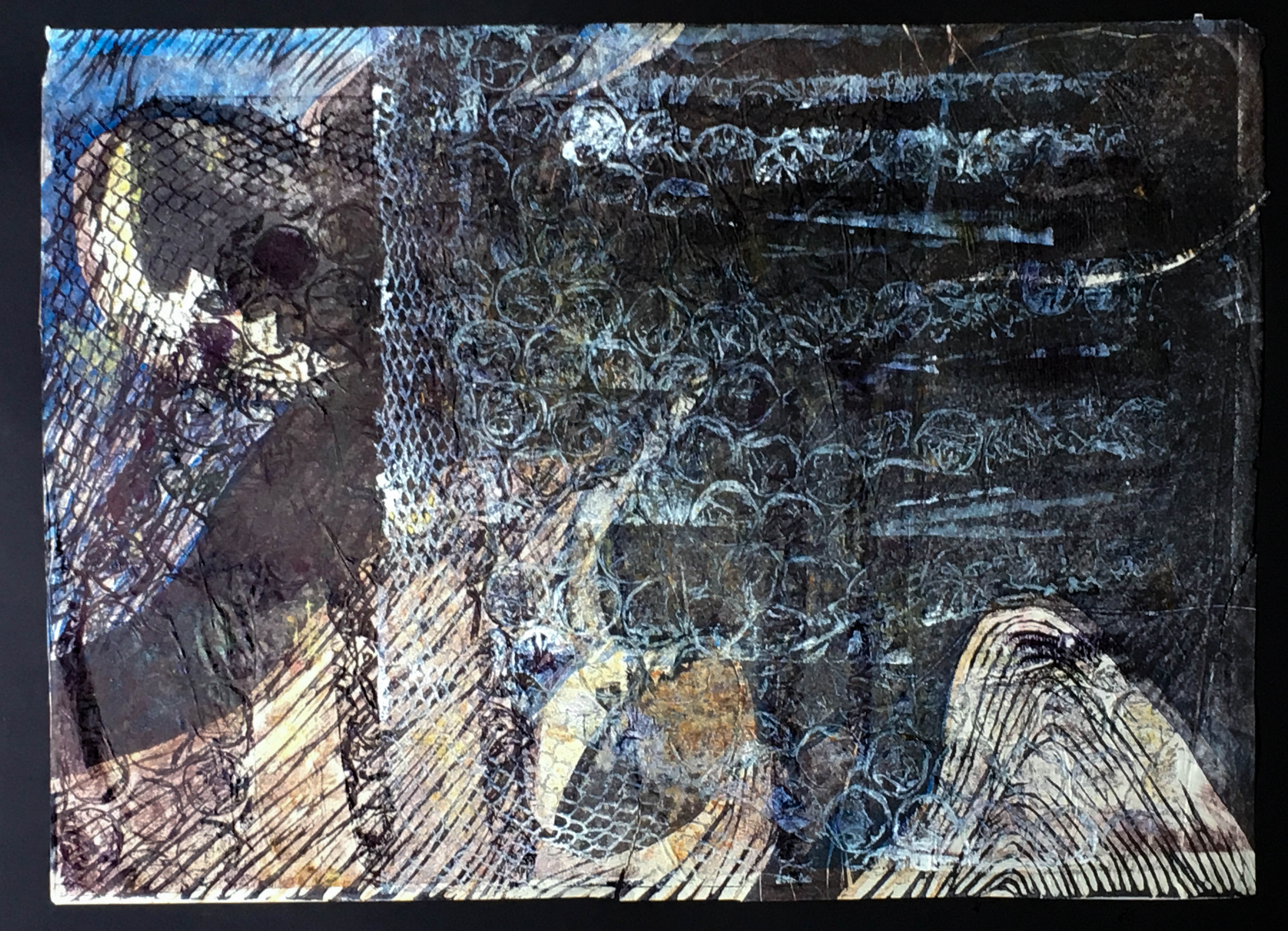
Arcadia Recycled 3: The Edge of Nightmare
This third print started with a much darker and violent image on rather torn newsprint. I started just overprinting once in black – quite interesting when cropped right in. I then turned the plate round and overprinted again with white. This gave a much more ghostly and deathlike image. Cropping in to leave just the hint of the face of the menacing figure at the top gives more prominence to the white subject on the right looking out to a sort of ocean. I find this image quite haunting in its suggestion.

Final Reflections
It was clear it is very easy to make a complete mess with this approach. It would have been possible to use much more solid textures for the overprinting eg just card and carborundum and achieve a similar effect to the urban abstract linocuts from Project 1.3. But using the more complex open textures of bubblewrap and netting required a much more evocative and interesting under-texture.
The plate itself was quite fragile because bubblewrap does not varnish well. So I was a bit conservative with the colours to avoid having to wash it. Overprinting white on black gave interesting textile-like lace textures on newsprint.
But I think all three images work quite well and were pleasant surprises once I got a bit of an idea how the images would work together in which orientation.
Leave a Reply