Categories
Abstraction Artists Inspiration Random abstract

Helen Frankenthaler experiments

Studies for Project 2.2 Random Abstract Prints

Issues for printmaking technique:

  • Use water-based Schminke inks because they can be very dilute and mix beautifully on the paper.
  • Do a painting on the plate using different thicknesses of pigment and leave to dry fully.
  • Then selectively spray with water, and use gravity to move the pigment around, to produce the final painting.
  • Hand print on damp paper.
  • Many print variations can be made on the same inking plate through adding pigment and respraying.

About Helen Frankenthaler

Website of Helen Frankenthaler Foundation

Helen Frankenthaler (1928-2011) was eminent among the second generation of postwar American abstract painters and is widely credited for playing a pivotal role in the transition from Abstract Expressionism to Color Field painting.

Through her invention of the soak-stain technique, she expanded the possibilities of abstract painting, while at times referencing figuration and landscape in unique ways. Her 1952 Mountains and Sea, was a seminal, breakthrough painting of American abstraction. Pioneering the “stain” painting technique, she poured thinned paint directly onto raw, unprimed canvas laid on the studio floor, working from all sides to create floating fields of translucent color. Mountains and Sea was immediately influential for the artists who formed the Color Field school of painting, notable among them Morris Louis and Kenneth Noland.

Helen Frankenthaler painting: HFF website

Some of the most impactful for the mixing of pigments on the surface are her watercolours.

Helen Frankenthaler watercolours: Google images

In addition to unique paintings on canvas and paper, she worked in a wide range of media, including ceramics, sculpture, tapestry, and especially printmaking. As a significant voice in the mid-century “print renaissance” among American abstract painters, she is particularly renowned for her woodcuts.

Helen Frankenthaler print: HFF website

Stain painting techniques

Categories
Abstract Artists Inspiration Landscape

John Virtue

Paintings on Google

WeAreOCA profile of John Virtue

John Virtue is an English artist who specialises in monochrome landscapes. Virtue uses only black and white on his work as he sees colour as “unnecessary distraction”.He uses shellacblack ink and white paint.

He is well known for his “London Paintings” which were displayed in The National Gallery and focused on the London skyline, using easily distinguishable landmarks from the capital such as the Gherkin, the NatWest Tower and St. Paul’s Cathedral, to familiarise his audience with the otherwise hazy, smoggy and ambiguous drawings.

Categories
Abstract Drypoint Inspiration Landscape Printmakers

Ross Loveday

website: http://www.rossloveday.com/prints.html

‘The fine line which separates figuration and abstraction interests me; time, place , weather and light alongside gesture, glimpse and memory.

The subjects are only the starting points- sometimes small insignificant details or texture triggers a complete piece.’

Drpoint and Carborundum
Lifelines. Monoprint and Drypoint
North Bank Monoprint and drypoint

Working process

He uses drypoint with monoprint and/or carborundum on a metal plate.


Categories
Drypoint InProcess Inspiration Landscape Monoprint Natural Printmakers

Iona Howard

http://www.ionahoward.com/

She has a studio in Cottenham in the Cambridgeshire Fens.

My prints explore the notion of time and landscape through a contemplative exploration of surface. The sources of my prints can come from working in the open air or expressing landscape filtered through memory…I am captivated by the ancient semi-natural landscapes typical of my native west Cornwall where a blurred line exists between nature and human activity. Recent works of the Fens focus on the meeting point of land, horizon and sky, their flatness altering the perception of distance. ‘

From interview with Iona in Cambridge 4th Feb 2017:

Her landscapes have a strong geometric structure of contrasting colours and textures. She mainly uses a combination of carborundum, drypoint and monoprint techniques. A mix of a binder (polyurethane varnish) and carborundum grit is applied onto the surface of a plate and sealed with the same varnish. The binder has to withstand a lot of working but should not be so thick as to hide the grit texture of the carborundum. To contrast the carborundum, drypoint is added to produce an incised line. The plate is then inked up using etching ink and copperplate oil with a brush or roller.

Originally she worked in black and white. Now she also works in colour from memory and notes. Colour is built up by layering carborundum plates or more often overlaid though monoprint. Dry ink can be added as a third pass. Ink can be laid on thickly for more embossing. She can use the same base plate but with different seasons. Editions of 40. Or 10-15. She gets commissions where people ask for specific colours.

The technique allows working directly in the landscape to paint on the carborundum and the drypoint plates, and large images can be produced. She prints  on thick Somerset paper, printing to the edge of the paper to “leave the composition as unconstrained as the landscapes from which I seek inspiration”. She mounts with  nonreflective glass.


Categories
Inspiration

Sources

My work on this course draws on a number of sources:

Books and Journals

Galleries and Exhibitions

Websites

Categories
Inspiration Printmakers

June Wayne


See parts 2and3

Categories
Inspiration Media

Collagraph inspiration

!! Post in process

For details of my own collagraph prints and techniques see: Collagraph Techniques

Origins of collagraph printing

There is no exact date for the beginnings of collagraph printing. It evolved alongside other intaglio and relief printing, particularly with the move towards abstraction, introduction of ‘found’ materials and use of collage and mixed media in 1950s and 1960s. It was also helped by the widespread availability of new, cheap materials like acrylics and very strong adhesives.

Pierre Roche – sculptor developed gypsographic printing using bas-relief plaster engraving – inked in relief and printed by hand onto dampened paper, leaving a slightly raised blind embossing. Later he added layers of an adhesive called gypsum onto metal plate for an embossed effect.

Google images for Pierre Roche collagraph

Bauhaus: Klee, Picasso, Braque, Schwitters and Moholy-Nagy used collage materials and this was adopted by printmakers.

Rolf Nesch: one of the first artists to have consciously used collage to create collagraph printing plates. He gave depth and texture to prints by soldering out metal shapes and wire to metal printing plates. He then took this further by drilling holes in plates and sewing to the base plate. The prints were so deep he hneeded 8 blankets to get the right pressure and very heavy strong paper.

For more details on the work of Rolf Nesch, click here.

William Hayter developed viscosity printing – a technique that allowed a single printing plate to be printed in many colours. The basic principle is that the viscosity or stickiness of an ink can be reduced by adding linseed oil. A stiff viscous ink will absorb and mix with an oily ink laid over the top. But if an ink full of oil is placed on the plate first, it will reject a dry viscous ink and will not mix with it.

Google images for William Hayter collagraph

Richard Hamilton mixed painting with forms of printmaking, such as collotype, lithograph and silkscreen.

Google images for Richard Hamilton collagraph

Joan Miro created numerous collagraphs combining carborundum, aquatint and etching.

Google images for Miro collagraph

Henry Moore used collograph and resist techniques in versions of his drawings

Google images for Henry Moore collograph

Contemporary Collagraph

Brenda Hartill has been very influential in UK, building on Hayter’s techniques of viscosity printing.

Click here for more details of Hartill’s work

Hughie O-Donoghue produces large abstract figures using acrylic and carborundum

Click here for more details of O’Donoghue’s work

Other collagraph artists:

  • Katie Jones
  • Helga Thomson
  • Mari French
  • Tessa Horrocks
  • Kim Major George
  • Jet James
  • Laurie Rudlin
  • Marlene Groinic
  • Diane Bamford

Bibliography

D’arcy Hughes, A. & Vernon-Morris, H., (2008) The Printmaking Bible: the complete guide to materials and techniques, San Francisco: Chronicle Books.

Grabowski, B. & Flick, B., (2009) Printmaking: A Complete Guide to Materials and processes, London: Lawrence King Publishing.

Hartill, B. & Clarke, R., (2005) Collagraphs and mixed media printmaking, London: A&C Black.

Major-George, K., (2011) Collagraph: a journey through texture, UK: Major Impact.

Martin, J., (1993) The Encyclopedia of Printmaking Techniques,London: Quarto Publishing.

Stobart, J., (2001) Printmaking for Beginners, London: A&C Black.

Woods, L., (2011) The Printmaking Handbook: Simple techniques and step-be-step projects, London: Search Press.


Categories
Inspiration Media

Monoprint inspiration

!!In Process

See also Monoprint Technique  for an overview of the different types of monoprint and my own explorations

History and development

Hercules Seghers (1589-1638), a Dutch painter and printmaker, was one of the early artists who experimented with printing in color, on unusual papers (and linen), and with unusual horizontal formats to emphasize the horizon,  called. He experimented by using different inks and papers, but reworked his prints by adding accents by hand. Most of his images differ widely from impression to impression, and most are preserved in only a few sheets.

Rembrandt in the 1650s often retouched his plates with drypoint, burin or by burnishing areas to delete some unwanted parts. He also inked and wiped the plate each time differently, reworking some areas by moving around the ink with rags, fingers or paintbrushes. This enabled him to render flames, smoke and rich areas of shadow,  creating dramatic darkness and light contrasts. Each impression was virtually different from the previous one.

Benedetto Castiglione (1609-1664) devised a new printmaking process by drawing images directly onto an unetched plate and then pulling a unique impression; he drew white lines with a stick, created tonal areas with his fingers, rugs and brushes, then printed the plate using a press, just like we do today.

William Blake (1757–1827) started experimenting with monotypes. He painted with oil and egg tempera onto a copperplate or piece of millboard from which he pulled prints by pressing the dampened paper against the paint. He then retouched his works by hand with ink and watercolor. Some of the monotypes were used as a guide for overpainting in another media.

But the medium failed to become popular because of its limitation to one print and also because it depended too much on accidental effects and uncontrollable properties of ink when subjected to the heavy pressure of a press.

In the late 1860s when the young impressionists became interested in the creative use of inking. These printing experiments seem to have been influenced by early developments of photography with its black and white contrasts and interplay of positive and negative imagery.

Edgar Degas (1834-1917) found monoprints gave him a great deal of artistic freedom. He used the ‘dark field’ method and created very dramatic chiaroscuro effects. 

Camille Pissarro (1830-1903) was one of the artists who became interested in monoprinting after Degas exhibited his prints in the third Impressionist exhibition of 1877.  Through experimentation and accidents he created a series of unique impressions, turning his imperfections to his advantage to create effects of light and texture.

Paul Gauguin (1848-1903) worked independently developing his own unique technique called trace monotype. His method consisted of inking a sheet of paper, laying another sheet over it, and drawing on the back of fresh paper thus transferring the ink creating an image in a linear manner.

Paul Klee (1879-1940) experimented and mastered this method a few years later in his inventive drawings.

Maurice Prendergast (1859-1924) used this method extensively. He was  influenced by Japanese prints. He described his way of making monotypes : “Paint on copper in oils, wiping parts to be white. When the picture suits you, place Japanese paper on it and either press in a printing press or rub with a spoon till it pleases you. Sometimes the second or third plate is the best.”

Pierre Bonnard (1867-1947) produced hundreds of richly colored monotypes pressing the paper by hand or with a roller on a previously inked and painted metal plate.

Pablo Picasso (1881-1973), Chagall, Miro’, Dubuffet, Matisse and many other contemporary artists produced hundreds of exceptional monotypes, too.

Contemporary Monoprints

Bibliography

Ayres, J., (2001) Monotype: mediums and methods for painterly printmaking, New York: Watson-Guptill Publications.

Brown, N., Tracey Emin, London: Tate Publishing.

D’arcy Hughes, A. & Vernon-Morris, H., (2008) The Printmaking Bible: the complete guide to materials and techniques, San Francisco: Chronicle Books.

Grabowski, B. & Flick, B., (2009) Printmaking: A Complete Guide to Materials and processes, London: Lawrence King Publishing.

Hambling, M., (2009) The Sea, Salford Quays: The Lowry Press.

Hauptman, J., (2016) Degas: A Strange New Beauty, New York: MoMA.

Hayter, C. E., (2007) The Monotype: The History of a Pictorial Art, Milan: Milton Avery.

Martin, J., (1993) The Encyclopedia of Printmaking Techniques, London: Quarto Publishing.

Merck, M. & Townsend, C. (eds.) (2002) The Art of Tracey Emin, London: Thames & Hudson.

Newell, J. & Whittington, D., (2004) Monoprinting, London: A&C Black.

Ramkalawon, J., (2016) Maggi Hambling Touch: works on paper, London: Lund Humphries and British Museum.

Stobart, J., (2001) Printmaking for Beginners, London: A&C Black.

Woods, L., (2011) The Printmaking Handbook: Simple techniques and step-be-step projects, London: Search Press.

Exhibitions and galleries

British Museum

Maggi Hambling – Touch: works on paper  (8 September 2016 –29 January 2017)

Fitzwilliam Museum

Degas: A Passion for Perfection  (3 October 2017 – 14 January 2018) prints in various media

Maggi Hambling: The Wave (27 April – 8 August 2010) monoprints and etchings

National Gallery

Maggi Hambling: Walls of Water (26 November 2014 – 15 February 2015)

Categories
Inspiration Linocut Media Printmakers

Linocut Inspiration

See also post: Linocut Technique

Linocut uses a cheap, versatile material that gives possibilities for dynamic mark-making and bold shapes with simplified colour. It has been used by for many different types of prints including portraits, political works, landscapes and typography. It has been particularly popular as a medium for political protest, including the Russian Revolution and US Civil Rights movements.

Earlier artists applied many of the techniques earlier developed for woodcut – both markmaking and use of tone and structure. Some were influenced by Japanese woodcut traditions as well as Western wood engraving and African and Oceanic art.  Linocut artists from the Grosvenor School and Russian Revolution (see below) were influenced by major art movements of the twentieth century, particularly cubism, futurism and constructivism. Others developed new directions with Picasso’s use of the reduction linocut (that can also be done with any other surface like wood). Contemporary linocut artists used a wide variety of experimental techniques, using abrasive solutions as well as power tools to create a range of marks and tones.

Nineteenth century

Linoleum was invented in the early 1860s and first used for printing in 1890 in Germany for the manufacture of wallpaper.

Franz Ciceck, an Austrian artist and teacher was one of the first to popularise lino for artists’ prints. He recognised the medium’s potential to instruct children in colour and design: it was cheap, easily worked with simple tools, adaptable to water-based inks, and versatile. He toured Europe and North America with examples by his pupils and influenced art education worldwide.

Twentieth century

In the early 20th century linocut became very popular as an artistic medium.

German Expressionists  1905-1920s : The first major artist to adopt linocut as a medium was Erich Heckel, and his earliest linocut is dated 1903. Artists from Die Brucke regularly used linocut instead of woodcut from 1905 to 1920s. These focused on bold shapes and expressive distortion in monochrome prints. The use of lino was ideal for this, although the fine lines and use of woodgrain etxture in some of the woodcuts was not possible.

This German Expressionist tradition has been continued by modern artists like Georg Baselitz who produces very large linocuts and combination prints often on subjects of political protest.

Russian Revolution

In revolutionary Russia important linocuts were produced from about 1918.

Lyubov’ Popova  was a Russian avant-garde and ‘new woman’ artist (Cubist, Suprematist and Constructivist) painter and designer. She produced a number of linocuts in constructivist style.

Grosvenor School

The printmakers of the Grosvenor School (see C.S. Ackley, 2008) produced very dynamic linocuts with strong curvature distortion influenced by the Vorticist and Futurist movements. Key artists were:

The work of the Grosvenor School has also influenced some contemporary linocut artists like the Canadian Gary Ratushniak who was trained by Sybil Andrews draws also on native America traditions.

Edward Bawden

Edward Bawden is another English artist and illustrator who often worked in watercolour, but also produced many linocuts. His work is more figurative and many of his paintings are from his experience as war artist in the Second World War.

Matisse

Matisse produced 70 linocuts between 1938 and 1952. These are similar in both style and subject matter to his black and white monoprints of figures. They use a fluid expressive white-line technique that takes advantage of the variation in  line that can be achieved as linocut tools glide through the  the soft material..

Picasso

See S. Coppel, S. (1998)

Picasso used linoleum for popular posters in the early 1950s. In 1959 he began a series of innovative colour linocuts, developing the reduction print technique. He developed a method of printing in different colours progressive states cut on a single block, so that the finished print comprises layered impressions of all the states.

US Civil Rights Movement

Linocuts were very popular as effective and cheap media for mass communication by African American artists involved in the American Civil Rights movement. Influenced by both African and Mexican art they depicted images of racial and sexual issues. Key proponents were:

Contemporary linocut

Recently there has been a resurgence of interest in linocut as an art form. It is a key part of the many printmaking courses as an easier introduction to relief printing than woodcut. It has therefore become widely used for things like greetings cards. But there are also contemporary linocut artists doing innovative work – including very large pieces that exploit its potential for being cut into smaller blocks and because of its relatively light weight. There has been development of a wide range surface etching and texturing techniques using different tools.

Some of the sources I have looked at (in alphabetical order – unfortunately  websites for other artists I looked at were fleeting and disappeared  since I started the course).

  • Richard Bosman creates linocuts that are often very experimental in their use of different types of paper.
  • Helen Brown creates landscape linocuts from plates produced outdoors on site.
  • Lynda Burke creates dramatic monochrome landscapes with a variety of mark-making.
  • Angela Cavaglieri produces very large linocuts on rolls.
  • Katarzyna Cyganic manages to create very detailed and complex monochrome images using using reflections and reversals.
  • Rika Deryckere produces striking overlaid images on contemporary themes.
  • Geraldine Theurot creates imaginary narratives See Saatchi Art

Bibliography:

  • Ackley, C. S., (2008) British Prints from the Machine Age: Rhythms of Modern Life, London: Thames & Hudson Ltd.
  • Coppel, S., (1998) Picasso and Printmaking in Paris, London: South BGank Publishing.
  • D’arcy Hughes, A. & Vernon-Morris, H., (2008) The Printmaking Bible: the complete guide to materials and techniques, San Francisco: Chronicle Books.
  • Griffiths, A., (1980) Prints and Printmaking: An introduction to the history and techniques, London: British Museum Press.
  • Martin, J., (1993) The Encyclopedia of Printmaking Techniques, London: Quarto Publishing.
  • Stobart, J., (2001) Printmaking for Beginners, London: A&C Black.
  • Woods, L., (2011) The Printmaking Handbook: Simple techniques and step-by-step projects, London: Search Press.
  • Yeates, S., (2011) Learning Linocut: A comprehensive guide to the art of relief printing through linocut, Gamlingay, UK: Bright Pen.

Exhibition

British Museum

Recent acquisitions two sets of Picasso linocuts (10 January – 6 May 2014)

Categories
Abstraction Inspiration Landscape

Cy Twombly

Cy Twombly website

The following is edited from article by on Tate website

Life

Born and bred in Lexington, Virginia, Twombly was deeply influenced by Modern European art, particularly twentieth century European painting, and moved to Italy in 1957. Since that date he has worked in Rome and various locations in Italy and the United States as well as travelling widely around the Mediterranean.

Approach

Throughout his career, Twombly’s paintings have been based on two components – line and paint.

In such early works as Panorama 1955 (Daros Collection, Switzerland), a monotone grey canvas is covered in irregular chalk scribbles which hover on the verge of becoming recognisable as letters or ciphers.

In the 1960s, daubs, smears and drips of colourful paint applied with a brush, the brush handle and the tips of the artist’s fingers begin to supersede the crayon and graphite marks of his earlier paintings. In some paintings, such as August Notes from Rome 1961 (Hirshorn Museum and Sculpture Garden, Smithsonian Institute, Washington DC), line is almost completely replaced by colourful patches of paint; in others, such as Leda and the Swan 1961 (collection the artist), it is a source of violent energy.

Since the mid 1970s, the linear marks frequently take the form of text, introducing a third component: written language. Clumsy capitals or scrawled cursive letters are mixed with doodled shapes and indecipherable scribbles usually in compositional balance with painted elements. The tension between the graphic qualities of linear inscription and the sensual materiality of paint is central to the impact of the work. This runs parallel to a tension between intellectual cultural history and intuitive emotional expression enacted in Twombly’s paintings. Classical mythology, literature and historical works of art are appropriated and translated into a visual response which is tactile, visceral and aesthetic. His particular reference to Greek and Roman myths evokes an archaic symbolism, a subject he shares with the American Abstract Expressionists. A generation younger, he is further connected to this movement by his expressive, ‘gestural’ use of paint.

Four Seasons

spring

Primavera, or spring, represents the first season of the year. A column of red curved and slashed forms dominates the image. These relate to traditional Egyptian rowing boats which, it has been suggested, symbolise the journey through the underworld in the Egyptian ‘Book of the Dead’ (Bastian, p.37, note 15). Twombly lived for several months in Egypt in the mid 1980s and began to use the symbol of the boat in 1992. In Primavera, the red boat forms are smeared with patches of yellow, as though touched by the sun. In part II, Estate (Tate T07888), echoes of the boat forms in black, over-painted with white, are entirely covered with yellow, perhaps concealed by the blinding summer sun. The yellow patches in Primavera are applied in a central row, drawing the eye upwards to the top of the painting, where they culminate in a bouquet-like form containing touches of purple and pink. Strokes of white paint cover parts of the bouquet and the red boats, obliterate long dribbles of red paint and other smears and form a background for areas of text. The title Primavera, with the artist’s initials and the date ‘June 94’ written in red crayon, is followed by a fragment of poetic text in pencil referring to happiness and emotion ‘that almost overwhelms’. Twombly’s impression of spring is vibrant and celebratory.

summer

autumn

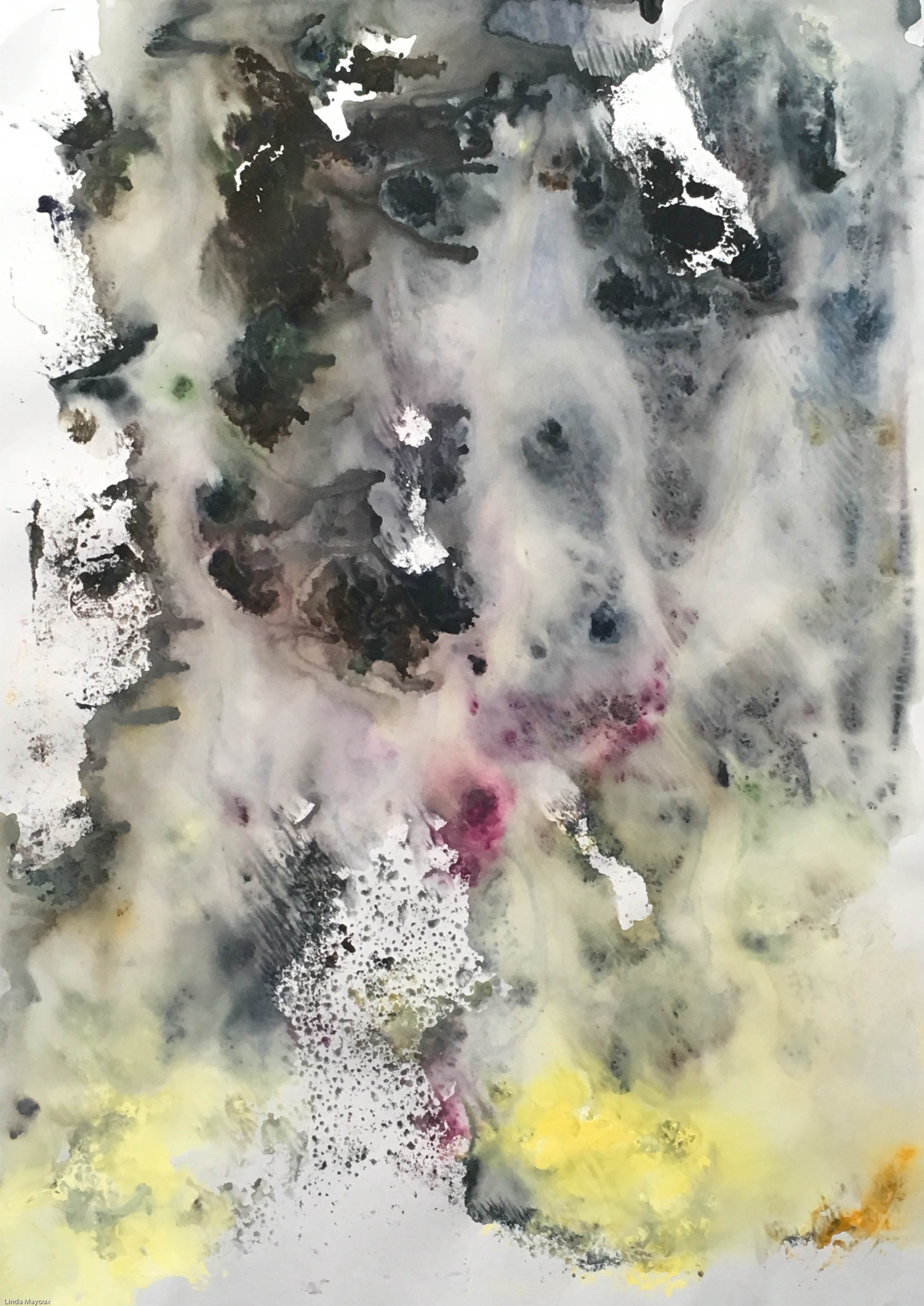
Autunno, or autumn, represents the third season of the year. The idea for the cycle began with this season, inspired by the wine harvest in Bassano in Teverina. Appropriately for the season, the colours in this painting are the richest in the group. The title is painted in irregular, dripping brown capitals near the top of the painting. Patches of deep greens, reds and browns blend with smears of dark blue, violet and yellow. On the left, stalks tipped with berries drawn with dark crayon emerge from clusters of muddy brown paint smeared with the artist’s finger tips. Placed in a vertical line above a thickly painted green area, the clusters of brown paint and their long drips form a dark margin on the side of the painting. Other finger smears and prints in red and green appear near a central formation of mixed, smeared colours. Near this, round patches of red extend towards the right with long, horizontal projections, echoing the direction of the stalks and suggesting movement. This appearance of sideways movement across the canvas dramatically counterbalances the sense of verticality created by the long drips. White paint, used to cover marks and text, has been applied more sparingly than in other paintings in the cycle. The words ‘your blood’ may be distinguished, half concealed by streaks and dribbles. Other text is too fragmented to be legible.

winter

Inverno, or winter, represents the fourth season of the year. In this painting, the jagged forms made up of horizontal and vertical strokes which produced curved ‘boats’ in parts I and II of the cycle, Primavera (Tate T07887) and Estate (Tate T07888), are depicted in an altered state in black. Heavily painted over and blended with one another, they are virtually indistinguishable as discrete forms. On the right side of the painting, black boat shapes beginning at the centre expand upwards into a large black patch. This is balanced by a smaller black patch at the bottom left of the painting. Swathes of white and daubs of yellow have been mixed over the areas of black, breaking it up so that it evokes pine branches buffeted by rain. Marks made by the movement of the artist’s fingers and brush across the canvas in horizontal streaks has created a sense of sideways motion, echoing that made by horizontal strokes of red in Autunno (Tate T07889). Fragments of text and other marks on the cream canvas are covered by white paint. Several layers of this have been smeared over a large proportion of the canvas in a thin wash resulting in dribbles over much of the central area. Minimal blobs of light green in the centre and a patch of pale yellow on the right soften the harsh atmosphere of the image, which conveys a strong sense of winter’s harsh winds and bleak cold

Quattro Stagioni is a cycle of four paintings representing the four seasons. Tate’s version is the second of two cycles; the first is in the collection of the Museum of Modern Art, New York. Both cycles were begun in 1993 at Twombly’s studio in Bassano in Teverina (north of Rome) and completed in 1994 at another house owned by the artist in Gaeta on the Tyrrhenian Sea.

Twombly’s representations of the four seasons are typical to his production of the late 1980s and 1990s in which light has become a principal theme. His prominent use of white echoes that of French Impressionists such as Claude Monet (1840-1926) for whom it was an important ingredient in the depiction of light. A series of nine paintings, Untitled 1988 (Cy Twombly Gallery, Houston), portraying the green reflective surfaces of a watery pool, recalls Monet’s celebrated paintings of his water garden at Giverny, France created between 1899 and 1926. Plant life and the sea also recur in Twombly’s imagery of this period. A single work is frequently made up of several parts, as in Quattro Stagioni which is subtitled A Painting in Four Parts.

The four seasons as symbols of the natural cycles of birth and death are a classical theme in poetry, music and painting. In Twombly’s Quattro Stagioni strong colours evoking the brilliance of the Mediterranean light are combined with scrawled poetic fragments from several sources. After pre-priming the canvases with cream-coloured gesso, the artist pinned them to the wall and applied individual colours, allowing the paint to dribble down in long, vertical lines.

Estate, or summer, represents the second season of the year. Predominantly white and yellow, the painting is dominated by the blinding light of mid-summer in a hot country. The canvas is covered with many layers of paint and text in pencil and red crayon. Echoes of the red boat-shapes, which form a central column in part I, Primavera (Tate T07887), cross the centre of this painting in a diagonal line. Originally painted in black, they have been covered by patches of bright yellow, onto which the artist has made vertical and horizontal pencil lines repeating the basic form of the boat. This relates to traditional Egyptian rowing boats which, it has been suggested, symbolise the journey through the underworld in the Egyptian ‘Book of the Dead’ (Bastian, p.37, note 15). Twombly lived for several months in Egypt in the mid 1980s and began to use the symbol of the boat in 1992. On the right side of Estate, passages of a poem by the Greek poet George Seferis (1900-71) are partially legible. Referring to the transience of youth and the passage of time, it evokes the vanitas tradition, in which symbols of mutability and mortality undercut symbols of beauty and fertility. At the top of the painting, the name Baia de Gaeta is superimposed over the words ‘Say goodbye Catullus to the shores of Asia Minor’. Twombly subsequently used these words as the subtitle for a painting in three parts begun in 1972 and finally completed in 1994. This work, Untitled Painting 1994 (Cy Twombly Gallery, Houston) shares much of the imagery of Quattro Stagioni, including the journeying boats and the focus on white light. The Roman lyric poet Catullus (84-54 BC) died soon after returning to Rome from the neighbouring province of Bithynia, Asia Minor, reputedly of a broken heart.
Further reading:
Heiner Bastian: Cy Twombly: Catalogue Raisonné of the Paintings, volume IV 1972-1995, Munich 1995, pp.34-5 and 178, reproduced p.180 in colour
Demosthenes Davvetas, Roberta Smith and Harald Szeemann, Cy Twombly: Paintings, Works on Paper, Sculpture, exhibition catalogue, Whitechapel Art Gallery, London and Städtische Kunsthalle, Düsseldorf 1987
Kirk Varnedoe, Cy Twombly: A Retrospective, exhibition catalogue, Museum of Modern Art, New York 1994, pp.162-5
Elizabeth Manchester
May 2003
Read this summary in full