Categories
Artists Etching Inspiration Media Monoprint Printmakers

Maggi Hambling: Parallel Project

Maggi Hambling was the artist and printmaker chosen for my Parallel Project.

Life Unleashed: Movement in the Art of Maggi Hambling

considers the different techniques she uses to communicate movement in her drawing, painting and printmaking and some of the learnings for my own printmaking practice.

Other notes and video links

Overview of her work

for British Museum ‘Touch’ exhibition 2016

“The border-line between what is tragic and what is comic interests me…They are a pathetic human way of trying to come to terms with the fact of our own death, the fact of other peoples’ deaths, the fact of the horror we see on the news everyday, the terrible things that happen. Some moments you cry, other moments you laugh” (Conversation with Judith Collins Hambling 1993 p13)

Drawing and portraits

My first introduction to Maggi Hambling was through the ‘George always’ exhibition at the National Portrait Gallery in 2009.

Then her wave and Walls of Water paintings shown at the National Gallery. These include a series of monotypes first shown at Malborough Fine Art (see the exhibition), then the Fitzwilliam Museum in Cambridge and the National Gallery.

More recently her work has been more political with the exhibitions, dealing with topics like global warming, migration and war:

How important is being ‘lesbionic’?

Book References

Hambling, M. (1993). Towards Laughter. Sunderland, UK, Northern Centre for Contemporary Art.
Hambling, M. (1998). maggi & henrietta.
Hambling, M. (2006). Maggi Hambling the Works and Conversations with Andrew Lambirth. London, Unicorn Press Ltd.
Hambling, M. (2009). The Sea. Salford Quays, The Lowry Press.
Hambling, M. (2009). You Are the Sea. Great Britain, Lux Books.
Hambling, M. (2015). War, Requiem and Aftermath. London, Unicorn Press Ltd.
Ramkalawon, J. (2016). Maggi Hambling Touch: works on paper. London, Lund Humphries and British Museum.

Maggi Hambling website

Exhibitions

Attitude towards death and relationship with Henrietta Moraes Evening Standard 1999

Categories
Landscape Media

Softfoam

(further experiments and details planned)

Softfoam is a very cheap soft material that is used for children’s crafts. (click here for pictures and types).

I first used it for the Japanese landscape series ‘Stepping Stones’ in Printmaking 1. I really like the hazy effects.I used one softfoam plate inking several sheets with the same layer, but re-inking with different shades of a similar colour – starting with yellows then going to browns and then blues to produce a range of different prints. Although using softfoam in this way limits the amount of colour contrast that is possible, it does build up beautiful subtle tone and colour variation.

The focus of the assignment was on contrasting markmaking – I combined wiping out for the stones, scratching out with a screwdriver for the bamboos. I also used a drypoint tool on its side and with its point to get a range of different marks. A key issue though was how to make the stones recede into the background through making the outlines and contrast reduce in sharpness towards the back. I managed to achieve a range of dramatic contrasts in the marks from soft edged stones to very fine lines and bold sweeping lines.

I then used softfoam with Schminke water-based inks in Assignment 1: Willows.

I started with experimenting with different markmaking. The ink was quite clumpy at the beginning, but this gave interesting misty effects.

Categories
Inspiration Media

Monoprint inspiration

!!In Process

See also Monoprint Technique  for an overview of the different types of monoprint and my own explorations

History and development

Hercules Seghers (1589-1638), a Dutch painter and printmaker, was one of the early artists who experimented with printing in color, on unusual papers (and linen), and with unusual horizontal formats to emphasize the horizon,  called. He experimented by using different inks and papers, but reworked his prints by adding accents by hand. Most of his images differ widely from impression to impression, and most are preserved in only a few sheets.

Rembrandt in the 1650s often retouched his plates with drypoint, burin or by burnishing areas to delete some unwanted parts. He also inked and wiped the plate each time differently, reworking some areas by moving around the ink with rags, fingers or paintbrushes. This enabled him to render flames, smoke and rich areas of shadow,  creating dramatic darkness and light contrasts. Each impression was virtually different from the previous one.

Benedetto Castiglione (1609-1664) devised a new printmaking process by drawing images directly onto an unetched plate and then pulling a unique impression; he drew white lines with a stick, created tonal areas with his fingers, rugs and brushes, then printed the plate using a press, just like we do today.

William Blake (1757–1827) started experimenting with monotypes. He painted with oil and egg tempera onto a copperplate or piece of millboard from which he pulled prints by pressing the dampened paper against the paint. He then retouched his works by hand with ink and watercolor. Some of the monotypes were used as a guide for overpainting in another media.

But the medium failed to become popular because of its limitation to one print and also because it depended too much on accidental effects and uncontrollable properties of ink when subjected to the heavy pressure of a press.

In the late 1860s when the young impressionists became interested in the creative use of inking. These printing experiments seem to have been influenced by early developments of photography with its black and white contrasts and interplay of positive and negative imagery.

Edgar Degas (1834-1917) found monoprints gave him a great deal of artistic freedom. He used the ‘dark field’ method and created very dramatic chiaroscuro effects. 

Camille Pissarro (1830-1903) was one of the artists who became interested in monoprinting after Degas exhibited his prints in the third Impressionist exhibition of 1877.  Through experimentation and accidents he created a series of unique impressions, turning his imperfections to his advantage to create effects of light and texture.

Paul Gauguin (1848-1903) worked independently developing his own unique technique called trace monotype. His method consisted of inking a sheet of paper, laying another sheet over it, and drawing on the back of fresh paper thus transferring the ink creating an image in a linear manner.

Paul Klee (1879-1940) experimented and mastered this method a few years later in his inventive drawings.

Maurice Prendergast (1859-1924) used this method extensively. He was  influenced by Japanese prints. He described his way of making monotypes : “Paint on copper in oils, wiping parts to be white. When the picture suits you, place Japanese paper on it and either press in a printing press or rub with a spoon till it pleases you. Sometimes the second or third plate is the best.”

Pierre Bonnard (1867-1947) produced hundreds of richly colored monotypes pressing the paper by hand or with a roller on a previously inked and painted metal plate.

Pablo Picasso (1881-1973), Chagall, Miro’, Dubuffet, Matisse and many other contemporary artists produced hundreds of exceptional monotypes, too.

Contemporary Monoprints

Bibliography

Ayres, J., (2001) Monotype: mediums and methods for painterly printmaking, New York: Watson-Guptill Publications.

Brown, N., Tracey Emin, London: Tate Publishing.

D’arcy Hughes, A. & Vernon-Morris, H., (2008) The Printmaking Bible: the complete guide to materials and techniques, San Francisco: Chronicle Books.

Grabowski, B. & Flick, B., (2009) Printmaking: A Complete Guide to Materials and processes, London: Lawrence King Publishing.

Hambling, M., (2009) The Sea, Salford Quays: The Lowry Press.

Hauptman, J., (2016) Degas: A Strange New Beauty, New York: MoMA.

Hayter, C. E., (2007) The Monotype: The History of a Pictorial Art, Milan: Milton Avery.

Martin, J., (1993) The Encyclopedia of Printmaking Techniques, London: Quarto Publishing.

Merck, M. & Townsend, C. (eds.) (2002) The Art of Tracey Emin, London: Thames & Hudson.

Newell, J. & Whittington, D., (2004) Monoprinting, London: A&C Black.

Ramkalawon, J., (2016) Maggi Hambling Touch: works on paper, London: Lund Humphries and British Museum.

Stobart, J., (2001) Printmaking for Beginners, London: A&C Black.

Woods, L., (2011) The Printmaking Handbook: Simple techniques and step-be-step projects, London: Search Press.

Exhibitions and galleries

British Museum

Maggi Hambling – Touch: works on paper  (8 September 2016 –29 January 2017)

Fitzwilliam Museum

Degas: A Passion for Perfection  (3 October 2017 – 14 January 2018) prints in various media

Maggi Hambling: The Wave (27 April – 8 August 2010) monoprints and etchings

National Gallery

Maggi Hambling: Walls of Water (26 November 2014 – 15 February 2015)

Categories
Media

Monoprint Techniques

See also print Monoprint inspiration

What are Monoprints and Monotypes?

A monoprint is a single impression of an image made from a reprintable block. It  involves the transfer of ink from a plate to the paper, canvas, or other surface that will ultimately hold the work of art. Monoprints are known as the most painterly method among the printmaking techniques; it is essentially a printed painting. The beauty of this medium is in its spontaneity and its combination of printmaking, painting and drawing media. Monoprints may also involve elements that change, where the artist reworks the image in between impressions or after printing so that no two prints are absolutely identical. Monoprints may include collage, hand-painted additions, and a form of tracing by which thick ink is laid down on a table, paper is placed on top and is then drawn on, transferring the ink onto the paper. Monoprints can also be made by altering the type, color, and pressure of the ink used to create different prints.

  • monotyping: plates have no permanent marks that will impart any definition to successive prints. Imagery is dependent on one unique inking, resulting in one unique print. At most two impressions (copies) can be obtained
  • monoprinting:  plates have permanent features on them that can be reused, but not to produce an identical result. Monoprints can be thought of as variations on a theme, with the theme resulting from some permanent features being found on the plate – lines, textures – that persist from print to print. Variations are confined to those resulting from how the plate is inked prior to each print. The variations are endless, but certain permanent features on the plate will tend to persist from one print to the next.

I used different monoprint techniques in:

For ways in which other printmakers and artists have used and innovated with monoprint see Monoprint Inspiration.

Monoprint process

  1. Preparing the plate

Plates can be of any type, as long as they are non porous: plexiglass or thin sheets of metal such as copper or zinc, heavyweight vinyl, mylar or acetate, masonite, discarded thin litho zinc or aluminium plates, cardboard sealed with gesso or acrylic spray or glue, glass (only used when handprinting), styrofoam, polystyrene.

Some of my work uses softfoam.

Prior to drawing, the plate to be used (usually plexiglass) needs to be finely sanded and the edges bevelled. This will allow color to fix better on the plate and make drawing much easier. Using a sponge or small brayer apply a thin even coat of hand soap to the entire printing surface and allow it to dry. The soap will perform as a releasing agent and allow the colors to lift during printing.

2) Inking the plate

Inks include  water-based inks (eg Akua-Kolor  or Schminke Inks) or oil-based inks (eg Caligo water-washable inks of Hathorne inks), or paints like Holbein Duo water-soluble oil paints or watercolour paints and pigments. Other water-soluble materials such as crayons, watercolour pencils or watercolour felt tip pens can also be used.

Applicators and wipers include brushes, rollers, sticks, rags, fingers, palette knives etc

Monoprints can use one or more of the following inking processes:

Painterly approaches: adding ink

Draw directly onto the surface of the plate with the water-soluble materials, letting the color dry for a few hours prior to printing.

Subtractive techniques

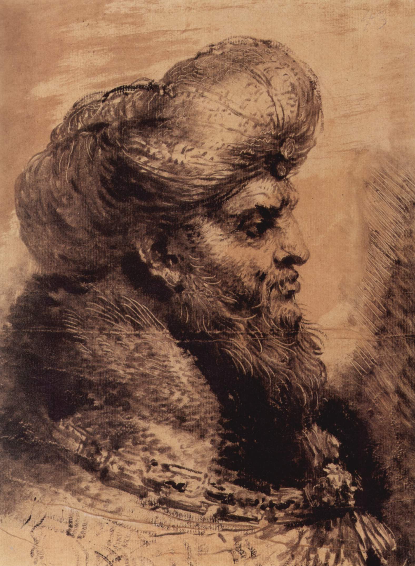
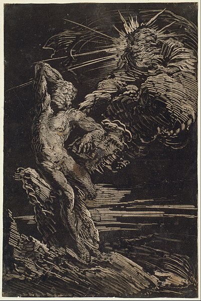
Inspiration:  Castiglione   Degas

Masking

Using thin plastic or paper shapes to produce positive and negative space images in one or more colours.

Inspiration: Matisse cut-outs

Trace drawing

Also known as back-drawing or back-tracing. Inking up a plate and then drawing on the back of the paper with different instruments to produce a line and shading- pencils for sharp lines, flat or soft objects for tone. This gives a very angular and nervous line. There is no limit to the number of times you can back-drawn a print and different colours and textures can be built up.

Project 4.2 Self-portrait reflected

Inspiration: Gauguin, Klee, Tracey Emin

Textured prints

Using textured materials to make marks in the ink and/or act as a mask between the ink and the paper.

Salt

Collage monoprint: materials are not glued on the surface but are used on the paper either inked or not inked (only used to produce embossments on paper). Materials often used are cut or torn shapes from textured papers, lace, cloth, thin vinyl sheets, leaves, and even metal grating.

Special effects can also be achieved dabbing solvents such as mineral spirits or turpentine to your inked plate, allowing the solvent to dissolve the ink so as to create beautiful reticulate marks.

Printing the Plate

Paper  can use thin or thick papers, watercolour paper, and cheaper papers like newsprint etc

The paper to print on should be damp, but not excessively wet unless you want the colors to “run”. When printing, the moisture in the paper will reactivate the drawing materials, allowing for the transfer of the color to the paper. Run the plate through the press with moderate to heavy pressure. This will give you the best impression. Prior to removing the printed image. Check the impression quality by lifting the corner of the print and checking the image. If the impression is not satisfactory, lightly spray/sponge the back of the paper with water and run it through the press again. Repeat this until the image is of acceptable quality.

Bibliography

Ayres, J., (2001) Monotype: mediums and methods for painterly printmaking, New York: Watson-Guptill Publications.

Brown, N., Tracey Emin, London: Tate Publishing.

D’arcy Hughes, A. & Vernon-Morris, H., (2008) The Printmaking Bible: the complete guide to materials and techniques, San Francisco: Chronicle Books.

Grabowski, B. & Flick, B., (2009) Printmaking: A Complete Guide to Materials and processes, London: Lawrence King Publishing.

Hambling, M., (2009) The Sea, Salford Quays: The Lowry Press.

Hauptman, J., (2016) Degas: A Strange New Beauty, New York: MoMA.

Hayter, C. E., (2007) The Monotype: The History of a Pictorial Art, Milan: Milton Avery.

Martin, J., (1993) The Encyclopedia of Printmaking Techniques, London: Quarto Publishing.

Merck, M. & Townsend, C. (eds.) (2002) The Art of Tracey Emin, London: Thames & Hudson.

Newell, J. & Whittington, D., (2004) Monoprinting, London: A&C Black.

Ramkalawon, J., (2016) Maggi Hambling Touch: works on paper, London: Lund Humphries and British Museum.

Stobart, J., (2001) Printmaking for Beginners, London: A&C Black.

Woods, L., (2011) The Printmaking Handbook: Simple techniques and step-be-step projects, London: Search Press.

Exhibitions and galleries

British Museum

Maggi Hambling – Touch: works on paper  (8 September 2016 –29 January 2017)

Fitzwilliam Museum

Degas: A Passion for Perfection  (3 October 2017 – 14 January 2018) prints in various media

Maggi Hambling: The Wave (27 April – 8 August 2010) monoprints and etchings

National Gallery

Maggi Hambling: Walls of Water (26 November 2014 – 15 February 2015)

Categories
Abstract Abstraction Landscape Media Monoprint Natural

Forest Moses

website: http://www.forrestmoses.com/monotypes.htm

Forrest Moses monotype
Categories
Abstraction Inspiration Printmakers

Toko Shinoda

[wpdevart_youtube]u2vnKHyCabw[/wpdevart_youtube]

Spanish slideshow of her work

[wpdevart_youtube]ryO6uknKch4[/wpdevart_youtube]

Toko Shinoda Exhibit by The Tolman Collection, Tokyo at Musee Kikuchi

[wpdevart_youtube]u2vnKHyCabw[/wpdevart_youtube]

Google images

Toko Shinoda (篠田 桃紅 Shinoda Tōkō?, born March 28, 1913) is a Japanese artist working with sumi ink paintings and lithograph prints. Her art merges traditional calligraphy with modern abstract expression. She says she prefers her paintings and original drawings, because sumi ink presents unlimited colour spectrum. In printmaking, Shinoda uses lithograph as her medium. Unlike woodcut that requires chisel, or etching that requires acid, lithograph allows Shinoda to work directly and spontaneously on the plate with her fluid brushstroke. Shinoda’s strokes are meant to suggest images and vitality of nature. She says, “Certain forms float up in my mind’s eye. Aromas, a blowing breeze, a rain-drenched gust of wind…the air in motion, my heart in motion. I try to capture these vague, evanescent images of the instant and put them into vivid form.” Shinoda’s print editions are small, usually ranging from twelve to fifty-five, and after each edition has been pulled, she often adds a stroke or two of sumi color by hand to each print.

Life

Shinoda was born in Manchuria where her father managed a tobacco factory. Two years later, her family returned to Japan. Influenced by her father’s love of sumi ink painting, calligraphy and Chinese poetry, Shinoda practiced calligraphy since she was six.

Shinoda traveled the United States from 1956 to 1958. During this time her works were bought by Charles Laughton and John Lewis of the Modern Jazz Quartet. Shinoda also became involved in the abstract expressionist movement of the time.

A 1983 interview in Timemagazine noted that “her trail-blazing accomplishments are analogous to Picasso’s”. Shinoda’s works had been exhibited in the Hague National Museum, the Art Institute of Chicago, Cincinnati Art Museum and other leading museums in the world.

She turned 100 in March 2013.

Books on her work

  • Takashina, Shuji. Okada, Shinoda, and Tsukata: Three Pioneers of Abstract Painting in 20th Century Japan. Washington: Phillips Collection, c1979.
  • Tolman, Mary and Tolman, Norman. Toko Shinoda: A New Appreciation. Rutland, Vermont: Charles E Tuttle Company, 1993.
Categories
Abstraction Inspiration

Wilhelmina Barns-Graham

Wilhelmina Barns-Graham 1912 –  2004

from Wikipedia

Google Images

Barns-Graham Charitable Trust images

Looking In Looking Out  You Tube video

My Aunt Wilhelmina Barns Graham  You Tube video


I want my work to be a simple statement. To have an atmosphere and integrity – this is a presence…To have interesting space relationships, relationships of colour, and colour to form – that is form suggesting colour and vice versa. One plane over another in a totality of image, with something of the fun of the unexpected. A world in itself – of small area against large mass.


The positive aspect of working in an abstract way for me, is the freedom of choice, i.e.medium, space, texture, colours, the challenge of feeling out the truth of an idea – a process of inner perception and harmony of thought on a high level…Abstract is a refinement and greater discipline to the idea, truth to the medium thus perfecting the idea, only using that which perfects or adds to that idea.


At my age, there’s now no time to be lost. I say to myself, ‘Do it now, don’t be afraid.’ I’ve got today, but who knows about tomorrow? I’m not ready for death yet, there’s still so much I want to do. Life is so exciting. Trying to catch one simple statement about it. That’s what I’m aiming for, I’ll keep on trying.

Wilhelmina Barns-Graham’s work generally lies on the divide between abstract and representational, typically drawing on inspirations from landscape.

Wilhelmina Barns-Graham was born in St Andrews, Fife. She enrolled in Edinburgh College of Art in 1931, after some dispute with her father. After periods of illness,  she graduated with her diploma in 1937. In 1940, she moved to St Ives, Cornwall, in 1940, near to where a group of Hampstead-based modernists had settled, at Carbis Bay, to escape the war.This was a pivotal moment in her life. Early on she met Borlase Smart, Alfred Wallis and Bernard Leach, as well as the painter Ben Nicholson and the sculptors Barbara Hepworth and Naum Gabo.  Perhaps the most significant innovation at this time derived from the ideas of Naum Gabo, who was interested in the principle of stereometry – defining forms in terms of space rather than mass.

Her pictures from this period are exploratory and even tentative as she began to develop her own method and visual language. Later, local shapes and colours appear in the images – the Cornish rocks, landscape and buildings.

At the suggestion of the College’s Principal Hubert Wellington, Barns-Graham became a member of the Newlyn Society of Artists and the St Ives Society of Artists but was to leave the latter when, in 1949, the St Ives art community suffered an acrimonious split, and she became a founder member of a breakaway group of abstract artists, the Penwith Society of Arts. She was also one of the initial exhibitors of the significant Crypt Group. In the same year she married the art critic David Lewis (they divorced in 1960).

She travelled regularly over the next 20 years to Switzerland, Italy, Paris, and Spain. With the exception of a short teaching term at Leeds School of Art (1956–1957) and three years in London (1960–1963), she lived and worked in St Ives. From 1960, on inheriting a house outside St Andrews from her aunt Mary Niesh (who had been a support to her throughout her art college years), she split her time between summers in Cornwall and winters in Scotland.

Barns-Graham’s series of glacier pictures that started in 1949, inspired by her walks on the Grindelwald Glacier in Switzerland, reflect the idea of looking at things in a total view, not only from the outside but from all points, including inside. In 1952 her studies of local forms became more planar and two dimensional, but from the mid-1950s she had developed a more expressionist and free form attitude following journeys to Spain.

In the early 1960s, reflecting the turmoil in her personal life, Barns-Graham adopted a severe geometrical form of abstraction as a way of taking a fresh approach to her painting. Combined with a very intuitive sense of colour and design, the work often has more vitality than is immediately apparent. Squares tumble and circles flow across voids. Colour and movement come together and it is at this point in her work that St Ives perhaps exerts the least influence; rather, this approach more likely reflects an interest in the work of Josef Albers who was exciting UK artists at this time, in embracing new possibilities offered by the optical effects of a more formulaic abstraction.

Nonetheless there is evidence to suggest that many images did stem from observations of the world around her. This is seen in a series of ice paintings in the late 1970s and then in a body of work that explores the hidden energies of sea and wind, composed of multiple wave-like lines drawn in the manner of Paul Klee. The Expanding Form paintings of 1980 are the culmination of many ideas from the previous fifteen years – the poetic movement in these works revealing a more relaxed view.

From the late 1980s and right up until her death, Barns-Graham’s paintings became more and more free; an expression of life and free flowing brushwork not seen since the late 1950s. Working mainly on paper (there are relatively few canvases from this period) the images evolved to become, initially, highly complex, rich in colour and energy, and then, simultaneously, bolder and simpler, reflecting her enjoyment of life and living. “in my paintings I want to express the joy and importance of colour, texture, energy and vibrancy, with an awareness of space and construction. A celebration of life — taking risks so creating the unexpected.” (Barns-Graham, October 2001) This outlook is perfectly expressed in the extraordinary collection of screen prints that she made with Graal Press, Edinburgh, between 1999 and 2003.

Post-war, when St Ives had ceased to be a pivotal centre of modernism, her work and importance as an artist was sidelined, in part by an art-historical consensus that she had been only as a minor member of the St Ives school. In old age, however, she received belated recognition, receiving honorary doctorates from the University of St Andrews in 1992 and later from the universities of Plymouth, Exeter and Falmouth . In 1999 she was elected an honorary member of the Royal Scottish Academy and the Royal Scottish Watercolourists. She was awarded a CBE in 2001, the same year that saw the publication of the first major monograph on her life and work, written by Lynne Green — W.Barns-Graham : A Studio Life (Lund Humphries). This publication was followed in 2007 by The Prints of Wilhelmina Barns-Graham : a complete catalogue by Ann Gunn (also a Lund Humphries publication). Her work is found in all major public collections within the UK.

Wilhelmina Barns-Graham died in St Andrews on 26 January 2004. She bequeathed her entire estate to The Barns-Graham Charitable Trust, which she had established in 1987. The aims of the trust are to foster and protect her reputation, to advance the knowledge of her life and work, to create an archive of key works of art and papers, and, in a cause close to her heart, to support and inspire art and art history students through offering grants and bursaries to those in selected art college and universities. Information about the trust and its activities is to be found at http://www.barns-grahamtrust.org.uk

Copyright

Barns-Graham Charitable Trust

“You may download the material featured on this website to file or printer for non-commercial research and private study. You will need a licence from us for any other form of re-use. Applications can be sent to us at:

Barns-Graham Charitable Trust
PO Box 29267
St Andrews
Fife
KY16 6AT”

Categories
Chiaroscuro Inspiration Media Portrait Printmakers

Benedetto Castiglione

Giovanni Benedetto Castiglione

(Wikimedia Commons)

Kopf eines bärtigen Orientalen 1655 31.7 × 23.6 cm (12.5 × 9.3 in), Windsor Castle

Giovanni Benedetto Castiglione (1609–64) was an Italian painter and etcher who was the first artist to produce brushed sketches intended as finished and final works of art (rather than as studies for another work).

Heavily influenced by Rembrandt he experimented with different inking variations on etchings. From there he invented the monotype process in the 1640s. He produced over twenty surviving monotypes, over half of which are set at night.

He normally worked from black to white. He drew directly into an unetched plate, drawing white lines with a stick, created tonal areas with his fingers, rags and brushes. He then printed using a printing press.

File:Giovanni Benedetto Castiglione - The Creation of Adam - Google Art Project.jpg
The Creation of Adam circa 1642 Monotype (dark manner) in black on ivory laid paper Height: 303 mm (11.93 in). Width: 203 mm (7.99 in).

Categories
Abstraction Chine colle Inspiration Linocut Media Monoprint Portrait

Henri Matisse

Draw happiness from oneself, from a good day’s work, from the light it can bring to the fog which surrounds us. Think…”that was the best time”

Categories
Abstraction Inspiration Media Printmakers

Koichi Yamamoto

Inspiration for my printmaking

I find Yamamoto’s large abstract monochrome monoprint landscapes extremely evocative. Inspired by a Zen minimalist aesthetic, with a focus on tone and markmaking, they have a dreamy and ethereal feel – full of suggestion of light and dark, huge towering buildings or seething underlying masses in the deep. Yet cannot be completely grasped or understood.

Yamamoto Printmaking Official website

Monoprints

Google images of Yamamoto monoprints

Koichi Yamamoto is an artist who merges the traditional and contemporary by creating unique and innovative approaches to the language of printmaking.Koichi’s prints explore issues of the sublime, memory, and atmosphere.
Koichi has worked with meticulous copper engravings to large-scale monotypes.
He completed BFA at the Pacific Northwest College of Art in Portland, Oregon then move to Krakow, Poland for producing works and to study copper engravings in Bratislava Academy of Fine Arts in Slovakia Republic.
He studied in Academy of Fine Arts in Poznan, Poland and then completed MFA at University of Alberta, Canada. He also worked as a textile designer in Fredericia, Denmark.
He has exhibited internationally. He has taught at Utah State University and University of Delaware and currently an Associate Professor at University of Tennessee in Knoxville.
Video of his working process

[wpdevart_youtube]51MP7MLLt8A[/wpdevart_youtube]

Sources of inspiration in water surfaces

[wpdevart_youtube]gJpf-zuEcbM[/wpdevart_youtube]

Metal engraving

[wpdevart_youtube]l7kbmU1U-z4[/wpdevart_youtube]

Copperplate etching Kite design

[wpdevart_youtube]hRsLbfUXl_M[/wpdevart_youtube]